News for hackers. Stuff that matters.
Re:John Carmack Leaves Meta by richliss on Saturday December 17, 2022 @08:02AM (#34027405)
I worked with someone who was a bona fide development genius about 10 years ago and he was a CTO and co-founder at the time and considered himself to be able to input into any conversation with people who were domain experts in fields that he wasn't.

I remember him overruling the Head of Design and enforcing Arial to be the typeface used for the corporate brand because it was the typeface was present on more computers than any other in the world. Suffice to say the original typeface was much better.

Self doubt is a really really important trait to have as a leader - don't automatically assume you're right outside of your area of expertise and that team members can come up with good solutions that aren't yours is the only way you can ever really scale.

The CTO ultimately was forced out and became a specialist consultant and that probably suited him.

Re:John Carmack Leaves Meta by michpoch on Saturday December 17, 2022 @08:29AM (#34027574)
Ok, that is an example where his advice was apparently incorrect.

Was that a rule though? If you give advice in 100 different meetings, you'll be wrong in some of them for sure, even if you're a domain expert.

If he was the CTO and co-founder it seems that his approach worked well, at least to get him and the company to that level.

Re:John Carmack Leaves Meta by bee_rider on Saturday December 17, 2022 @06:53PM (#34033540)
What’s wrong with Arial? I mean I know it is disliked by typography fans because it is a ripoff of the popular Helvetica. But like, moral concerns aside or whatever, as a slightly worse ripoff of a good and popular typeface, it is unsurprisingly fairly visually appealing…

It seems like a reasonable product decision given that most people don’t care about typeface history.

Re:John Carmack Leaves Meta by bb88 on Saturday December 17, 2022 @09:31PM (#34034523)
I find Arial slightly discomforting, because the kerning is not as nice as with Helvetica. Helvetica feels "denser".

But more to the point, for a corporate logo, Arial feels like a cheap knock off to the more polished Helvetica. You can see this yourself, by looking at corporate existing corporate logos designed in helvetica and then redesigned in Arial.

https://www.ironicsans.com/helvarialquiz/

Admittedly this is personal preference in the end, but I feel like if HR is going to give someone bad news, they're going to do it in Arial. If Apple is going to release a life changing technology, they're going to do it in Helvetica.

Re:John Carmack Leaves Meta by bee_rider on Saturday December 17, 2022 @09:54PM (#34034641)
I should have thought more about the experiment. I was trying to identify the helvetica ones, looking for example for logos that looked slightly unusual or janky.

I guess it would fit your point a little more if I just looked for whichever I thought was more aesthetically pleasing.

Anyway, I got about 50% (accidentally closed the window, I think it may have been 51%?) so at least if I was the customer, the company would not seem to gain any advantage from licensing the superior font.

Re:John Carmack Leaves Meta by bb88 on Saturday December 17, 2022 @11:03PM (#34034950)
The "R", "r", and "t" characters are the way you can tell between the two fonts.

I think an example of a bad logo is Arial is this one:

https://www.designworkplan.com/wp-content/font-arial-everywh...
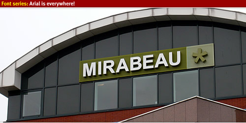
The A has too much space around it and it looks "uneven".

The bottom one of this one is Helvetica.

https://cdn0.tnwcdn.com/wp-content/blogs.dir/1/files/2009/10...

It looks "fuller", "denser" to me. And leaves me with an impression of a "sturdy" company.

Finally, here's Neue Helvetica 75 and Arial Pro Bold pages from Linotype. I just open them up in a new tab each and switch tabs to get a better idea for things.

https://www.linotype.com/1264130/neue-helvetica-75-bold-prod...

https://www.linotype.com/716034/arial-bold-product.html

Re:John Carmack Leaves Meta by bee_rider on Sunday December 18, 2022 @12:00AM (#34035182)
I’m not sure I see a huge quality difference in the second example, but the A in the first example definitely looks awful.
Re:John Carmack Leaves Meta by bb88 on Sunday December 18, 2022 @04:55PM (#34043978)
You can type "MIRABEAU" in Arial and Helvetica in the forms above, and you should see a definite improvement by using Helvetica.
Re:John Carmack Leaves Meta by outworlder on Saturday December 17, 2022 @09:32PM (#34034527)
It's a typeface that was designed to be legible in monitors, more than two decades ago. There are better choices today.
Re:John Carmack Leaves Meta by DonHopkins on Sunday December 18, 2022 @06:03AM (#34036585)
I shipped a successful game that used Comic Sans! ;)
Re:John Carmack Leaves Meta by aswanson on Saturday December 17, 2022 @10:19PM (#34034745)
It's hilarious the CTO was enforcing corporate logo aesthetics. Talk about nanomanagement. Sheesh.
Re:John Carmack Leaves Meta by cerved on Sunday December 18, 2022 @04:04AM (#34036127)
also, Arial
Re:John Carmack Leaves Meta by aswanson on Sunday December 18, 2022 @06:12AM (#34036633)
Right?
Re:John Carmack Leaves Meta by codethief on Sunday December 18, 2022 @08:07AM (#34037331)
> Self doubt is a really really important trait to have as a leader

While I get the point you're making, I remember reading somewhere that successful people (in terms of their career) tend to exhibit less self-doubt.