The "R", "r", and "t" characters are the way you can tell between the two fonts.
I think an example of a bad logo is Arial is this one:
https://www.designworkplan.com/wp-content/font-arial-everywh...
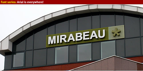
The A has too much space around it and it looks "uneven".
The bottom one of this one is Helvetica.
https://cdn0.tnwcdn.com/wp-content/blogs.dir/1/files/2009/10...

It looks "fuller", "denser" to me. And leaves me with an impression of a "sturdy" company.
Finally, here's Neue Helvetica 75 and Arial Pro Bold pages from Linotype. I just open them up in a new tab each and switch tabs to get a better idea for things.
https://www.linotype.com/1264130/neue-helvetica-75-bold-prod...
I’m not sure I see a huge quality difference in the second example, but the A in the first example definitely looks awful.
I guess it would fit your point a little more if I just looked for whichever I thought was more aesthetically pleasing.
Anyway, I got about 50% (accidentally closed the window, I think it may have been 51%?) so at least if I was the customer, the company would not seem to gain any advantage from licensing the superior font.