When I first fired this up, I made a tarball of one of the repos I'm currently working in (it has uncommitted changes) and started clicking around. I'd do something in the GitHub app, then go back to my bash prompt to see what happened. I was pretty confused when I switched branches and all my changes were gone. Then I went back and read the blog post. It auto-stashes when you switch branches. I also wondered what the heck the "Synchronize" button does, so once again, I referred to the blog post. It performs what they call a "smarter version of pull --rebase && push that reduces merge commits but doesn't rewrite your merges". Oh, really?
At that point I realized that GitHub has done the hard thing. They haven't re-created the git CLI tool in a GUI, they've created something different. They've created a tool that makes Git more accessible. Little things like auto-stashing when you switch branches will confuse git veterans, but it will make Git much easier to grok for newcomers because of the assumptions it makes about your git workflow.
I see great things in this app's future. It's probably not for everyone. If you're a proficient git cli user, and you like it that way, then you're probably best off sticking with what you've got. Maybe explore some of the more traditional Git GUI clients like GitK or GitX, but keep in mind, that's not what this is.
I'm mostly discussing GUI trends (as a Mac developer who cares about this stuff), using GitHub as an example (which, as you say, gets job done great, but I say that it can be improved).
"You argue"?
Clutter means (let me open the dictionary) "a collection of things lying about in an untidy mass".
I never said only spacing produces clutter. Either I'm not explaining myself clearly or you read something that was not in my comment (this is called a strawman, right?)
No hostility meant by "you argue". You provided a critique, an argument. I'd open the dictionary... ;)
His posts were completely non-hostile, so aren't you overreacting?
The rest of my reply was pointing out how I perceived this to be different than GitX, which was tangential to the point, but I didn't really think a separate reply was required. Sorry for the confusion.
Everyone I know uses a different fork, much to my dismay.
Notably, SourceTree (what mainly use) and Tower (if the incomprehensible one-repo-at-a-time limit isn't a dealbreaker) now compare favorably to gitx in most ways.
So I don't recommend gitx anymore, but from what I hear Gitx (L) is a fairly active and popular fork:
I use GitX for committing and browsing and the command line for the rest. None of the GUIs have blown me away yet, but deep GH integration is a big plus for me so GH for Mac might join my workflow.
Git seems to have broken down the social contracts around forking that kept most opensource projects cohesive. Unless the project has a great deal or inertia, it is difficult to remain the canonical source, and the project effectively disperses.
If you think about it, this is basically 1) a marketing problem and 2) would be solved instantly should GitHub introduce a better 'network' visualization.
- Projects should be top-level in the github namespace, not people.
- Forks should live underneath their source project, and should not be top-level projects themselves.
1. Let me enter an email address separate from my GitHub account. 2. Automatically found git repos on my system. Let me pick which ones to use.
My only two requests are:
1. Show untracked files the way git does, where if a whole folder is untracked, it only shows up in the list once, rather than showing every subfolder and file inside it.
2. Handle submodules better: let me see the submodule changes in a commit, let me browse and commit submodule changes and the commit the parent.
That said, creating a desktop interface for GitHub is a brilliant move. Bravo!
Also, you should let some of that angst go, because it's clear that Apple is anticipating an iOS experience on the desktop for a long time coming.
I think there's a misunderstanding. I'm not against single windows, I'm against making me navigate through screens when it's unnecessary.
Also, you should let some of that angst go, because it's clear that Apple is anticipating an iOS experience on the desktop for a long time coming.
Apple is anticipating better GUI experience. It doesn't mean that they'll make all apps occupy a single window with a single task shown at a time. Notice the difference between iPhone Mail and iPad Mail clients.
1. Floating inspectors drive me bananas unless they can be pinned in the app "wrapper".
2. A new window for every document makes me crazy, because I like to use tools like Witch for doc-level tab switching.
3. The push away toward full screen apps and in-app file management is, IMO, a good thing.
I'm with you here, mostly. iCal's switch from sidebar in 10.4 to popups and floating inspectors in 10.5 is painful. On the other hand, Acorn's floating tools window is good.
2. A new window for every document makes me crazy, because I like to use tools like Witch for doc-level tab switching.
I'm not so into tabs for documents, but can't live without them in browsers.
3. The push away toward full screen apps and in-app file management is, IMO, a good thing.
And yes, and no. It depends, as with other points. I'm glad that now Mac apps are not locked into multiple windows/floating inspectors for everything, but "you have a single window and you can look only at one thing at a time, deal with it" is also not the panacea.
1. Floating inspectors: Inspectors in general are getting better and I definitely prefer when it is well integrated into the view without interrupting my flow. They have a good start; further work is needed (not sure what though)
2. I think even tabs are a mistake now. We learned a lot from iOS about how to well integrate multiple views into a seamless interface. Tabs are kind of unnecessary imho now; we need something better.
3. Full screen isn't what I think the best aspect is - we do want to be able to view different apps at the same time. Case in point: - I have this chrome tab open on the right hand side of my iMac monitor - 3 terminal windows on the left hand side - My vc pitch in PPT on my second monitor's right hand - My PPC ad management software open on the second monitor's left side.
Restricting to one screen for an app isn't the right way I think, but an in-between method is. Funnily enough, I think Windows 8 almost nailed it.
As for in-app file management: YES. iCloud, Dropbox and a myriad of other systems all working together have such potential. I can't wait.
Some people actually like interfaces to be aesthetically pleasing. And whitespace is one of those things that really helps to make ui usable and clean.
* Finder in 10.4: http://miki.samborsky.de/files/article/2008/LeoIcon/Tiger-Fi...

* Finder in 10.5-10.6: http://www.askdavetaylor.com/3-blog-pics/mac-finder-places-m...
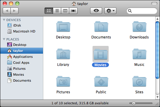
* Finder in 10.7: http://gavinsmith.me/wp-content/uploads/2011/02/Screen-Shot-...

And whitespace is one of those things that really helps to make ui usable and clean.
You missed "the right amount of" before "whitespace".
But you're right that you can avoid using multiple windows in the app if it's good for usability. My point is that currently it's not possible to have two repositories opened simultaneously; especially since on OS X it's difficult to open two instances of the same application.
(As an example, in Mail you have previews in a single window, but you can also double-click the message to open it in a separate window).
Layout: All-In-One
"This layout provides virtually all operations within a single window, such as editing files and project content, filtering in the detail view, viewing the build results and build log, and debugging".

Other than the APIs for fullscreen support, there's little that can be said without violating NDA. Other Apple applications have gone single-window over the years; Logic merged its windows two major versions ago, and Final Cut Pro X just did the same.
Steve Jobs has always preferred single windows. Before OS X 1.0, the toolbar button was instead a toggle for single window mode.
However, +10 for "Make animations go faster".
If you've ever used Quickbooks, you'll understand the pain they're looking to avoid: http://www.quickbooks-software.co.uk/images/quickbooks_scree....

I think overall this is a very nice product, even though some of the loading is a wee bit slow (even on an i7 iMac). It adds a very nicely done, easy to navigate interface for the times I want to visually manage stuff.
9/10 times I'll use the command line to do stuff, but this makes other aspects of code management go much quicker for me.
Solid 7/10 from me.
Some feedback:
* Get rid of huge spacing everywhere (for example here: http://github-images.s3.amazonaws.com/blog/2011/mac-screensh...)
* Make animations go faster.
* History should have preview pane with diffs (see Mail) instead of making me click on commits.
* There are windows on Macs. You can use them instead of [edit: or in addition to] making me navigate inside a single window.
* Loading indicators are annoying. Move them to bottom (there it won't distract me, but I'll know that it's still loading).
Oh, and congrats on release.