News for hackers. Stuff that matters.
Re:Unofficial Apple Archive by telegrammae on Thursday January 16, 2020 @12:40PM (#22066840)
Apple's design of 10-15 years ago looks excellent even today. Truly - good design does not lose its attractiveness as styles and standards change. Most icons, fonts, panels, colors of most of their old software and promotional materials look very pleasant, even in low resolution.
Re:Unofficial Apple Archive by Nextgrid on Friday January 17, 2020 @12:07AM (#22072051)
I especially notice this with iOS. iPhone OS (back when it was called that) was a masterpiece of design with every app having its own, different personality while being simple & efficient to use.

The last few iOS releases are a disaster on both fronts. Design-wise it’s completely blank, flat & empty, and usability wise a lot of the apps are just shadows of their former selves. Music, messages, maps, App Store, podcasts, etc. Even basic text editing was downgraded.

Re:Unofficial Apple Archive by jdofaz on Thursday January 16, 2020 @12:55PM (#22067021)
It comes down to your taste, I thought aqua and the lickable interface was ugly then, and now.
Re:Unofficial Apple Archive by throwaway2048 on Thursday January 16, 2020 @01:32PM (#22067396)
the original osx pinstripe look is pretty hideous, and the faux glossy emboss look hasn't aged well either

https://images.techhive.com/images/article/2016/01/mac-os-x-...
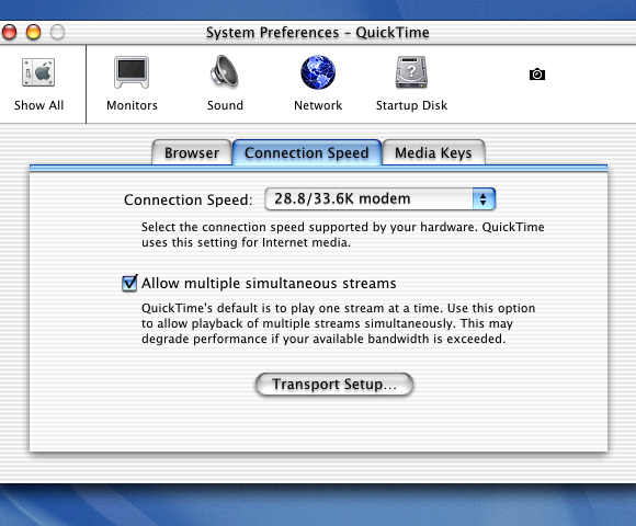
Re:Unofficial Apple Archive by ryanSrich on Thursday January 16, 2020 @02:47PM (#22068141)
As a designer, I couldn't disagree more. The screenshot you linked is far better than 99% of design today. It took time and effort to create such engaging and aesthetically pleasing design. Today's designers don't care — the profession is overrun by MBAs calling themselves UXers.
Re:Unofficial Apple Archive by kitsunesoba on Thursday January 16, 2020 @02:19PM (#22067857)
The 10.4 version and especially the 10.9 version of Aqua was basically perfect in my eyes… they had dimension and contrast without being overbearing and were bright and cheery without being blinding. I know people are fond of the 10.5 and 10.6 Aqua but I found its darker grey window chrome a bit too dreary looking.
Re:Unofficial Apple Archive by aspectmin on Thursday January 16, 2020 @03:25PM (#22068496)
We have gained so much along the way (I.e. fast computing), but we’ve lost a lot as well - computers are nowhere near as friendly/stylish.
Re:Unofficial Apple Archive by trilinearnz on Thursday January 16, 2020 @05:42PM (#22069829)
Great point. I think part of this is that computers are now so ubiquitous, there is less call for making them approachable to people who are not using them.

Personally I like the friendly stylings of old which were empathetic to users' needs. Computers these days seem to take themselves too seriously, and we've lost a bit of the fun as a result.

Re:Unofficial Apple Archive by Wowfunhappy on Thursday January 16, 2020 @04:00PM (#22068861)
I've never used them, but from what I've read 10.0–10.2 were pretty bad across the board, and 10.3 (Panther) was when OS X became a truly viable product.

I think Apple knew this, too. If you look at the timeline of macOS releases, 10.0–10.2 were released in the span of just over a year, and 10.3 had barely a year of life before Panther replaced it (incremental annual releases are the norm now, but they weren't then). And of course, Apple was still supporting OS 9 at the time.

Re:Unofficial Apple Archive by jsjohnst on Thursday January 16, 2020 @07:17PM (#22070560)
10.0 -> 10.1 = 6 months

10.1 -> 10.2 = 11 months

10.2 -> 10.3 = 14 months

10.3 -> 10.4 = 18 months

Re:Unofficial Apple Archive by aspectmin on Thursday January 16, 2020 @03:32PM (#22068557)
Is there a good design book, or program that would teach design principles/philosophy like this?

To me, a lot of these modern interfaces (eg Unity) feel like staring at a dark concrete city. I’d love to see some more of this come back.

Re:Unofficial Apple Archive by hokumguru on Thursday January 16, 2020 @02:41PM (#22068082)
I don't know what you're talking about. Maybe the text shadows on the window title there are overdone but otherwise I think that looks great!
Re:Unofficial Apple Archive by anthk on Thursday January 16, 2020 @07:12PM (#22070528)
OSX Tiger was not like that, it was the most polished UI from Apple ever since System 7.
Re:Unofficial Apple Archive by ukyrgf on Thursday January 16, 2020 @04:59PM (#22069470)
Meanwhile I'd go out of my way to use system themers and programs that supported skins just to get that aqua aesthetic in Windows.
Re:Unofficial Apple Archive by xvector on Thursday January 16, 2020 @04:02PM (#22068885)
I love the vaporwave aesthetic of this photo! Thanks for sharing.
Re:Unofficial Apple Archive by pyridines on Thursday January 16, 2020 @04:08PM (#22068941)
When this design came out, I thought it was bold and futuristic. The "juicy" look is dated now, but to hear it described as "vaporwave" makes me feel old.
Re:Unofficial Apple Archive by anthk on Thursday January 16, 2020 @04:47PM (#22069334)
This. When I say OSX Tiger after sufffering Windows 98 (and having KDE3 in parallel) I was amazed, that doesn't look vaporwave at all. If anything, Amiga OS 3.1 and before is vaporwave. OSX Tiger was "UI done right".
Re:Unofficial Apple Archive by galad87 on Thursday January 16, 2020 @01:48PM (#22067575)
Fortunately they were toned down in 10.2.
Re:Unofficial Apple Archive by ceejayoz on Thursday January 16, 2020 @01:37PM (#22067444)
We'll say the same about flat buttons-that-don't-look-like-buttons too.
Re:Unofficial Apple Archive by reaperducer on Thursday January 16, 2020 @01:47PM (#22067569)
The good thing about Material Design is that we don't have to wait for it to go out of fashion among developers. People have been saying it's butt ugly from day one.
Re:Unofficial Apple Archive by throwaway2048 on Thursday January 16, 2020 @02:27PM (#22067924)
sure, but the discussion is about "timeless" design