This was so much easier to scan at a glance: http://tb43.com/wp-content/files/finder_011.png

It's the other way around on mobile. Icons are still colourful (although too many are blue-on-white), but they all have the same shape, and Apple hates icon labels with a passion. In iOS 11, they are almost impossible to read on the stock wallpaper, and the new Dock gets rid of them altogether: http://media.idownloadblog.com/wp-content/uploads/2017/06/iO...
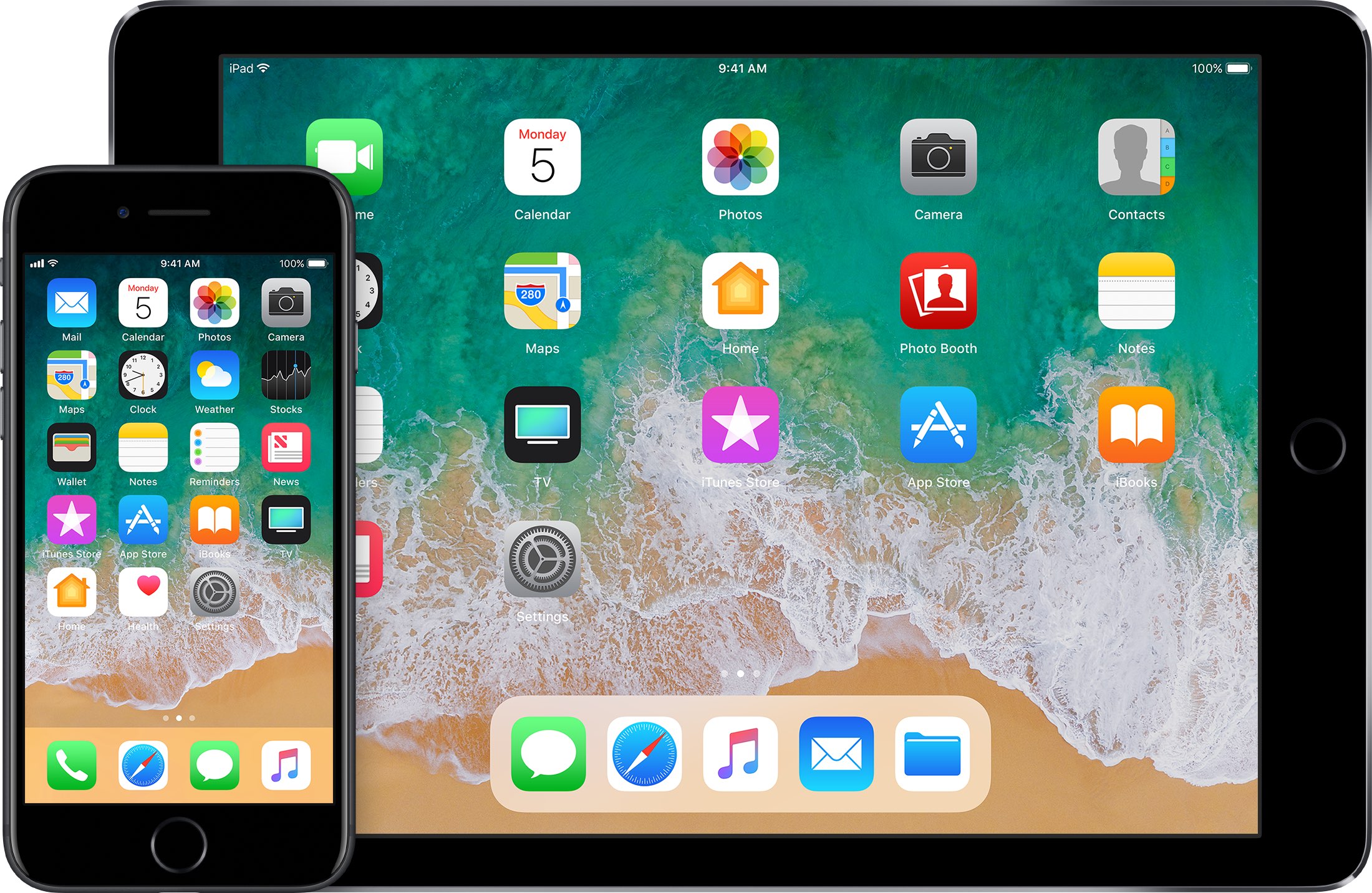
When I am a little low on energy, I regularly catch myself tapping the wrong iOS app just because it has the right colours at a glance. Icons should just always have both a colour and a shape, no matter how much it frustrates designers.
The all-out war on bookmarks and the original ways we organized information back in the 90s on the web is getting to be absurd.
Designer replied they were fixing the problem of the colorful icons being too "distracting". Still don't understand how a grey UI with grey icons is better...
I mean, they just look so much better this way (Nougat). Perhaps your requirements would be better addressed in the accessibility settings. Have you tried turning high contrast on?
For most of us, the better looking icons are a non-issue. I personally don't even look at them to navigate, I can read the options.
But that's exactly the problem. On furst glance it looks better but when you search for something then 20 icons of the same color just don't work that good. Give me ugly but visual distinct icons and I would be much happier.
Windows 7's appearance may not be "modern", or it may be too busy, but it looks so much better to my eyes too.
Take for example the setting menu from stock Android: Yes, there are still icon but they all have the same color and it is really difficult to tell them apart. Every time I go to settings I have to search around until I find the settings I was looking for. If it had colorful icons then navigation would be easier because my brain would learn "blue icon = keyboard settings"
Or take Chrome on Android: Open Chrome, press the three dots on the bottom right for the menu and try to find the 'search in page' entry. Every time i wanna search something I have to read half of the menu items to find the search function... If it would have a distinct icon it would be much easier to find.