I keep hoping it's just a phase, but the economical advantages this trend is bringing looks like something that's going to make it stay with us for a while.
Frankly, I cynically suspect that the flat, semi-functional design became widespread when the revenue model of many computer and phone vendors started overwhelmingly relying on super-revolutionary "apps" being churned out on minimal budgets.
Today, you can get a complete design for the kind of money (and time) that got you a really good icon for an OS X application back in 2005. It's a major step back in terms of interaction model, not only looks, but the consumer industry runs on money, not quality.
I doubt the plausibility of that timeline - the original iPhone was announced in January 2007, KDE 4.0Alpha1 was released in May 2007[1].
KDE 4.0 was a terrible release (missing functionality, lots of regressions). IMO, they should have kept it as a develop branch and only released 4.1 as 4.0.
1. https://www.kde.org/announcements/announce-4.0-alpha1.php
What's really funny and sad is that the GNOME team made the exact same mistake with Gnome3.
That does not jive with my memories - and I remember WinAmp, MusicMatch Jukebox and Nero Burning ROM vividly.
Heresy! WinAmp was much-loved. This is the first time I'm hearing anything but love for WinAmp - it was the best music player/organizer at the time, and they added Milkdrop as bonus
https://developer.apple.com/design/ https://material.google.com/ https://developer.microsoft.com/en-us/windows/design
Now you can make text on a button bold italic, but who knows what that means when you see it in relation to a button that isn't bold italic or is just bold or just italic (other than that the designer has bad taste). I once worked with a designer who wanted control over the focus-caret styling (the dotted line in Firefox/highlighting in Chrome that indicates where keyboard input is destined, which changing has potentially huge impacts for accessibility). Having a UI/UX that grossly visually distinct negatively impacts usability, discoverability, and accessibility, IMO, for very little gain in branding (unless your branding is purposely meant to be "confusingly different from everyone else").
But maybe its just the color palette...
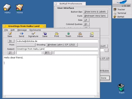
Really miss BeOS. Loved the way the desktop worked.
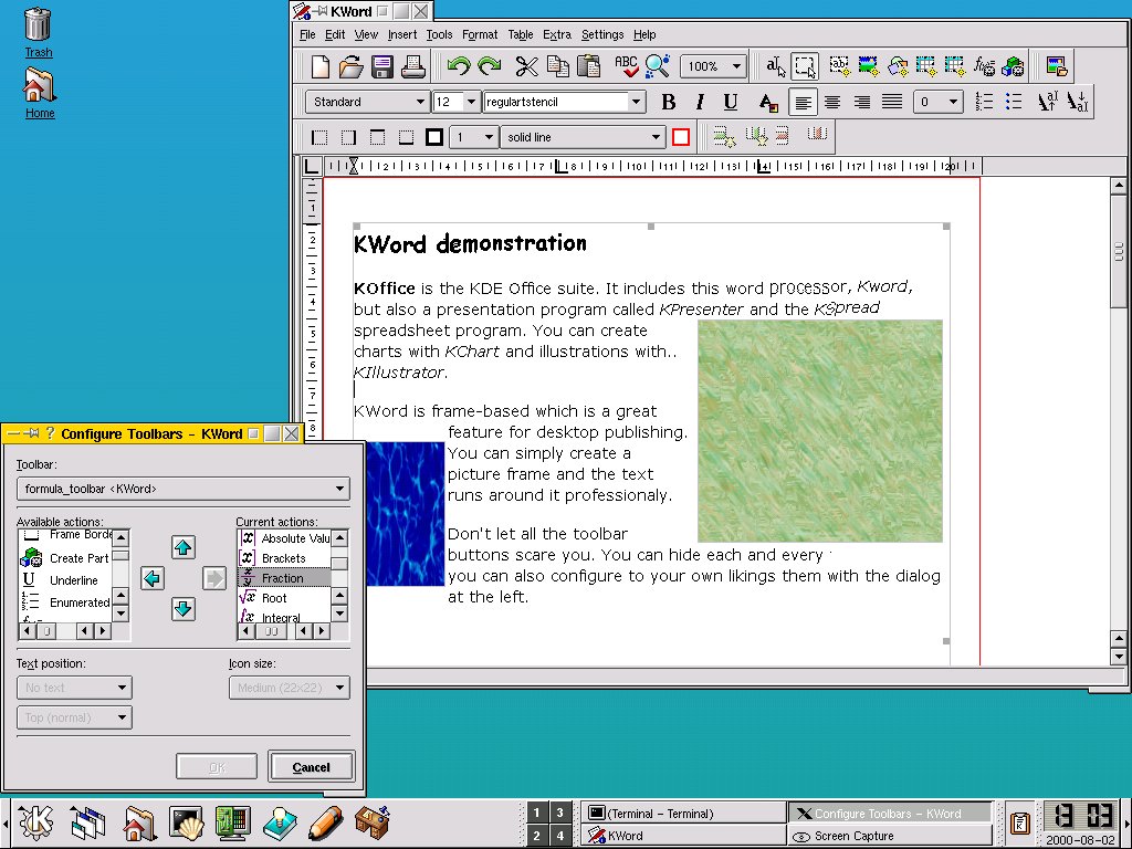
I think one of the best things about early 2000-era desktop environments was that it was hard for programs to look out-of-place. In a modern desktop environment, you can easily tell the difference between programs written with different toolkits, like GTK+ and Qt. Even though each toolkit can imitate the other (there's a Adwaita theme for Qt and a Breeze theme for GTK3,) due to the complexity of modern UI themes, it's impossible to get things right and the lack of drop-shadows or animations or hover effects will leave some programs looking sub-standard. On the other hand, every developer can draw a 3D-bevelled grey box. Both GTK+ and Qt apps were made of grey boxes and they both represented each kind of widget in a pretty similar way.