News for hackers. Stuff that matters.
Re:Blue Ocean: a new user experience for Jenkins by JorgeGT on Saturday May 28, 2016 @09:05AM (#11791496)
I agree with you, and it's very easy to test. Print 15 mixed weather icons on one sheet of paper and 15 red/green/orange circles in another. Show them to test subjects for 1-2 seconds, and ask them to assess the situation. Now repeat the test, but showing the sheets from two meters away. Our brain is really good at color cues, and especially red = danger is deeply wired into us!
Re:Blue Ocean: a new user experience for Jenkins by jacques_chester on Saturday May 28, 2016 @03:07PM (#11792921)
> Our brain is really good at color cues, and especially red = danger is deeply wired into us!

Except for the colourblind, who need additional ways for that information to be conveyed.

I like red/green schemes too, but there always needs to be other cues.

Re:Blue Ocean: a new user experience for Jenkins by jamesdwilson on Saturday May 28, 2016 @03:31PM (#11793040)
so that can be an option instead of crippling everyone else.
Re:Blue Ocean: a new user experience for Jenkins by jacques_chester on Saturday May 28, 2016 @03:53PM (#11793144)
It's not an either/or proposition, designs can accommodate both.

The simplest approach is to add a symbol for failures, to distinguish them from successes. Other colours can be chosen for other statuses that the colour-blind can distinguish without additional symbols.

Re:Blue Ocean: a new user experience for Jenkins by i386 on Saturday May 28, 2016 @07:28PM (#11794039)
> It's not an either/or proposition, designs can accommodate both.

And Blue Ocean accommodates both. I think this would be a good blog post :)

Re:Blue Ocean: a new user experience for Jenkins by crummy on Saturday May 28, 2016 @09:48AM (#11791642)
Red = danger doesn't seem to be so widespread outside the western world:

http://www.informationisbeautiful.net/visualizations/colours...

Re:Blue Ocean: a new user experience for Jenkins by JorgeGT on Saturday May 28, 2016 @11:02AM (#11791852)
Since the graph list "web sources" as a source, a cursory web search of "danger sign + region" reveals that red seems predominant in danger signs from:

- India: http://3.imimg.com/data3/II/GU/MY-762554/danger-signs-boards...

- Asia: http://cache4.asset-cache.net/gc/152921698-warning-these-sig...

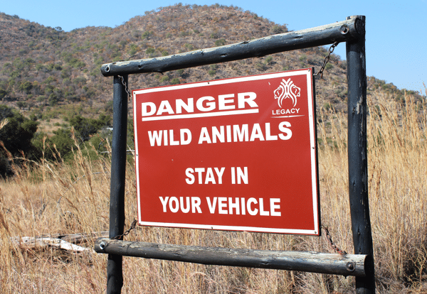
- Africa: http://www.lifeloveandsugar.com/wp-content/uploads/2015/06/d...
- Middle East: http://cache3.asset-cache.net/gc/474346969-an-israeli-sign-i...

Re:Blue Ocean: a new user experience for Jenkins by oblio on Saturday May 28, 2016 @10:55AM (#11791836)
Possible, on the other hand traffic lights around the world have pretty much standardized on:

- green/blue: safe/go

- (optional) yellow: caution

- red: danger/stop

I don't know of any country where this convention is not in use.

Re:Blue Ocean: a new user experience for Jenkins by i386 on Saturday May 28, 2016 @11:08AM (#11791874)
As I learnt looking into the indicators the accessibility of traffic lights had a lot more to do with their vertical position than their colors. Can't use solid green, yellow and red if we want them to be understood by people with various forms of color blindness.
Re:Blue Ocean: a new user experience for Jenkins by tylermac1 on Saturday May 28, 2016 @12:18PM (#11792172)
But you could make colorblind-friendly color schemes available through plugins instead of making a slightly more confusing option default.
Re:Blue Ocean: a new user experience for Jenkins by i386 on Saturday May 28, 2016 @12:52PM (#11792319)
Do you mean the weather icons? They are not the alternative to properly designed status indicators. Take a look at this https://jenkins.io/images/post-images/blueocean/pr-view.png

There's more about why and when we use them in my other comments.

Re:Blue Ocean: a new user experience for Jenkins by SEJeff on Sunday May 29, 2016 @12:33AM (#11794797)
Look no further than mother nature, where bright colors often mean WARNING, I WILL MESS YOU UP. A few things to look up as examples:

* Rosary Pea

* Coral Snake

* Stag Beetle

* Jerusalem Cherry

* Phantasmal poison frog

* Strawberry poison dart frog

* Bittersweet nightshade berries

Re:Blue Ocean: a new user experience for Jenkins by robocat on Sunday May 29, 2016 @08:10PM (#11798860)
The Coral snake is debatable: it is so deadly that no animal can "learn" by getting bitten by it.

Instead one theory is that the mimicry is in reverse: the coral snake is mimicking the non-fatally venomous "false coral snake" which is also more numerous.

There are a variety of different theories on mimicry, and the science of the coral snake is still debated...

Re:Blue Ocean: a new user experience for Jenkins by stephenconnolly on Saturday May 28, 2016 @04:53PM (#11793442)
For the record, this was by design

I wanted the status balls to be the primary focus. The weather icons should only be looked at when all the builds are blue. If they are too attention grabbing then you don't go fixing the red (didn't built) and yellow (tests failing) builds first