News for hackers. Stuff that matters.
Re:Why Every Movie Looks Sort of Orange and Blue by swalsh on Thursday January 29, 2015 @10:44AM (#8966732)
In The Matrix, you could tell which "world" you're in by the general grade of color. When in the Matrix, everything had a greenish overtone, and when in the "real world" it was more blue. I really liked that use of color to be a part of the story telling process.
Re:Why Every Movie Looks Sort of Orange and Blue by ixtli on Thursday January 29, 2015 @11:10AM (#8966905)
That's definitely the part of the movie i remember most, 16 years later: that feeling of flatness in the matrix that they emphasized by the green and black. You'll also notice, if you go back and watch it, that everything in the matrix is angular and well defined where as in the Nebuchadnezzar everything is curved and messy with pipes and wires leading to nowhere in every shot.
Re:Why Every Movie Looks Sort of Orange and Blue by coob on Thursday January 29, 2015 @11:20AM (#8967001)
You can also see this changing after Neo acquires his bullet stopping powers in the hallway. The walls go all bendy (they're cloth).
Re:Why Every Movie Looks Sort of Orange and Blue by scelerat on Thursday January 29, 2015 @12:03PM (#8967348)
Steven Soderbergh's Traffic (2000) made heavy use of this, too, to distinguish different locales and parts of the story. The Mexico/Benicio Del Toro partions were heavy on gold/orange, burnt, sepia, while the Washington/Michael Douglas parts were blue, cool.
Re:Why Every Movie Looks Sort of Orange and Blue by mrec on Thursday January 29, 2015 @01:00PM (#8967760)
Yeah, Breaking Bad always painted everything a lurid yellow for scenes in Mexico.
Re:Why Every Movie Looks Sort of Orange and Blue by ben1040 on Thursday January 29, 2015 @04:37PM (#8969001)
Which inspired this funny photoshopped image on Reddit, poking fun at the border:

http://i.imgur.com/PXMGX.jpg

Re:Why Every Movie Looks Sort of Orange and Blue by pbhjpbhj on Thursday January 29, 2015 @05:58PM (#8969447)
Fringe is another good example of using colour casts to indicate [in this case] which universe the viewer is in.

http://www.imdb.com/title/tt1119644/?ref_=nv_sr_1 - Fringe (2008)

Re:Why Every Movie Looks Sort of Orange and Blue by hcarvalhoalves on Thursday January 29, 2015 @11:09AM (#8966900)
This. Their use of color grading is one of the things that made The Matrix have a very unique feel. The sound design is also worth paying attention to.
Re:Why Every Movie Looks Sort of Orange and Blue by ixtli on Thursday January 29, 2015 @11:10AM (#8966911)
I also find that the lack of money forced the grittiness that was lacking in the second and third movies, and in a lot of high budget movies that attempt "edginess" like that.
Re:Why Every Movie Looks Sort of Orange and Blue by hcarvalhoalves on Thursday January 29, 2015 @11:19AM (#8966985)
In my opinion the pill scene [1] has everything that made The Matrix unique. The color, lightning, costumes, ambience (rain and thunder outside), surgical use of soundtrack and the dialogue itself. All the elements successfully contribute to give it that comicbook/cyberpunk feel.

In contrast, the sequels don't have such simple but striking scenes like that.

[1] https://www.youtube.com/watch?v=te6qG4yn-Ps

Re:Why Every Movie Looks Sort of Orange and Blue by agumonkey on Thursday January 29, 2015 @12:23PM (#8967522)
The most intense glass of water in movies. A nice hommage to Total Recall too I guess.

ps: or not https://en.wikipedia.org/wiki/Red_pill_and_blue_pill

Re:Why Every Movie Looks Sort of Orange and Blue by bronson on Thursday January 29, 2015 @12:35PM (#8967603)
More intense than this glass of water? https://www.youtube.com/watch?v=YFBrIVCasE4&t=16
Re:Why Every Movie Looks Sort of Orange and Blue by agumonkey on Thursday January 29, 2015 @12:42PM (#8967647)
Hehe nice one, but no drinking happened.
Re:Why Every Movie Looks Sort of Orange and Blue by arethuza on Thursday January 29, 2015 @11:23AM (#8967018)
The 1984 version of 1984 had an intentional "washed out" appearance to reflect the grimness of the world it was showing - apparently done by a bleach bypass done to each print:

http://en.wikipedia.org/wiki/Nineteen_Eighty-Four_%28film%29...

I suspect Lars von Trier's Breaking the Waves did something similar as well - it had quite a distinct look:

http://en.wikipedia.org/wiki/Breaking_the_Waves

Re:Why Every Movie Looks Sort of Orange and Blue by matwood on Thursday January 29, 2015 @08:26PM (#8969982)
Pitch Black also did this. The daytime had such a bright filter that it made the shift to darkness that much more jarring.
Re:Why Every Movie Looks Sort of Orange and Blue by riffraff on Thursday January 29, 2015 @01:45PM (#8968035)
Hero[0] (2002) has each section of the movie tinted differently, it's visually outstanding (and a pretty good movie overall)

[0] http://en.wikipedia.org/wiki/Hero_%282002_film%29

Re:Why Every Movie Looks Sort of Orange and Blue by pkroll on Thursday January 29, 2015 @10:52AM (#8966786)
Just as a note, the green grading was made stronger in releases after the original DVD.
Re:Why Every Movie Looks Sort of Orange and Blue by teh_klev on Thursday January 29, 2015 @12:26PM (#8967545)
You can see a comparison here:

https://www.youtube.com/watch?v=gtktg9hbC_g

I do think they over-egged the pudding in the Blu-ray release. In some scenes Neo's skin tones look awful.

Re:Why Every Movie Looks Sort of Orange and Blue by pluma on Thursday January 29, 2015 @01:06PM (#8967822)
Interesting. Being partially colour blind I would have thought that the original was much greener, while the re-release is a lot bluer and bumped up the brightness contrast.

For example, most of the agent scenes in that comparison the left frame appears "greener" (but also more washed out in terms of brightness contrast) than the right.

Re:Why Every Movie Looks Sort of Orange and Blue by pkroll on Thursday January 29, 2015 @01:55PM (#8968097)
I'm in the same boat: it's weird seeing the comments describing the blu-ray as "green-ray" and that things are SO GREEN when I literally can't see it. For those of you with decent color sight, was the original... more orange?
Re:Why Every Movie Looks Sort of Orange and Blue by teh_klev on Thursday January 29, 2015 @03:09PM (#8968540)
There was a bit of a green hue in places in the original, but not as pronounced as in the "green-ray" version.

When I first saw the blu-ray version I had to check my TV colour settings to make sure no-one had been fiddling with them (colour saturation, temp etc). It was quite jarring on the eyes, and that was even after three or four years of not having watched The Matrix. As a non colour blind viewer my reaction (after checking the TV settings etc) was, "yeesh".

Re:Why Every Movie Looks Sort of Orange and Blue by Retra on Thursday January 29, 2015 @03:01PM (#8968497)
The original looks more green-orange and flat. The blu-ray looks more green-blue and contrasted. The original feels 'warm' and the blu-ray feels 'cool.'
Re:Why Every Movie Looks Sort of Orange and Blue by pluma on Thursday January 29, 2015 @04:02PM (#8968810)
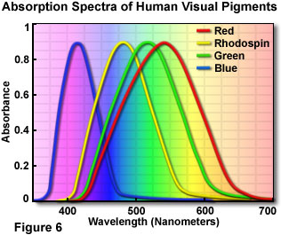
Ah, that explains it. I'm technically green deficient. Because of how colour vision works, green perception partially overlaps with red perception[0], so I tend to think of green as more of an "earth tone" (essentially brown).

Colloquially people with normal vision tend to say "green" when they refer to teal (i.e. green-blue or just generally green with some blue in it). Because I don't actually perceive the green part of the hue, the blue is much stronger for me.

I absolutely agree with the "warm" vs "cool" thing, though.

[0]: http://micro.magnet.fsu.edu/primer/lightandcolor/images/huma... (the fourth "pigment", Rhodopsin, is what we use in low-light conditions)
Re:Why Every Movie Looks Sort of Orange and Blue by maaku on Thursday January 29, 2015 @04:10PM (#8968844)
> Because I don't actually perceive the green part of the hue, the blue is much stronger for me.

Interesting. Yes that's the opposite the effect it has in me. Teal is a washed-out blue...

The original/DVD release of the Matrix did have a visually distinctive green tint in the scenes taking place inside the Matrix. But it felt soft, warm, and flat. It was also subdued in some scenes, such as the training dojo. The scenes in the real world lacked the filter and felt harsh, cold, and rigid by comparison. It was a great artistic choice.

The new blu-ray release (and the sequels) have the entire movie feel like the harsh, cold, rigid reality, and have heightened the contrast to make it worse :(

EDIT: I have no color blindness.

Re:Why Every Movie Looks Sort of Orange and Blue by tempestn on Friday January 30, 2015 @03:57AM (#8971114)
Ugh. I can see why they wanted to move more in the green/blue direction from the very red/monotone original, but it definitely looks like they went too far. Both sides of that comparison look pretty awful at times.
Re:Why Every Movie Looks Sort of Orange and Blue by athenry on Thursday January 29, 2015 @11:34AM (#8967124)
Very True. I remember when I got the bluRay, and increased green in the first movie was very clear.
Re:Why Every Movie Looks Sort of Orange and Blue by MrDom on Thursday January 29, 2015 @01:49PM (#8968058)
They also do this in a TV series called "Charlie Jade." In the show there are three known universes and each has its own distinct color and hue. You know which one you're looking at by the color change alone. It really helps keep the universes (and by extension, the timeline and story) straight.
Re:Why Every Movie Looks Sort of Orange and Blue by mercer on Thursday January 29, 2015 @02:53PM (#8968443)
The British show Utopia also used various colors to great effect in different scene to represent different themes/interests.
Re:Why Every Movie Looks Sort of Orange and Blue by csl on Friday January 30, 2015 @03:22AM (#8971039)
I remember that the book "The Neverending Story" also employed a similar scheme: Red and green ink was used to distinguish between the book's two worlds.

See, for example, https://greaterthanknowledge.wordpress.com/2010/03/01/an-ins...

The book was published in 1979. It would be fun to hear of similar techniques used even earlier.

Re:Why Every Movie Looks Sort of Orange and Blue by actionscripted on Thursday January 29, 2015 @12:36PM (#8967614)
I've always wondered if part of the reason for the blue/green shift beyond storytelling was due to blue/green screens used heavily throughout the movie.

I would imagine it helps smooth some rough edges during the compositing phase when the overall grade matches the color key.

Re:Why Every Movie Looks Sort of Orange and Blue by jaredsohn on Thursday January 29, 2015 @12:06PM (#8967370)
Another example of this is the the show Fringe, which used a tint (blue or red) to indicate information about where a scene took place. (Keeping it a little vague to not include spoilers.)
Re:Why Every Movie Looks Sort of Orange and Blue by walterbell on Thursday January 29, 2015 @12:20PM (#8967492)
The last season also had a distinct color/look.
Re:Why Every Movie Looks Sort of Orange and Blue by agumonkey on Thursday January 29, 2015 @12:18PM (#8967475)
IIRC this was long after the first season right ?
Re:Why Every Movie Looks Sort of Orange and Blue by glittershark on Thursday January 29, 2015 @01:51PM (#8968068)
It's not a great film from a storytelling perspective, but I think Beyond the Black Rainbow is a fantastic example of this sort of use of color
Re:Why Every Movie Looks Sort of Orange and Blue by mmanfrin on Thursday January 29, 2015 @02:17PM (#8968240)
Visually and aurally that movie was astounding. Story and pacing felt a little disjointed though.

One of the few times I think I prefer watching the trailer to the movie.

https://www.youtube.com/watch?v=Q1ertVYn750