There's an issue about the quality of the photo, and its colour reproduction, for instance compare these three photos:
http://historicartgallery.com/store/media/catalog/product/ca...

http://www.ibiblio.org/wm/paint/auth/vermeer/i/music-lesson....
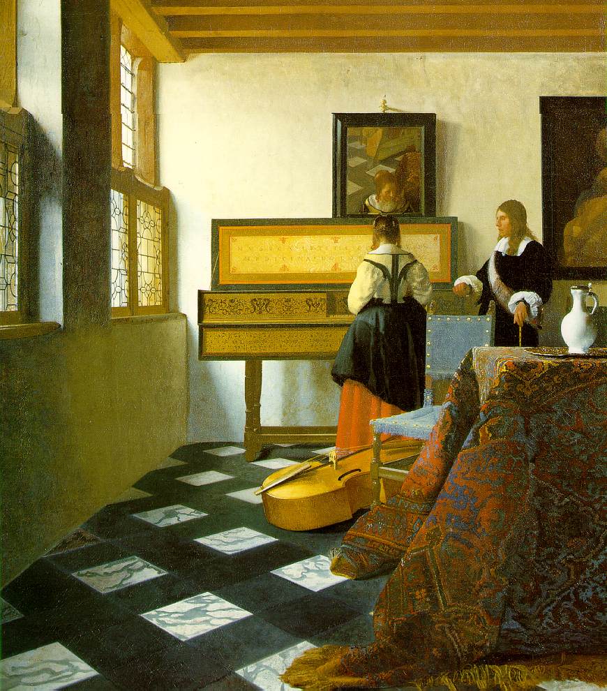
http://media.boingboing.net/wp-content/uploads/2014/06/xl_mu...

Also, part of the exhibition was about various painting and materials techniques he used to achieve effects like opalescence, and I suspect things like that (which work by reflection of light as you move past the photograph) are difficult to capture using photography.
Having said that, the reproduction is extremely impressive. I wonder if the process could be automated. I wouldn't mind a fake, almost-as-good-as-Vermeer hanging in my room.
Here is a better scan of vermeer: (4000x5000) https://upload.wikimedia.org/wikipedia/commons/b/bc/Johannes...

Also, the woman is facing the wrong way in Tim's.
I also disagree with his assertion that Vermeer is photorealistic. Very realistic, true, but not more than other Dutch masters, and there are many contemporary artists whose paintings and drawings truly are indistinguishable from photographs.
I first saw a piece about this painting a long time ago, possible an Open University / BBC collaboration - it was concerned with the room being the wrong length to allow for the optical method people thought was used, or some such, I don't recall too well.
Other (?) speculation has been on here not too long ago.
As for the dimensions of the room, being 'wrong', that may be deliberate. Again in film props and furniture are adjusted out of their natural position surprisingly often, in pursuit of aesthetic harmony. If you analyzed an interior scene that had been shot from multiple angles in hopes of mapping the room's contents accurately, you'd be disappointed to discover that many things had changed position by ~10% of their own size from shot to shot. Part of the craft is the ability to look at the image on a tiny monitor and be able to identify whatever it is that is distracting your eye from where you're supposed to be looking, like a table which looks fine in one shot but feels too small following a change in the focal length of the camera lens for a different shot. Solution - move the table towards the lens a bit.
Don't even get me started on lighting and related tricks, which can further mess up your spatial intuition. For example, a very common and cheap effect is to make a room feel bigger by painting adjacent walls slightly different shades of the same color. Lots of these techniques are stolen from painting, where the deliberate falsification of perspective has long been used for both aesthetic and semantic effect. Check out this especially famous example: http://en.wikipedia.org/wiki/The_Ambassadors_(Holbein)
Otherwise both paintings are great.
Is it wrong for me to think that Tim's Vermeer is better than Vermeer's Vermeer?
Vermeer: http://media.boingboing.net/wp-content/uploads/2014/06/xl_mu...
Tim: http://media.boingboing.net/wp-content/uploads/2014/06/ML2s....