Re:VisualBasic.World: A gallery of Planet Source Code progra...
by elwebmaster on Tuesday November 17, 2026 @06:31AM
(#50530061)
Notice how everything is logical, thinking has gone into the usability of every control and embedding information into its state. I can't say the same for modern design.
[ Parent
| on HN ]
Re:VisualBasic.World: A gallery of Planet Source Code progra...
by netsharc on Tuesday November 17, 2026 @07:46AM
(#50530667)
Outlook 98 (is it Copilot for Communication 365 ProMax now?) looked like this:
https://image3.slideserve.com/6380850/inbox-screen-l.jpg
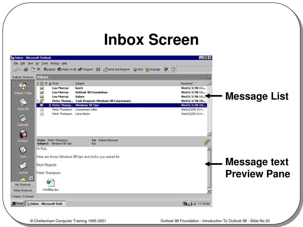
At some point it changed to the minimalist flat layout. I was staying at a hotel and the nice old receptionist mentioned to me he somehow messed up the sorting of the emails from "newest e-mail on top of the list" and couldn't find how to change it back. I pointed to him the text "Received" which seemed to be just floating in the middle of nowhere...
Re:VisualBasic.World: A gallery of Planet Source Code progra...
by cowlevel on Tuesday November 17, 2026 @07:50AM
(#50530704)
"click header to sort" is already pretty unintuitive, and usually not something you want in email anyway.
Re:VisualBasic.World: A gallery of Planet Source Code progra...
by xstas1 on Tuesday November 17, 2026 @09:54AM
(#50532207)
What would be more intuitive?
Re:VisualBasic.World: A gallery of Planet Source Code progra...
by cowlevel on Tuesday November 17, 2026 @09:43PM
(#50541196)
Latest emails at the top. Always. If you really want to have a feature to change this, bury it in a menu.
Re:VisualBasic.World: A gallery of Planet Source Code progra...
by minkeymaniac on Tuesday November 17, 2026 @01:46PM
(#50536238)
That looks almost like Outlook Express to me.. was pretty neat.. also had the news reader for the newsgroups.. like alt.binaries.... and you could combine multiple messages and save the file... fun times
Re:VisualBasic.World: A gallery of Planet Source Code progra...
by darkwater on Tuesday November 17, 2026 @07:48AM
(#50530692)
What is more important / most used between "Click me" "Submit query" "Reset" in the very first Button example?
Everything of the same grey, nothing stands out, but there is usually a most used button.
Re:VisualBasic.World: A gallery of Planet Source Code progra...
by nvme0n1p1 on Tuesday November 17, 2026 @09:47AM
(#50532115)
If you move your eyes a centimeter lower, you'll find the answer.
Re:VisualBasic.World: A gallery of Planet Source Code progra...
by darkwater on Tuesday November 17, 2026 @10:48AM
(#50533053)
Touche! And yeah, I remember it now also from the original Win9x UI but still not convinced it was a radically better design/UX than modern and standard UIs.
Now, better than the custom UX created from scratch by an inexperienced designer for a random company website, that's another topic.
Re:VisualBasic.World: A gallery of Planet Source Code progra...
by ptx on Wednesday November 18, 2026 @08:23AM
(#50546014)
The modern standard UX in Windows 11 is completely broken in this regard, at least in the UAC password dialog. The "No" button is loudly emphasized in blue, but that's not the default button - when you press enter, it actually triggers the "Yes" action.
Re:VisualBasic.World: A gallery of Planet Source Code progra...
by biofox on Tuesday November 17, 2026 @08:46AM
(#50531303)
How do we get back to this? I want logical interface standardisation in my life.
Re:VisualBasic.World: A gallery of Planet Source Code progra...
by ezst on Tuesday November 17, 2026 @10:42AM
(#50532924)
We won't, as long as we keep letting Apple, Google and Microsoft reign supreme over personal computing, having their incentive to engineer those as content-consumption vehicles. The "this" you are referring to was the product of UIs thought to maximize effective and productive use of computers. Looking at current Android, iDevices, and modern-era MacOS/Windows, how much would you say they align with that?