Or the time a relative visiting the city took the wrong train because when they needed to go north, the metro map showed northbound trains as eastbound in that area.
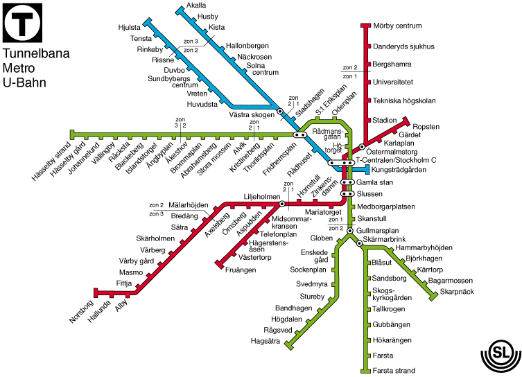
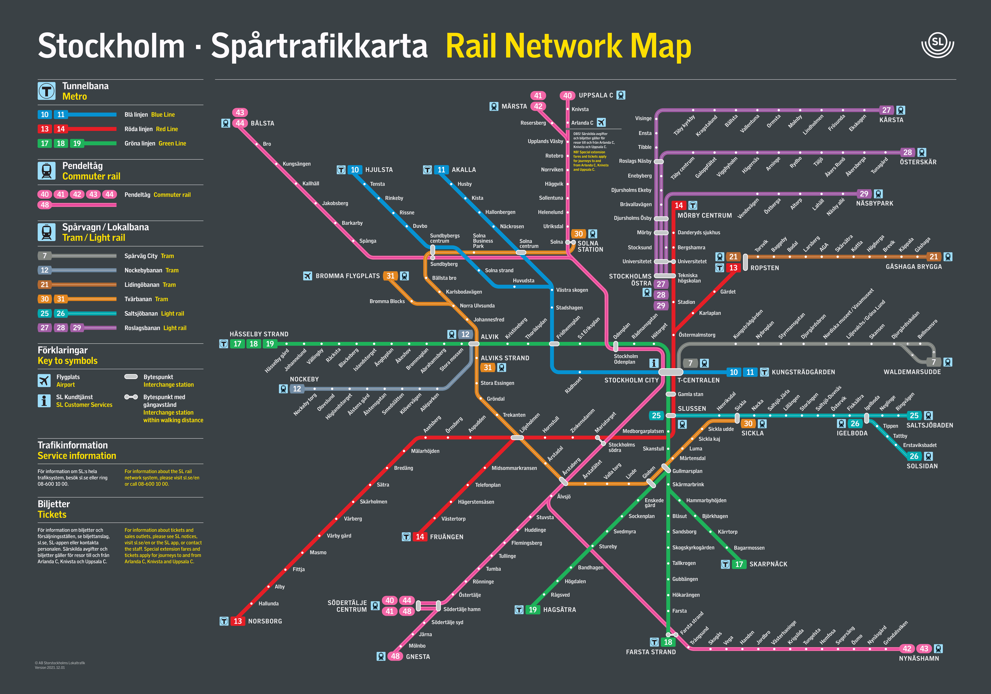
I think there is a compromise to be made. The best example of it I've found is the Stockholm metro map[1], which has straight, artificial lines but where the spacing and geometry between stations is still relatively faithful to reality. (Compare to what I assume is the real geography[2].)

(TBF I live in London so I’m fairly comfortable with the Tube map)
You could perhaps have thin lines between "walkable" stations for the cognoscendi or similar.
I agree. I don’t think the point in the documentary was that geography in subway maps is irrelevant, just that it is secondary to connection clarity. When in doubt, prioritise for the latter.
Additionally, I remember they made this comment specifically about the London Underground map, it wasn’t a blanket statement for all subway maps.
It’s not an aesthetic decision, it’s a practical one juggling space constraints and clarity.
Where I live we have both: the main maps are non-geographic, and that allows them to be placed in several locations including the trains themselves. Geographic maps do exist, but take so much space they are only displayed at certain points in certain stations.
You can get either online.
Was it Map Men? They mention not forcing the London tube map onto the geographical map. It has two parts:
1. "The Tube Map nearly looked very different" https://www.youtube.com/watch?v=cTLCfl01zuE
2. "What went wrong with the Tube Map?" https://www.youtube.com/watch?v=jaEhvWXmLyk
Funny. I remember watching a design documentary years ago where they made the exact opposite point: subway maps were trying to get the geography right but that became unwieldy and confusing, so the epiphany was that connections mattered more than the geography. That the way people were using the maps was to get from place A to place B and what mattered was quickly navigating the intersections.