You may personally find the output awkward, but typographers will disagree. They didn't always have high density displays. They did always have superior type rendering, with output more closely matching the underlying design. Hinting was used, but they didn't clobber the shapes to fit the pixel grid like Microsoft did.
I personally like the Apple rendering, but I realize that many people around me don't. In the end, it is subjective.
If anything, bitmap fonts on older/crt monitors were as fuzzy as the scaled ones, and on lcds, too jagged, so that hunted their readability. For me, enabling antialiasing actually improved their appearance.
But then, I always disliked the X11 bitmap fonts as ugly; the Microsoft's MS Sans Serif was about the only bitmap font I could tolerate (nowadays, it is truetype too).
[1] https://srdjan.si [2] https://bootcamp.uxdesign.cc/why-dark-mode-isnt-a-ux-panacea... [3] https://cdn.osxdaily.com/wp-content/uploads/2018/09/font-smo... [4] https://damieng.com/blog/2007/06/13/font-rendering-philosoph...
And then on the other hand you have finally a seemingly great solution, despite their sabotage. So, yeah gnome?
Simply turn off anti-aliasing, and use a period-specific font that was designed for presentation without anti-aliasing such as the MS core truetype fonts (e.g. Verdana, Arial, etc.) It will look fine IF you have full hinting turned on.
Reading through one of the GTK4 issue threads, it seems that one problem with early versions was an insufficient gamma correction strategy.
[1] https://gitlab.gnome.org/GNOME/gtk/-/merge_requests/6190
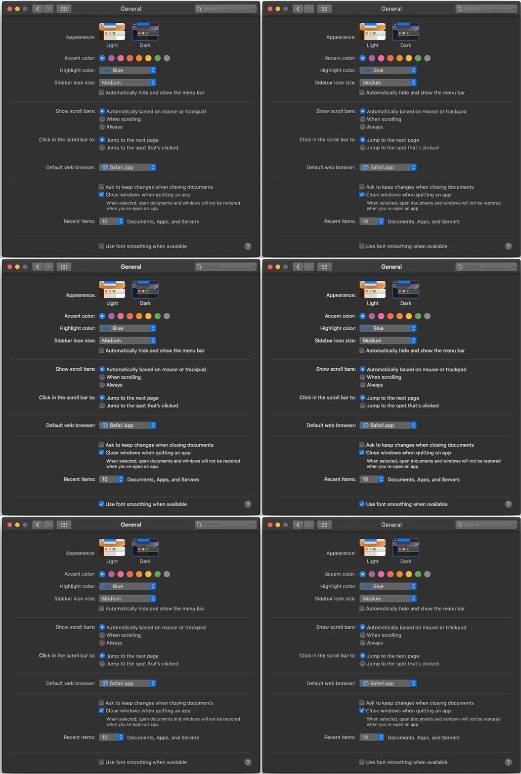
Ironically for "always expose relevant options through system settings" Apple, you can still access font smoothing via command line, e.g. "defaults -currentHost write -g AppleFontSmoothing -int 3". You can use 0-3 where 0 disables it (default) and 3 uses "strong" hinting, with 1 and 2 in between.
Regardless, I hope everyone agrees that hi dpi + no hinting (or smearing) looks the best.
This blog post seems to lay out the tradeoff between, at least, Windows and Mac font rendering: https://blog.typekit.com/2010/10/15/type-rendering-operating...
Fonts have several distinct periods where they were designed expecting that renderers would function a certain way. File format notwithstanding, one size does not fit all. You really do need to match your font to your renderer's settings.
IF i specifically REALLY wanted a font that required hinting to look good, I would make a special config for that particular font, but I would need some serious advantage to bother doing that
I find 1 is a reasonable compromise in practice. I think of it as simulating a little paper ink bleed.
Background:
https://gitlab.gnome.org/GNOME/gtk/-/merge_requests/6190
Basically gtk-hint-font-metrics=1 was needed with Gtk4 on non-HiDPI displays to get crisp text. Thanks to the change from 6190 above it is already automatically applied, when appropriate depending on which display is used. Mixed setups with multiple displays are common and Gtk4 cares about. The whole topic caused a heated issue before - because it depends on your own vision, taste and hardware.
Apple avoids trouble and work by always using HiDPI displays. Attach a MacMini to a non-HiDPI display and you could recognize that the font rendering is awkward.