News for hackers. Stuff that matters.
Re:Show HN: Density userstyle to remove spacing from popular... by radiojasper on Sunday August 28, 2022 @08:26AM (#32627853)
As a web designer, I love the white space. Calms the web down. Your screenshot is giving me the heebie jeebies.
Re:Show HN: Density userstyle to remove spacing from popular... by adambatkin on Sunday August 28, 2022 @10:31AM (#32628668)
But I think that's the problem. For some things, the "form" is important, things like marketing sites, maybe prose. But for sites that are supposed to be highly functional, information density (function) should always win out. That's not to say that it shouldn't still be presented nicely, and that may make it more difficult. But when I'm browsing files or commit history on GitHub, the more stuff I can see at one time, the more useful it is.
Re:Show HN: Density userstyle to remove spacing from popular... by gravypod on Sunday August 28, 2022 @11:21AM (#32629069)
At work we have many internal systems with no padding, confirmation models, etc which are used for development tasks. I am usually afraid when interacting with them and others do not seem to understand why. Recently I made a mistake where I had to click "Accept" on each item in a row of ~100 items. It's a simple HTTP webserver where every button is an <a> and does a new page load which causes a new paint. I accidentally clicked "Revert" on 3 / 100 items because when things reloaded I clicked too soon and the "Accept" / "Revert" buttons are horizontally aligned but vertically offset.

Spacing/padding/alignment improves UX for tools when used correctly.

Re:Show HN: Density userstyle to remove spacing from popular... by sokoloff on Sunday August 28, 2022 @03:51PM (#32631455)
The need to click Accept on 100/100 items one-by-one seems like the bigger UX failure than the alignment of the buttons.
Re:Show HN: Density userstyle to remove spacing from popular... by netsharc on Sunday August 28, 2022 @05:20PM (#32632168)
At that point I'd use the Developer Tools to make each link open in a new window, and then a loop that simulates a click of each Accept link.
Re:Show HN: Density userstyle to remove spacing from popular... by tffcccdredf on Sunday August 28, 2022 @06:54PM (#32632901)
That's not possible to do
Re:Show HN: Density userstyle to remove spacing from popular... by crazygringo on Sunday August 28, 2022 @05:23PM (#32632195)
> information density (function) should always win out

No. Clarity should always win out.

Spacing serves the important purpose of creating an information hierarchy so it's intuitively visible at a glance how things group into larger things. The higher the level, the higher the spacing.

This is why there's more space between words than between letters, between lines than between words, and between paragraphs than between lines. And similarly how there's more UX whitespace between a list and the toolbar buttons above it than there is between list items, and then even more space than that between the main content area and left bar.

Seeing more stuff isn't useful if you can't tell at an intuitive glance which commit a line belongs to, because there's no extra separation between commits.

Re:Show HN: Density userstyle to remove spacing from popular... by zozbot234 on Sunday August 28, 2022 @06:51PM (#32632885)
Information hierarchy is relative. You can totally allow for it within a denser layout, in fact traditional dense GUI's and text layouts pay a lot of attention to proper hierarchy. Where whitespace seems to be inescapable is for separating active elements of a layout, to avoid unintended touches.
Re:Show HN: Density userstyle to remove spacing from popular... by senttoschool on Sunday August 28, 2022 @10:40PM (#32634257)
You should try UI design. Open Sketch or Figma. Start putting buttons and boxes together. You'll quickly realize that having adequate spacing is absolutely a must. Everything just looks awful without enough spacing.

Usually, the biggest problem a piece of software has is adoption. People are far less likely to adopt your software if the first time they look at it, it looks like a huge complex mess. The sales people certainly won't want to present software like that to potential customers.

Re:Show HN: Density userstyle to remove spacing from popular... by nathias on Sunday August 28, 2022 @05:06PM (#32632061)
it's a mistake to equate information density with function, the more things I see don't matter if they are not legible, there are two extremes of course and a good design makes a good compromise (but removing whitespace completely isn't good, a better solution is customizable density per user)
Re:Show HN: Density userstyle to remove spacing from popular... by teraflop on Sunday August 28, 2022 @01:46PM (#32630313)
In my opinion, whitespace is fine when it's used to separate functionally distinct UI elements.

What I find most aggravating is when white space is used to pad out lists of items. For example, I got in the habit of using Google Keep to keep track of things like checklists and shopping lists on my phone. Then a few months ago, they updated the app so that every line of text has 2 lines' worth of whitespace above and below it, and now I can only fit half as much of any given list on my screen without scrolling. (And of course, unlike a web site, there's no way to override the styling of an Android app.)

Every time I see somebody making their UI worse in this way, I remember all the previous times I've seen it happen, and I get slightly more irritated than the last time.

Re:Show HN: Density userstyle to remove spacing from popular... by barnabee on Sunday August 28, 2022 @11:07AM (#32628969)
As a user, I wish the web gave designers less freedom.

I don’t care about design trends or “calming” the web down. I want to see as much information as can fit on screen at once, especially with sites and apps I use regularly. No superfluous UI animations either, please.

Density should at least be an option like dark mode.

Re:Show HN: Density userstyle to remove spacing from popular... by jbverschoor on Sunday August 28, 2022 @01:55PM (#32630401)
Well.. most designers think that everything is a magazine, when sometimes they should be just a screen of dense data

And developers think that everything sounds be an app, when sometimes they should be “documents“

Re:Show HN: Density userstyle to remove spacing from popular... by barnabee on Monday August 29, 2022 @09:40AM (#32638105)
NPM should print this comment every time someone inits a new project and Figma should display it at least daily.
Re:Show HN: Density userstyle to remove spacing from popular... by mrcartmeneses on Sunday August 28, 2022 @12:10PM (#32629477)
Your comment has me imagining a person who uses cut-throat razor as a butter knife.
Re:Show HN: Density userstyle to remove spacing from popular... by clairity on Sunday August 28, 2022 @11:35AM (#32629199)
like dark mode, there’s actually a media query for that, though it’s experimental for now: https://developer.mozilla.org/en-US/docs/Web/CSS/@media/pref...
Re:Show HN: Density userstyle to remove spacing from popular... by toastal on Sunday August 28, 2022 @01:19PM (#32630067)
Unfortunately it hasn't been extended to differentiate dark from black. On my OLED screens I want #000 black, not some tinted gray—which actually looks very muddy and unnatural on my displays (which are never overly bright so the contrast helps too). My own userstyles go through to fix this on many websites.
Re:Show HN: Density userstyle to remove spacing from popular... by 57FkMytWjyFu on Sunday August 28, 2022 @02:01PM (#32630464)
I've wondered about this off white "dark" for some time. The crazy person in me thinks it might be to throw more nits at our face so emotion and attention may be tracked by our helpful webcams, aided by the Windows Camera Frame Server service.

Full disclaimer, I'm actually crazy.

Re:Show HN: Density userstyle to remove spacing from popular... by clairity on Sunday August 28, 2022 @05:52PM (#32632436)
i believe that’s the user agent stylesheet doing that, because the browser/system color for dark is usually a dark grey, not black, just like the browser/system color for white is usually off-white.
Re:Show HN: Density userstyle to remove spacing from popular... by senttoschool on Sunday August 28, 2022 @10:43PM (#32634274)
That's because black typically looks less comforting than dark grey.
Re:Show HN: Density userstyle to remove spacing from popular... by barnabee on Monday August 29, 2022 @09:36AM (#32638054)
I’m not sure which I like less, the “calm” of excessive whitespace or the comfort of low contrast not-very-dark modes.

Am I the only person who wants computer programs to be effective tools, not provide emotional support?

At this point I wonder if it might really be easier to add the features to turn terminals into decent fully featured GUIs than to fix existing actual GUIs.

Re:Show HN: Density userstyle to remove spacing from popular... by senttoschool on Monday August 29, 2022 @03:09PM (#32642209)
99.99% of the world isn't using terminals.
Re:Show HN: Density userstyle to remove spacing from popular... by barnabee on Monday August 29, 2022 @09:29AM (#32637965)
Close, I’d like to see prefers-reduced-whitespace, prefers-increased-density, and prefers-more-than-ten-results-per-page too though…
Re:Show HN: Density userstyle to remove spacing from popular... by clairity on Monday August 29, 2022 @11:06AM (#32639194)
haha, i would too. let's prefer all the things!
Re:Show HN: Density userstyle to remove spacing from popular... by marssaxman on Sunday August 28, 2022 @05:28PM (#32632228)
I wish I could upvote this multiple times!
Re:Show HN: Density userstyle to remove spacing from popular... by barnabee on Monday August 29, 2022 @09:38AM (#32638072)
I wish anyone would listen if you could/did!
Re:Show HN: Density userstyle to remove spacing from popular... by zasdffaa on Sunday August 28, 2022 @11:14AM (#32629025)
If your websites are just for you that's good, if not, you are designing for the end-user. What you've just said seems to amounts to a big F.U. to the user. Not a good approach to improving a UI.
Re:Show HN: Density userstyle to remove spacing from popular... by Gualdrapo on Sunday August 28, 2022 @12:32PM (#32629676)
We then need to see some research into what people actually prefers. Because as some other comment said, I have the feeling that long time users are who prefer crammed UIs, while other people like me find them terribly difficult to work with or even read.
Re:Show HN: Density userstyle to remove spacing from popular... by zasdffaa on Sunday August 28, 2022 @01:27PM (#32630143)
UI research is a thing. Aside of that, allowing the user to alter the UI to their tastes might also be a thing. Customising, it used to be called. That way it can be good for both of us - or even the same person who's level of experience and thus their needs, changes over time.
Re:Show HN: Density userstyle to remove spacing from popular... by senttoschool on Sunday August 28, 2022 @10:46PM (#32634284)
Very few pieces of software could justify having support for multiple layouts to increase or decrease content density.

Gmail is one that comes to mind.

I can't think of anything else I use that I would want more density.

Re:Show HN: Density userstyle to remove spacing from popular... by nine_k on Sunday August 28, 2022 @12:26PM (#32629619)
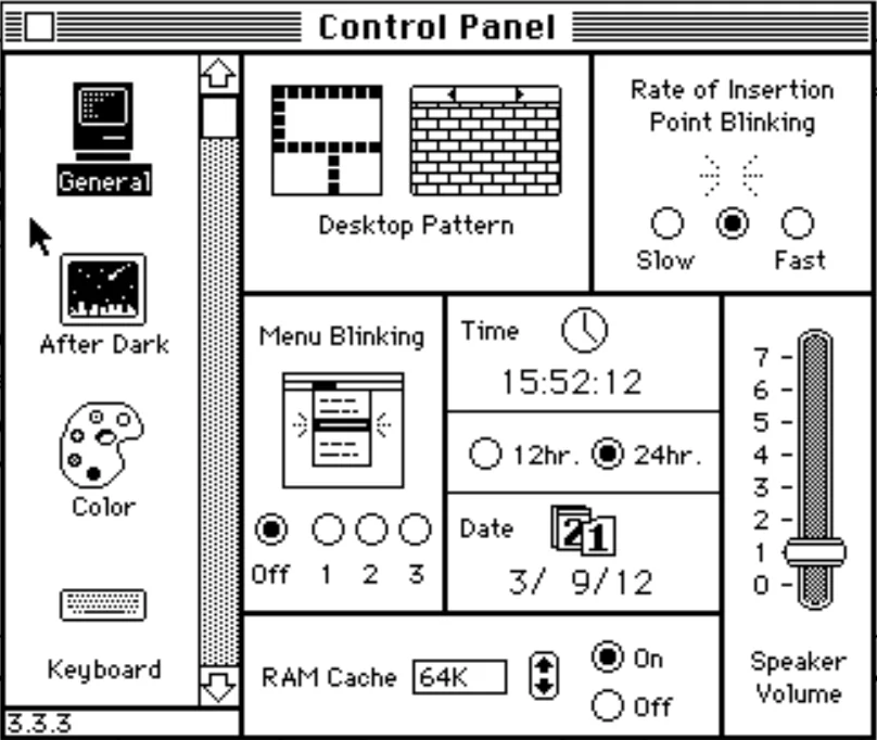
To me the screenshot looks very similar to the aesthetics of MacOS 6 approximately [1].

[1]: https://www.versionmuseum.com/images/operating-systems/class...