News for hackers. Stuff that matters.
Re:Yep, I created the new Avatar font by webmaven on Monday May 09, 2022 @05:24PM (#31319955)
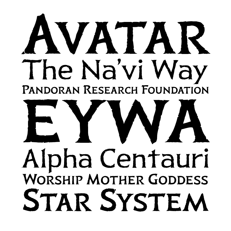
The new typeface is nice, providing the required feel without succumbing to cliche, but now whoever is actually using it to typeset titles isn't doing any kerning! This makes the title look like it is supposed to be "Avata R" (the typographer almost certainly did create proper kerning in the font, but as soon as you start messing with different sizes and increasing the tracking, the kerning is going to have to be adjusted as well, and that wasn't done).

It's like James Cameron said "Fine! I won't let my guy I had make the titles last time choose the font, we'll have a new font made. But I want the my guy to do the rest of the title work, because he'll still do it for just a crew jacket."

https://www.creativebloq.com/news/avatar-way-of-water-logo

Anyway, I quite appreciate the WIP sketches, it makes it plain what the influences are: the bones of the letters are somewhat reminiscent of typefaces like Lithos or Penumbra, and the slight blobbiness of terminals and serifs (which might otherwise be classified as either wedge or flare serifs) subtly recall both Papyrus and some "runic" typefaces. The "runic" influence shows up in some other details as well, like the 'v' of the A's crossbar. The rejected "too extreme" lowercase has a hint of Fraktur or something similar.

Like Papyrus, though, this is most certainly a display font. I hope the designer gets to create a toned-down text version that will be usable for subtitles, fixing the other poor typography decision made in the first movie.

Re:Yep, I created the new Avatar font by majormajor on Monday May 09, 2022 @07:44PM (#31321402)
Hmm, thery're doing some kerning, right? Looking at the pic in your link, only the final A and R are so spread apart, all the other letters seem to have more overlapping baked in?

If you pushed the R to the left you're breaking the bottom letter spacing consistency...

I'm not convinced it would look better.

Re:Yep, I created the new Avatar font by elaus on Tuesday May 10, 2022 @04:05AM (#31324676)
The sample image [1] of the author shows 'AVATAR' with much less spacing between A and R, which looks much better in my opinion.

[1] https://swelltype.com/wp-content/uploads/2020/01/Avatar-samp...
Re:Yep, I created the new Avatar font by jcronenberg on Monday May 09, 2022 @06:44PM (#31320850)
Thanks, now I can't ever unsee it being "AVATA R"
Re:Yep, I created the new Avatar font by codetrotter on Monday May 09, 2022 @06:52PM (#31320917)
I don't see it. It reads like "AVATAR" to me, even though this is the first time I am seeing the new logo and I read these comments before looking at the logo.

Are we reading it differently? I see that there is some additional space on the top before the "R", but I think that when I am reading it I might be looking mainly at the bottom 75% of the logo, and it looks fine there so maybe that's why it still looks fine to me?

Alternatively, having seen the first movie a couple of times and having seen the original logo a couple of times, maybe I am so used to the word "Avatar" from the original logo that even if I try to read the new logo as "AVATA R" I still read it as "AVATAR"?

On the other hand, there is a company in Norway (and I think they are in several other countries also), called "BDO" and even though I know about their company from having heard about it several times and having even attended a couple of business presentations that they have held, I consistently misread their logo as "LBDO". You can see their logo on the Norwegian website, it has the letters "BDO" on it in blue, with an L-looking shape in red surrounding the front and underside of the letters; https://www.bdo.no/nb-no/home-no . So it seems that familiarity is not always enough to read a logo the way that it was intended to be read.

Re:Yep, I created the new Avatar font by tejohnso on Tuesday May 10, 2022 @09:42AM (#31327009)
I don't see it either. When I read it it seems fine, and if I look at the distance between the foot of the A and the R compared the the distance between the foot of the A and the T it looks the same. If I look at the top, specifically between the A and the R it seems like there is a lot of space there, but I don't internalize that as a problem. I found the Gosling bit funny, but more as a bit about overly sensitive people, rather than that the use of Papyrus might be an actual problem that matters to any significant number of humans.
Re:Yep, I created the new Avatar font by wodenokoto on Tuesday May 10, 2022 @01:24AM (#31323758)
My reading of the article is that the logo came before the type.
Re:Yep, I created the new Avatar font by animal531 on Tuesday May 10, 2022 @05:03AM (#31324979)
I noticed it immediately on the "Q&A's" where the A is separated quite a bit from the &. After that if you begin looking you can see a few other examples as well.