The sample image [1] of the author shows 'AVATAR' with much less spacing between A and R, which looks much better in my opinion.
[1] https://swelltype.com/wp-content/uploads/2020/01/Avatar-samp...
[1] https://swelltype.com/wp-content/uploads/2020/01/Avatar-samp...
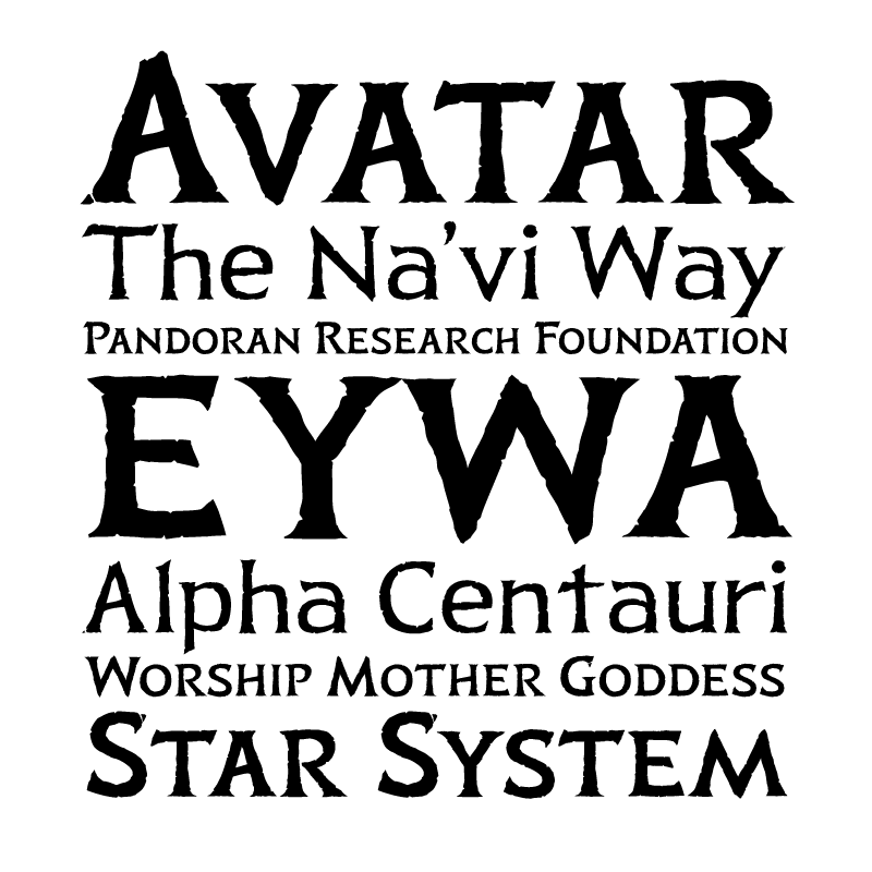
If you pushed the R to the left you're breaking the bottom letter spacing consistency...
I'm not convinced it would look better.