(Russian cursive is also notoriously hard to read for non-native speakers owing to a few idiosyncrasies: some letters are entirely different written vs. in print, and the letter forms can lead to ambiguity -- certain letter combinations are effectively identical.)
A near-universal phenomenon among people I've spoken with who took Russian in college is the unconscious blending of the two letter sets. Students, myself included, would routinely find themselves using Russian letters in English script while writing without realizing it, and sometimes even reading it later without realizing the presence of Russian letters.
I knew it was happening to me, but it wasn't until I loaned my political science notes -- ostensibly in English! -- to a non-Russian-student pal that the prevalence of the swaps were really clear. "Uh, I absolutely cannot read this."
Ooops.
Anyway, it's tangential to this topic, but I thought it was interesting enough to share.
This is the first link I found with illustrations of the Russian cursive alphabet:
I wonder if the Russian cursive slips in because it has sounds that are closer.
That is a very, very weird assertion.
In any case, the letters that would get swapped in were 1-for-1 replacements for the English ones, though, so I don't think that's the factor.
A small nitpick, Zanerbloser doesn’t derive from palmer script, but they both absolutely do belong to the same family.
I also found it really interesting to discover that the prescribed 52 degree writing angle for Spencerian is almost exactly what you get matching the diagonal on an 8.5" by 11" piece of paper (I'm surprised that's not more widely known!). Thus, rather than a difficult and seemingly arbitrary requirement, it's a super easy way of attaining consistency by simply rotating the page so its diagonal goes straight away from the writer. (If you're using US Letter paper, anyway)
It’s great that you recognize this handicap as dealing with it sooner rather than later is a good; bad posture is indeed harder to correct later as we know. The first measure you can take is course correcting yourself over shorter intervals i.e.Move The Paper towards yourself with no shame, even during the length of a line, as often as need be. Even Louis Madarasz did it, so don’t hesitate. But I think your fix becomes a habit, it becomes a non-issue later.
> ... the proscribed 52 degree writing angle for Spencerian is almost exactly what you get matching the diagonal on an 8.5" by 11" piece of paper
If this is true, you just blew my mind, thanks for sharing the discovery.
arctan( 11 / 8.5 )Asking because I think I've got about as much benefit as I'm going to from having used a fountain pen exclusively for the last five or so years, so I'm looking at this point to learn a proper script. It sounds like you're considerably more familiar and may know some good places to start, and I'm hoping to get the benefit of your experience.
[0]https://archive.org/details/cu31924029485467/page/n47/mode/2...
As far as recommendation goes, I think you should see if you would be content with learning something like the afore-mentioned D'Nealian method, which involves a lot of printing and shape reproduction, and stick to it. You can get far using a fountain with this.
However if you have the desire to reach for something more, I would recommend looking into a good "Business Writing" hand. There should a introductory book on a decent business hand produced by Ziller Inks on the Apple book store. I'd get that, it was pretty affordable last time I checked.
The business hand is a beginner friendly entry into the spencerian family and let's you carry your progress into more refined spencerian hands when you are ready for them later. Download a copy of the book "C.C.Canan - Collection of Penmanship" to see the kind of spencerian hands you could aspire towards.If you chose this path, it's a long journey so it depends on your personality like most hobbies.
Penmanship is a weird hobby, it looks both simple and intimidating at the same time. If you feel like you could use some personal advice, leave a comment and I'll reach out to contact info on your profile. I'm not an expert(I've seen what experts do and boy am I not one) but generally enjoy sharing penmanship learning advice so I don't mind a consultation or two.
http://www.richimages.net/wp-content/uploads/2015/07/spencer...
But adapted into business script AFAIU the simplification into two heights, and the shrinking of the "p" stem, is pretty common. I'm definitely not used to making "p" taller than "q" and I am not always consistent about it.
http://www.calligraphy-union.ru/EditorFiles/image/news/66315...

I still use traditional late 20th century American cursive (D'Nealian, I think), but all the practice with fountain pens has made my handwriting more legible than it's been in a long time.
Cursive came about because writing with quill and dip pens required you keep the nib on the paper for as long as possible, lest it dry out, or the ink drop to the page. Fountain pens aren't as bad in this regard, but still do better when the ink is flowing than just waving about in the air.
I happily take work notes all day long with fountain pens (today I have a Pilot Custom 74 inked up). I wouldn't want to give them up.
(The Vanishing Point was admittedly a little too big and heavy for comfort, but a Decimo has the same nib and mechanism in a lighter, narrower body. Looks a lot more elegant, too, with the smoother rounding of the shoulder.)
On the other end of the spectrum I have to recommend the Lamy Safari and Kaweco Sport for their utilitarian design and timeless aesthetics.
The Safari is very good as a starter (though I'm partial to the Pilot Metropolitan or TWSBI Eco for starters). I don't have experience with the Kaweco Sport, though I hear only good things.
This is not accurate. Zaner predates Palmer.
> Both of them are terrible. They have indistinct letter shapes that degrade horribly when written quickly.
I would more attribute this to...
  1. Unskilled modern penman
  2. An eye that's unaccustomed to reading old script
Source: was professional penman, specifically studying 1860-1920 American penmanship.
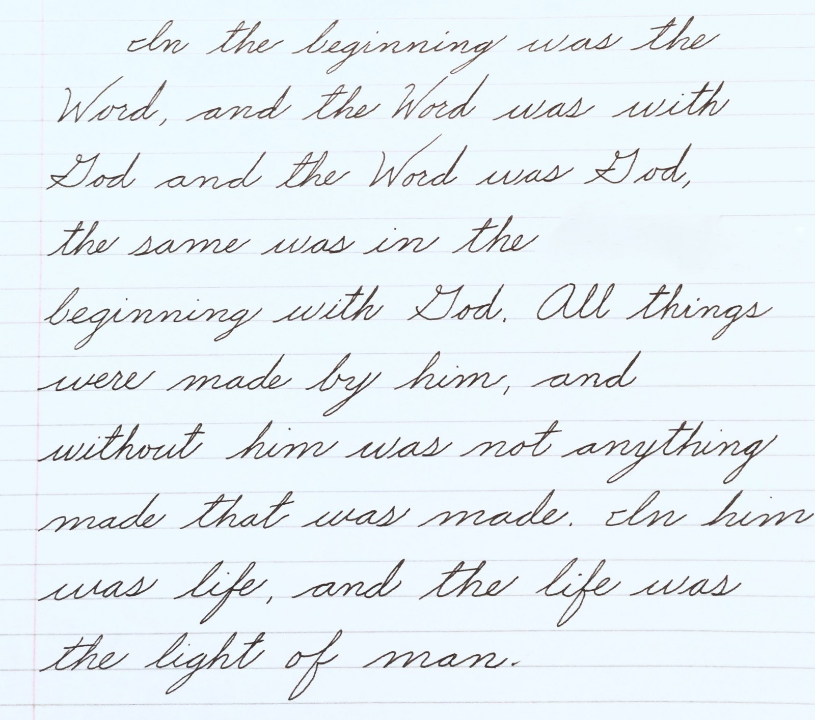
He's wrong that there's a standard cursive. Different countries and different centuries have used a variety of different cursives. Most Americans who were taught cursive in school learned either Zaner-Bloser or D'Nealian, which both derive from Palmer. Both of them are terrible. They have indistinct letter shapes that degrade horribly when written quickly.
Cursive Italic handwriting is much more legible, if slightly slower. There are popular systems including Getty-Dubay Italic and Barchowsky Fluent Handwriting. Both of those are fine, and should be strongly preferred to 19th-20th century cursive.