It seems like when you're VC-backed and get to a certain size, one of the items on the checklist is "design custom font that looks like every other VC-backed platform's custom font, but is slightly different."
Didn't Dropbox also make their own font?
https://addons.mozilla.org/en-US/firefox/addon/enforce-brows...
I personally block fonts via uBlock Origin, which lets me allow them for the subset of websites I visit regularly enough that I'm okay with allowing fontawesome-style fonts.
It doesn't help with icon fonts based on ligatures instead of PUA characters (Google's Material Design framework seems to do this) but we can't have everything.

https://i.postimg.cc/Gm8L8MPy/sw-appy-20210813-193924.png
In case that website blocks hotlinking: https://postimg.cc/gallery/RVSBXh7
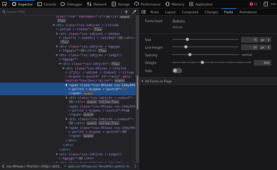
The first image shows https://twitter.com/newsycombinator with devtools on the right showing that the computed `font-family` for that one span has "TwitterChirp", and the uBO logger at the bottom showing that chirp-*.woff fonts were blocked by my uBO rules.
The second image is the Fonts tab of the dev tools showing that the font that the browser is using is Roboto, which I have available locally.
As for how I do it, see https://news.ycombinator.com/item?id=26284124 . If you don't want to go that far, you can still create a rule just for twitter.com that blocks just the chirp*.woff URLs.
    *:not([class*='icon' i]):not(i):not([style*='icon' i]):not([aria-hidden='true']):not([aria-label]):not([class*='fa-']) {
        font-family: "Operator Pro" !important;
}They often seem to be the result of inexperienced design or design by committee. An unnecessary and distracting effort at differentiation or branding. In the worst cases you might even see a FOUT or have to endure downloading 5mb of zillions of characters of some fonts your browser will never draw.
I know there are cases where it’s tasteful and well executed. I love that. It just isn’t common in my experience.
On my team at work we created a sort of pros and cons list and for our use case (instantdomainsearch.com) it made virtually no sense to incorporate a custom font into our design. When it was all laid out and considered it really drove home for me how unnecessary it is.
The designs looked really nice and it seemed compelling, but in real life on the internet I just want things to 1) load very quickly 2) draw and become interactive very quickly 3) look and feel familiar in the right ways such that I can I intuitively use the software. Custom fonts put a stick in the spokes of each of those points.
Maybe website owners could just use "monospace" in CSS and let users configure the browsers as they wish. But I guess it's too late for that now as users aren't used to do this.
Here we have the opposite: Twitter decided that tweet bodies should perform a marketing function. They sacrificed utility for brand cohesiveness. I understand the motivation, but there's a middle ground that serves both purposes: use your own custom font for the UI and use a system font for user-generated content. Gmail does this: the UI is Roboto, while the default font is "Arial, Helvetica".
I'm sure I'll get used to it, but eh.
[0] https://news.ycombinator.com/item?id=27063991