News for hackers. Stuff that matters.
Re:Fuckin' user interface design, I swear by EliRivers on Tuesday March 09, 2021 @04:55AM (#26397149)
Symbols on fuckin' telephones. I still cannot reliably answer telephones; growing up in a world where picking up the handset was to close that circuit and answer the call, the need to pick up the handset and then operate fucking buttons is still such a pain. I get it, there has to be an operation, because the phone could be in any position and any orientation at the moment of the phone call, being used for something else. But still.

These things have huge resolution now and the user can pick their language; would it really kill them to write words over the little icons? If in English, perhaps "ANSWER", "HANG UP", "MUTE" and so on, but the magic of words is that it doesn't have to be those exact words ("HANG UP" and "END CALL" are completely different sets of words yet in the context of a phone call, mean the same thing to almost everyone - magic).

Words. They carry so much information. So much. I know, people want to find some magic picture that carries full meaning to all cultures, but there simply ain't no such picture and there never will be; there's no shame in using words. Please. Use words. I'd even happily take them in a language I don't even speak, so long as it used an alphabet I could read (or even not - I can read some common software related words in Japanese simply through having sounded them out a few times). For me at least, words are easy; the ever-changing mist of icon-style-du-jour is not.

Re:Fuckin' user interface design, I swear by flashingleds on Tuesday March 09, 2021 @05:38AM (#26397408)
Along these lines, I admit with shame that lately I’ve been switching to airplane mode before looking up or modifying a contact, because it’s not obvious to me which combination of symbol-labelled buttons will do this without initiating a phone call. I feel old.
Re:Fuckin' user interface design, I swear by ajmurmann on Tuesday March 09, 2021 @09:18AM (#26398968)
And don't get me started on trying to click on a missed call to either find out more about the number, access the voice mail or simply get rid of the "new notification" dot. I more often than not start calling the number although that's the last thing I want to do.
Re:Fuckin' user interface design, I swear by jiehong on Tuesday March 09, 2021 @08:57AM (#26398759)
On iOS, There seems to be some background thing happening, because when editing a contact, it gets updated a few times.

But each time it gets updated while you're editing a field, it gets rid of the keyboard, and maybe of the info you just added.

It's extremely painful to use.

Re:Fuckin' user interface design, I swear by tormeh on Tuesday March 09, 2021 @08:38AM (#26398609)
If you are using Android it's possible to add in app names in addition to icons. It's in the settings somewhere...
Re:Fuckin' user interface design, I swear by amelius on Tuesday March 09, 2021 @06:07AM (#26397635)
Same here. Too often have I inadvertently initiated phone calls.
Re:Fuckin' user interface design, I swear by aivisol on Tuesday March 09, 2021 @09:49AM (#26399284)
My favorite was UI of a smartphone where a Hangup button when pressed will end a call and will display a contact screen of the other party with a Call button exactly at the position where the Hangup button was. So when you are about to end the call and the other side hangs up first, at the moment you pressed the Hang up button, it has turned into Call button and instead of hanging up you actually start to call them back.
Re:Fuckin' user interface design, I swear by jakub_g on Tuesday March 09, 2021 @06:46AM (#26397920)
I'm in the "text or GTFO" team, and the opposite is an especially annoying trend in desktop webapps. My bank rewrote their UI to icons-only a while ago and it's complete shitshow. I randomly click around to go to the screen I want because icons are non-descriptive at all.

Having said that, text has an annoying feature of needing to be localized, and localization of button texts is tricky because you want a very short string, in order to not overflow, because you have very small screen estate on mobile.

(It doesn't also help that some native built-in components have APIs that show the icons only, without text)

Re:Fuckin' user interface design, I swear by ashneo76 on Tuesday March 09, 2021 @12:36PM (#26401216)
This. It is confusin for me as someone who grew up with internet. We have a huge screen, use it. Geez. Forget about my parents and older relatives trying to figure out how to hangup. I miss the green and red buttons on Nokias..

There is no creativity any more. Everybody is too busy following apple

Re:Fuckin' user interface design, I swear by brokenmachine on Wednesday March 10, 2021 @09:02AM (#26411287)
I don't want creativity, I want functionality.

I want ugly buttons with clear text on them.

What I definitely don't want is four almost identical icons with nothing to tell me what any of them do, or swipe gestures that are impossible to discover, or (the worst) swipe gestures that expose icons.

And then, the absolute worst of all, the useless "upgrade" that offers zero additional functionality, but changes the location or design of all the icons of an app that you've already learned.

Re:Fuckin' user interface design, I swear by sesqu on Tuesday March 09, 2021 @06:31AM (#26397829)
A few weeks after I got my first touchscreen phone, I had to google for how to answer it.

I had assumed you'd just tap the "answer" button, but that failed more often than not. It never would have occurred to me to swipe a minimum of 3cm, starting with the answer button, and I must assume this knowledge has spread to users by osmosis rather than discovery.

Re:Fuckin' user interface design, I swear by com2kid on Tuesday March 09, 2021 @12:27PM (#26401113)
Accepting a call has been a different action on every Android phone I've ever owned.

Typically it is a tap and drag in some direction, but the direction to drag for answer vs hang up is always different between OEMs.

So that's fun. :/

Re:Fuckin' user interface design, I swear by perryizgr8 on Tuesday March 09, 2021 @08:43AM (#26398651)
The accept button animates on most phones in the way you need to move it. But it's true that I've seen many first timers get confused, probably because of the inherent pressure that accompanies a phone call.
Re:Fuckin' user interface design, I swear by flanbiscuit on Tuesday March 09, 2021 @10:25AM (#26399645)
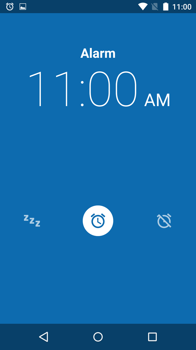
I'm on stock Android using the stock Google made Clock app for my alarms and I still sometimes need to double-take and make sure I'm not snoozing instead of turning my alarm off.

This[1] is what it looks like when the alarm goes off. (Swipe left to the "zzz" snooze icon or swipe right to the off icon). I can't always rely on muscle memory because I am not always consistent in which direction I put my phone down on the nightstand. This is not the best UI for a person who has just been woken out of sleep and still groggy.

1. https://www.androidpolice.com/wp-content/uploads/2015/07/nex...
Re:Fuckin' user interface design, I swear by godshatter on Tuesday March 09, 2021 @01:31PM (#26401928)
There is also plenty of room to replace those three icons with "Snooze" and "Stop Alarm" buttons. Plenty of room even for multiple snooze buttons of varying duration. There is a downside to the button approach, though. I have one app that uses buttons to snooze or stop the alarm and I almost always touch some random one when I'm pulling the phone out of my pocket. That's why I like some apps that use buttons that have to be held down for a second or two to register for certain actions.

Phone interfaces are a minefield for me for some reason. It's too easy to accidentally push a button you didn't realize was a button when you were trying to scroll down the screen but pressed it too hard when you did so. I run into lots of pitfalls like this. I grew up in the era where the OS interface was a "READY" prompt, so I've seen most of the paradigms out there over the years. Nothing has annoyed me as much in recent memory as having a touch-sensitive interface on a slick, compact phone with rounded edges that I desperately don't want to drop.