Most notably the work of Russian chemist Sergei Mikhailovich Prokudin-Gorskii, who took absolutely stunning color photos around 1910.
https://commons.wikimedia.org/wiki/%D0%A1%D0%B5%D1%80%D0%B3%...
There are whole pseudo-intellectual cultures like Objectivists who think that peak of culture are statues with the paint worn off and reading scripts of plays meant to be experienced in live performance.
I watched Peter Jackson's "They Shall not Grow Old" which is a collection of restored WW1 footage. Was super hyped going in, but when I saw the footage itself, it just felt off. Like the colors maybe weren't quite right or the motion was super messed up and the whole thing just felt weird and made watching it unenjoyable. I would have prefered to see it in black and white.
My other gripe with the film was that he also loaded it up with sound effects and even added not well mixed VFX like extra explosions and shingles falling off roofs that appear from nowhere (hence why I'm pretty sure they were added in post). Dumping that kind of cheap blockbuster action elements actually felt pretty disrepectful of the soldiers that got filmed. Kind of like they were using them as action figures to tell a story that wasn't quite what happened in reality.
Finally, there's an education factor at play. Young people deserve the best possible chance they can get to engage with their history, especially when it offers such a tremendously impactful lesson. And like it or not, I think 90% of people are going to be more engaged, not less, by well-curated, well-produced and respectful recreations of the past. Jackson recorded the SFX using original historical weapons, and colored uniforms using historical examples.
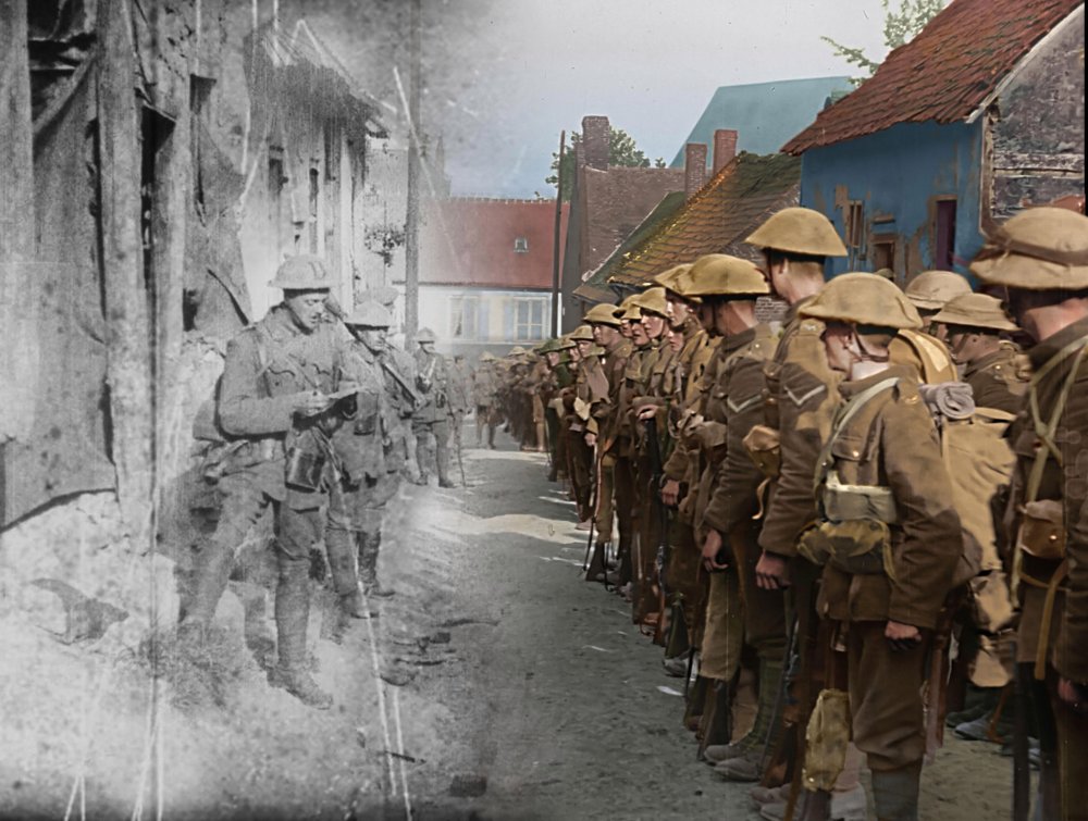
https://www2.bfi.org.uk/news-opinion/sight-sound-magazine/re...
One criticism:
"However, it’s a bizarre sight that greets us, and not just because we lose the top and bottom of each frame. The effect is initially impressive, but that soon wanes. Almost every man has a creamy, peachy skin tone, and the grass in each shot is a warm, yellowy green. The sky is blue. If it weren’t for the daubs of bright red blood, and the bomb craters, this would risk being a unnaturally prettified image of war, with remarkably consistent scenery. These are really incredible images – so homogenising them in this way does them a disservice. It’s not easy either to dispel the thought that all these colours (as well as many of the sounds) are simply guesswork: the colour of hair, blankets, signs and wildflowers having been plucked out of the air." (https://silentlondon.co.uk/2018/10/16/lff-review-they-shall-...)
That's an interesting commentary on how much technology has advanced, and how we have become so desensitized to it. Consider that when silent films first started, the movie of a train coming right at the camera scared the audience so much that they ran out of the theatre to get out of the way of the train, IIRC.
I agree on your point regarding engaging audiences. Saving Private Ryan and Dunkirk probably taught more people about WW2 than many classes or books.
But in reality, those sets were bright pastels. Actual dark walls and floors didn't show up well on film. Which makes me wonder how right we are with some of our other colorizations.
You can google [what did the munsters set actually look like] to get some great examples.
https://gbmedia.azureedge.net/aza/user/gear/1961-gibson-les-...

Actual white guitars would look like blown-out blobs on black and white TV. TV Yellow would "look" white on TV.
eg, this blue:
  24. Scotch Blue
      Throat of Blue Titmouse.
      Stamina of Single Purple Anemone.
      Blue Copper Ore.
Maybe that's because those others are more likely to do a bad job, because they lack the training to do a good one. Sort of like how sci-fi filmmakers have taught millions of people that you can hear explosions in space and that lasers make a "zap" sound.
BTW, if you want to support some folks that actually try to get it right, check out the expanse.
Also, we still have the techniques and materials used to make old paints. New batches can be whipped up (assuming they aren't too toxic) for comparison. Lead based paints obviously are more problematic, but modern technology is really good at replicating paint colors.
Um, do we really?
So if you were to recolor a film you can take skin colors from today. But an advert, car color or fabric is incredibly difficult, even if you have the original, since the material will have degraded. Even if you repaint it with the original paint it will look different, since the paint will have changed, or if you use new paint the process to manufacture the paint (->led).
It might as well be another universe.
Unless there's also a way to accurately extract the specific hue, you will never get anything accurate.
Anyone that ever wore foundation can tell you that human skin has tones, undertones, different reflective qualities, etc.
Just look at https://www.temptalia.com/wp-content/uploads/2018/05/summer-... or https://cdn.shopify.com/s/files/1/0009/0000/5932/files/Shade... or this https://pbs.twimg.com/media/B_zp3U1XAAAk4Iz?format=jpg&name=...


I think some of it comes down to the fact that convnets are really good at recognizing human "shapes" (faces, silhouettes, etc) and also the valid color space for human skin tone is pretty constrained if the photo was well lit and you have the luminance value for a grayscale image.
The network was particularly bad at getting the colors of balloons in a picture. I don't know what the real colors were, but the network was trying to tell me 4 of the balloons in a picture were pale yellow and beige while one was a super saturated red.
The process flow goes from converting the full spectrum lights in nature into color filtered photons captured on a camera sensor with an artificial color profile, it's own resolution and pixel arrangement, and its own lens specifics, then converted to another limited color palette with another artificial color profile and it's own resolution and pixel arrangement that is the display, in order to simulate the colors of nature as detected by yet another set of filtered detectors with it's own color profile, resolution, neuron arrangement, and lens specifics that is the human eye. There is already no such thing as objective truth when it comes to photography, every step involves heavy interpretation.
I've tried to make that point, but I failed many times. Let's try this crowd: We know what colors human faces have, so we can nail those, but coloring a film from, say, the 1950s the way photos from that era looked, is not what the colors back then actually looked like. That's just how camera technology was able to capture them at the time.
So even if you captured color back then, it probably wasn't very realistic.
I don't think people should stop experimenting, I find these videos fascinating and loved Peter Jacksons film, but the past didn't look like you think it did. You're just used to it because all the photographs from the era look a certain way but they were limited.