My complaints:
i) They do not have numbers on them!! You have to read words to know the value
ii) To make point i) worse, they have nicknames printed on some of the coins!! They do not write "ten cents", it is "one dime". They do not write "twenty-five cents", they write "quarter dollar" (even the unit here changes)
iii) To make points i) and ii) worse, there is no default place where the value is written. $0.01 is a horizontal banner. $0.10 and $0.25 are round-based by the edge of the coin. $0.05 is round-based, but not by the edge of the coin, just slightly above another text that is by the edge.
iv) The coins do not obey a coherent progression of value and size. From smallest to largest the coins are: $0.10 < $0.01 < $0.05 < $0.25
v) The colors are all the same, except for the $0.01 coin.
So when you have a bunch of coins, you have to properly spread them in your hand to be able to compare their sizes (which is hard when the items are circles), account that there is no size-value correlation, and if you do not remember by size; you have to read a tiny sentence, lost in the middle of several other sentences, with no typographic differentiation of where they are.
Those aren't nicknames. They are the official names of the coins as laid down in the Coinage Act of 1792 (though "dime" was originally spelled "disme") and its successors.
https://en.wikisource.org/wiki/United_States_Statutes_at_Lar...
Unfortunately the paper money isn’t similarly touch-friendly.
This is a completely arbitrary system, but American schoolchildren learn it very early on and memorize it, and it remains valid for the entire rest of their lives.
[1] You may recall that the faces of our four greatest presidents are also engraved on Mount Rushmore, except instead of Franklin Delano Roosevelt, Theodore Roosevelt is on the mountain. This is because Mount Rushmore was carved during the administration of FDR, and he had not yet had the opportunity to displace his cousin within the top four. Also, neither ranking is especially unanimous among historians or the public, but it is relatively close to the consensus.
Many times they don't even print them in a language I can read!
I'm kidding of course. Because usually, even if I'm only in a place for a week or two, I'll have it figured out and it's not a problem. I mean, there are only really 4 options. 1, 5, 10, and 25 cents.
And I can't remember the last time I used change to buy something.
Really 5 - I got a dollar coin. Apparently they're rare although I didn't handle a lot of cash and I got one on the second or third day I was there so...not that rare then.
I used my UK contactless card. It was funny because in a lot of places they'd never seen one and kept telling me to insert or even swipe it - something I've not done for years in the UK. When the tap didn't work once it was amusing handing the card to the cashier and watching him repeatedly swipe the card and then enter the long card number, expiry date etc like it was a cardholder-not-present transaction!
I haven't seen a dollar coin in years. Though maybe because I just don't pay in cash much anywhere.
> the iBill Talking Bank Note Identifier, is now available free of charge from the Treasury Department to any US citizen who is blind or visually impaired.
> It can speak the dollar amount; it can produce a different pattern of tones for each denomination; or it can vibrate silently
> The United States is the only country that prints all denominations of currency in the same size. The US and Switzerland are the only two countries that use the same colors for all of their various bills.
https://www.afb.org/blindness-and-low-vision/using-technolog...
https://www.google.com/search?q=oxenaar+geld&client=ubuntu&h...:
They don't really look much like that. See:
https://www.bankofengland.co.uk/banknotes/current-banknotes
I'm hoping the fact that's just the concept art means it'll be reworked to appear more like the existing notes ...
But the pattern remains, those bills are for the most part extremely dense and overflowing with information and layered graphics. Especially the existing $50 one which is crammed full of stuff.
It's like someone came up with a list of ideas and said yes to all of them.
Fact is, there's even more that you can't see, there's microwriting on them too (can't find an image, but on the £5 and probably all others) and it's almost unnoticeable without magnification.
Can anyone find an image of this?
A bigger but not clearer image here: https://www.bankofengland.co.uk/banknotes/5-pound-note
For this search using the words "bank notes" first in the list of search terms ruined the results.
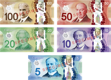
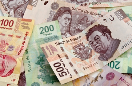
Just look at Canada, Australia, or even Mexican plastic currency. These are nowhere near as bad but are just as secure.
Canada: https://upload.wikimedia.org/wikipedia/en/9/92/Canadian_Fron...
Aus: https://i.pinimg.com/originals/d3/91/b8/d391b8dafd8c60277a81...

MX: https://www.inside-mexico.com/wp-content/uploads/2015/08/Fot...
You're not critiquing a web page design!
https://www.bankofengland.co.uk/banknotes/withdrawn-banknote...
Manx pounds are not legal currency in the UK but UK pounds (whether the notes are English, Scottish, or NI) are legal in the Isle of Man.
However, the concept art in that article is really ugly. I'm not that familiar with British banknotes - are they usually that messy looking? Every piece of text is in a different font, and it seems pretty vulgar to have a quote on the note at all. There's even drop shadows! It honestly looks like something I'd put together in Corel Draw in the mid-2000s.