News for hackers. Stuff that matters.
Re:Fonts for Complex Data by ggg9990 on Tuesday May 08, 2018 @02:31AM (#17019227)
This is written by Jonathan Hoefler. Not reading it on principle.
Re:Fonts for Complex Data by jenskanis on Tuesday May 08, 2018 @02:43AM (#17019272)
For those who might not know everyone in the industry: why not?
Re:Fonts for Complex Data by panic on Tuesday May 08, 2018 @03:00AM (#17019337)
Re:Fonts for Complex Data by lstamour on Tuesday May 08, 2018 @03:04AM (#17019359)
And https://iapps.courts.state.ny.us/fbem/DocumentDisplayServlet...

While the lawsuit seems very one-sided, there are plently of lessons to be learned here... and I’m not sure how any of it applies to a single article.

Re:Fonts for Complex Data by robin_reala on Tuesday May 08, 2018 @02:59AM (#17019335)
https://en.wikipedia.org/wiki/Hoefler_%26_Co.#Conflict_betwe...

What was perceived by one partner and onlookers (perhaps based on the name) as a 50/50 partnership turned out to be anything but.

Re:Fonts for Complex Data by turboturbo on Tuesday May 08, 2018 @05:03AM (#17019725)
I can see why your comment is being downvoted — the lack of explanation makes it seem more provocative — but I agree with your sentiment.

Although a settlement was reached in the H&FJ lawsuit, which probably involved Tobias Frere-Jones receiving payment of some sorts, it’s hard to see Hoefler profiting from work that he (morally, at least) stole.

Re:Fonts for Complex Data by jgtrosh on Tuesday May 08, 2018 @03:35AM (#17019472)
I chose to stop reading after the first example document with tasteful light gray text on delicate light gray background
Re:Fonts for Complex Data by m_eiman on Tuesday May 08, 2018 @04:50AM (#17019687)
Do you mean this image?

https://d31td5fkd89rr1.cloudfront.net/assets/images/blog/des...
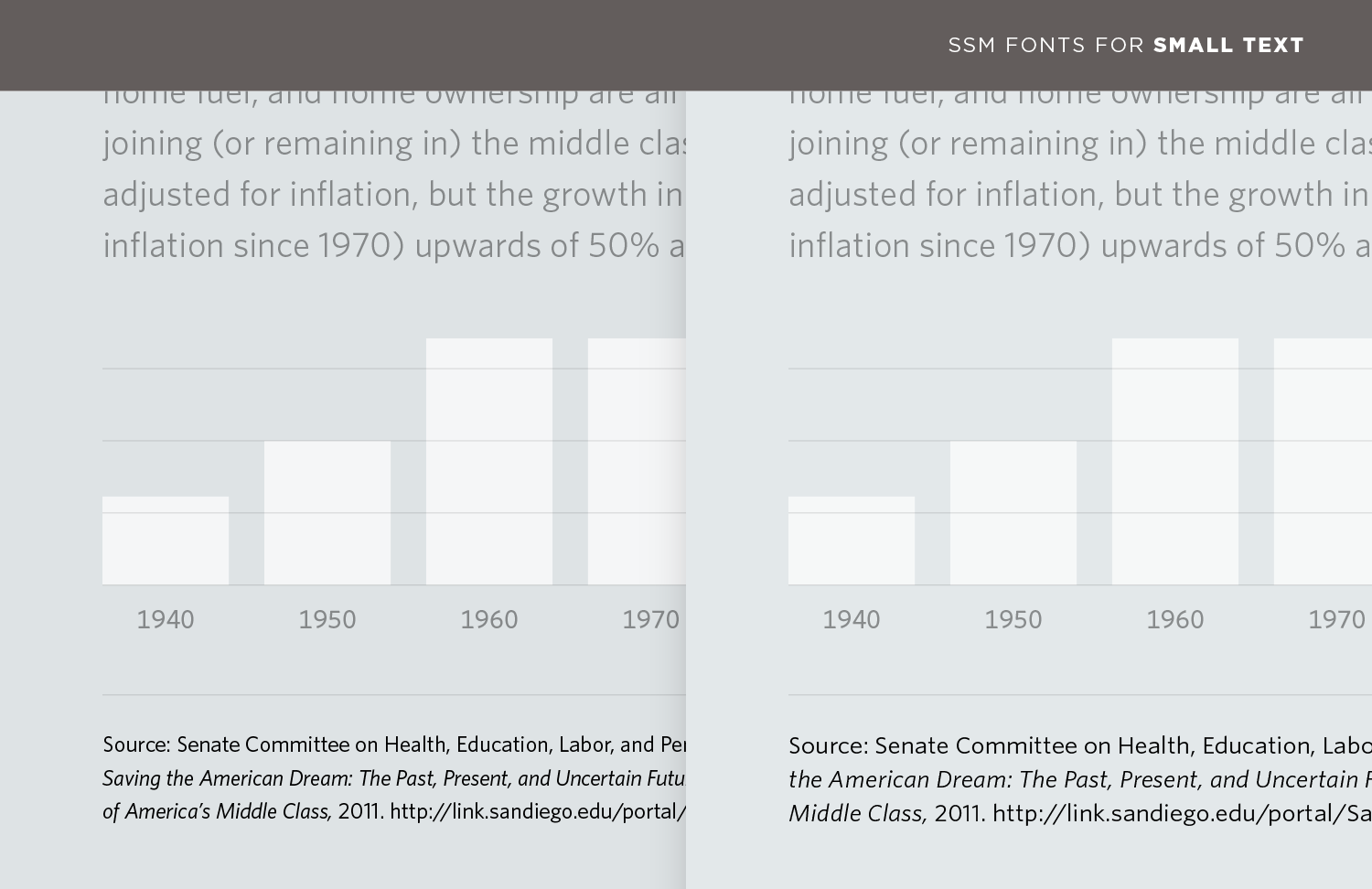
It's only the lower part of the image that's of interest as an example; to use low contrast on the (mostly irrelevant) upper part of the image makes it easier to focus on the part that's discussed in the text. IMHO.

Re:Fonts for Complex Data by jgtrosh on Tuesday May 08, 2018 @05:06AM (#17019733)
You might be right. Nevertheless it seems distracting on a typography focused article, while the same focus could have been drawn without affecting the look of the document.

Also the actual first image bothers me in a similar way: the colors seem to blend into the background.

I concede it might not be a very valid reason to give up on the article but since it seems to be an ad for a set of products I find it fitting to judge it on appearance.

Re:Fonts for Complex Data by Numberwang on Tuesday May 08, 2018 @03:58AM (#17019537)
I agree. When will this madness end?
Re:Fonts for Complex Data by yani on Tuesday May 08, 2018 @03:01AM (#17019343)
Yes, who is this person and why would you not read it. It seems quite informative on first read.