Re:Fonts for Complex Data
by jgtrosh on Tuesday May 08, 2018 @03:35AM
(#17019472)
I chose to stop reading after the first example document with tasteful light gray text on delicate light gray background
[ Parent
| on HN ]
Do you mean this image?
https://d31td5fkd89rr1.cloudfront.net/assets/images/blog/des...
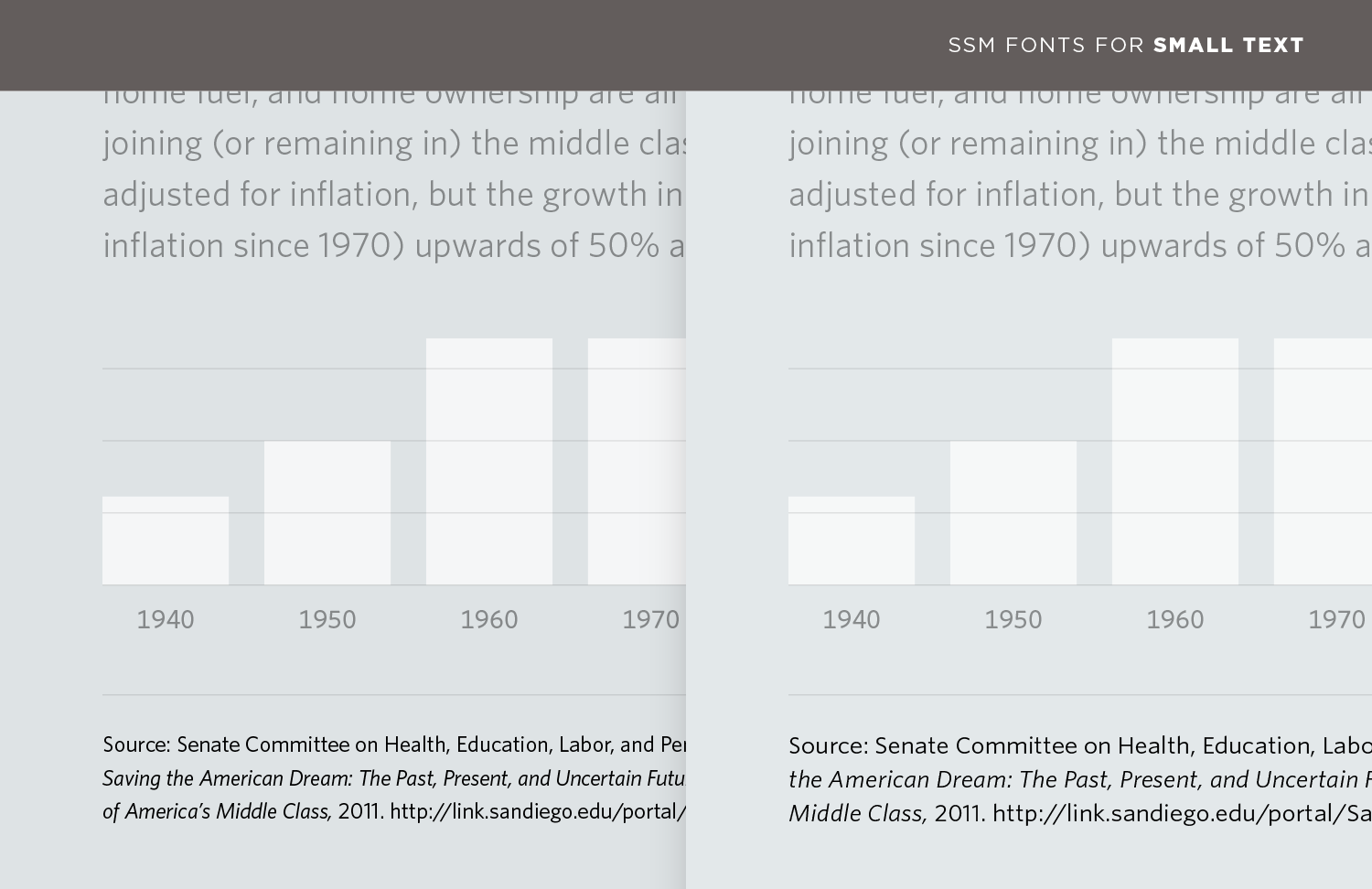
It's only the lower part of the image that's of interest as an example; to use low contrast on the (mostly irrelevant) upper part of the image makes it easier to focus on the part that's discussed in the text. IMHO.
You might be right. Nevertheless it seems distracting on a typography focused article, while the same focus could have been drawn without affecting the look of the document.
Also the actual first image bothers me in a similar way: the colors seem to blend into the background.
I concede it might not be a very valid reason to give up on the article but since it seems to be an ad for a set of products I find it fitting to judge it on appearance.
Re:Fonts for Complex Data
by Numberwang on Tuesday May 08, 2018 @03:58AM
(#17019537)
I agree. When will this madness end?