News for hackers. Stuff that matters.
Re:Noun Project – Icons for Everything by yoz-y on Friday May 12, 2017 @01:37PM (#14325999)
That really depends. Can you imagine photoshop's interface if it were all text? This is an extreme example but more generally I think text is better for discoverability but icons are better for visual memory and thus better suited for buttons in applications you use often.

On desktop there are always tool tips. On touch interfaces this was not yet figured out.

Re:Noun Project – Icons for Everything by jv22222 on Friday May 12, 2017 @03:17PM (#14327002)
I did a workup of the iphone with no icons and just text:

http://justinvincent.com/page/2387/if-the-iphone-used-text-l...

It shows just how stark an interface can look without them.

Re:Noun Project – Icons for Everything by biot on Friday May 12, 2017 @05:43PM (#14328180)
As a counterpoint, here are Zendesk's icons with no text: http://imgur.com/a/wzCO0 -- can you guess what those do?

Of course, this is about the worst example of iconography I've ever seen so here's the same with the labels left in: http://imgur.com/a/CyqA6 and I'd even go so far as to suggest that given their choice of icons they should just get rid of them and make it text-only.

Re:Noun Project – Icons for Everything by mediumdeviation on Friday May 12, 2017 @10:36PM (#14329301)
But those are product logo, not icons https://imgur.com/a/4kAKt. They don't serve the same purpose - logos are brand assets and are suppose to be distinct, otherwise they can't be trademarked.
Re:Noun Project – Icons for Everything by programbreeding on Friday May 12, 2017 @06:20PM (#14328382)
I "understand" the icons... support is one box leaning on another, guide is one leading another, chat looks like 2 speaking at each other, and talk looks like a phone.

But wow are they horrible. I agree, they really should go with text-only.
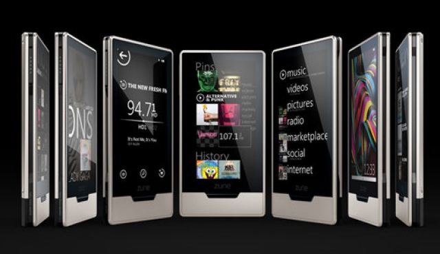
Re:Noun Project – Icons for Everything by joshvm on Friday May 12, 2017 @06:35PM (#14328488)
Zune is a good counterexample to this. It's a lovely UI, just a little too late to the game.

http://www.allaboutsymbian.com/images/features/zune_01.jpg

Re:Noun Project – Icons for Everything by zellyn on Friday May 12, 2017 @03:30PM (#14327123)
This is a fantastic refutation of the idea that text is best. You have to read the whole thing to figure out where to tap. Nicely done!
Re:Noun Project – Icons for Everything by dkersten on Friday May 12, 2017 @05:22PM (#14328048)
I disagree. I mean, yes, the icons look much, much nicer, but the text I can understand much easier.

For example, desprite owning an iPhone myself, after looking at that comparison, I just realised that I had actually never used (nor really knew what they meant) what the "do not disturb", "timer" or "calculator" icons were. I've always navigated to calculator and timer from the apps on the home screen (and have never used do not disturb).

I'm not saying that Apple should change the icons, not at all. Just that I don't think this is a refutation of the idea that text is best at all. If anything, it shows that text is much more descoverable and understandable, if a good bit uglier (and less compact).

I do think that icons are the right choice for the iPhone, and once you learn the icons there's no problem (as long as they don't get changed!), but its not as clear cut as you seem to be saying. I'm forever confused by non-standard various unlabelled icons all over the place. I also have no idea what most of the articles in the linked article mean (eg the washing machine/clothes icons -- I still don't know what they mean when I see them on clothes!)

Re:Noun Project – Icons for Everything by socialentp on Friday May 12, 2017 @08:05PM (#14328887)
I think Apple Mail actually strikes the right balance here. There are icons, but they have text below them by default. If you want a cleaner interface once you are able to easily identify the feature by the icons, you can right-click and turn off the text. It's like training wheels for the UI. I used the text labels until I no longer needed them, and now I only use the icons.
Re:Noun Project – Icons for Everything by pasquinelli on Friday May 12, 2017 @05:30PM (#14328107)
it also shows that an icon has to be iconic to work. play, fast forward and rewind, the camera and the calculator, i knew. airplane mode, wifi and bluetooth, i knew but could easily imagine people confused by. the crescent moon, the lock with the arrow around it, the flashlight and the dial i honestly didn't know, and would've had to tap them to try to figure out what they did.

you can't just make any picture iconic, it's not something an app can force.

Re:Noun Project – Icons for Everything by everyone on Friday May 12, 2017 @05:30PM (#14328105)
Just fyi my Android phone has icons with text underneath them for the equivalent menu (like a parc style OS also)

http://oi65.tinypic.com/339jeh3.jpg

Seems like a good solution.

Also interesting they recently updated all the icons / art for Android. I really dont like the new ones compared to the old ones. Its a jarring change. They are all line drawings now, rather than filled shapes.

Also, awesome little job u did there !

Re:Noun Project – Icons for Everything by __jal on Friday May 12, 2017 @06:07PM (#14328305)
On the other hand, I find myself suffering from "icon blindness" sometimes - it is usually after working for some time, but at some point, I just don't process them very well. Command-tab window switching (MacOS), for instance, is something I end up staring at a lot, trying to figure out which one I want.

But then I tend to interpret text much more quickly and without having to think about it than with icons, as well. I'm just a word person. Probably why I'm generally happier typing at the command line than poking and clicking at buttons.

I'd take the text-only iPhone, myself. Stark is fine.

Re:Noun Project – Icons for Everything by BaronSamedi on Saturday May 13, 2017 @09:21AM (#14330812)
I like the text only version a lot. The top icons could still be graphics as they are more gauges than icons. The cognitive load of a million different icons, mostly different per application is too much in my opinion. I would include this under design cleverness vs usability.

Symbolics Genera used an all text approach. Experimentally testing of text vs icons would be very interesting.

Re:Noun Project – Icons for Everything by baxtr on Saturday May 13, 2017 @04:33AM (#14330025)
Wow, great comparison. It's seems as if icons make a lot of sense in places that are used constantly (like the iOS screen)
Re:Noun Project – Icons for Everything by noxToken on Friday May 12, 2017 @02:00PM (#14326244)
Android has toast messages baked in. When you long press something, it can display a small tooltip at the bottom with the message. Toasts disappear automatically, and they are dismissable with another touch event.

iOS doesn't have the equivalent by default, but Stack Overflow shows that this behavior is achievable.

Re:Noun Project – Icons for Everything by everyone on Friday May 12, 2017 @01:43PM (#14326059)
Yeah. Well put.

I guess poor use of pictograms in mobile and wep-apps is becoming so common these days it made my original comment a bit lopsided.

Ive used a lot of programs like Autocad, Photoshop, 3DSmax, Ableton, Reason, Cubase and so on. Icons + tooltips are a great solution in that context. When you are just starting off you use the tooltips, later you know what each symbol means, and after more experience you can perform all your most common tasks with keyboard shortcuts. Autocad is particularly good for that. You can make an entire drawing with just the keyboard, it makes sense because youre making an accurate measured drawing so will want to type in all the dimensions/angles anyway.

Re:Noun Project – Icons for Everything by user5994461 on Friday May 12, 2017 @02:02PM (#14326270)
That's why the ribbon interface came to existence in office.

Much bigger than the traditional menu bar. Enough room to have big meaningful pictures and a text.

Re:Noun Project – Icons for Everything by gnaritas on Friday May 12, 2017 @08:23PM (#14328953)
You mean the one that is nearly universally hated? Those ribbons were a huge mistake and fuck you to users who knew how to use the software; it sucks.
Re:Noun Project – Icons for Everything by LoSboccacc on Saturday May 13, 2017 @06:23AM (#14330245)
The UX idea wasn't bad but the arbitrary grouping and the deep nesting ruined it.

They did not give enough thought to the user workflow and mental process to locate things (i.e. Why inserting and deleting a row had a completely different workflow at the beginning)

Re:Noun Project – Icons for Everything by gnaritas on Saturday May 13, 2017 @09:47AM (#14330945)
What they didn't give a thought too, was that this wasn't a new product and you can't drastically change things like that when you have a large existing user base that rely on your product day in and day out. They functionally broke the product for most of their users; I've never heard anyone in the word place compliment it, it's universally hated. The only people who seem to like it are designers, who frankly tend to come off as clueless to what real users just trying to get a job done actually want.
Re:Noun Project – Icons for Everything by grimmdude on Friday May 12, 2017 @02:08PM (#14326326)
I feel like icons can encourage application exploration too, which could be a good thing.