News for hackers. Stuff that matters.
Re:Iosevka – A Typeface for Code, from Code by debaserab2 on Saturday April 01, 2017 @01:04AM (#14010539)
I don't know what it is about this font but it doesn't feel monospaced.

Using this font I constantly keep second guessing myself as to where I've placed whitespace. Maybe I just need to use it more, I don't know.

Re:Iosevka – A Typeface for Code, from Code by matt4077 on Saturday April 01, 2017 @03:56AM (#14011083)
Maybe this is related – from https://github.com/be5invis/Iosevka/releases:

    Spacing: How wide some specific characters are.
        Default: The default variant with ligatures and semantic full-width glyphs.
        Terminal: Exact monospaced font without ligatures and full-width glyphs. Since some environments cannot interpret Iosevka as monospaced, and have difficulties with ligatures included, you can use Iosevka Term as an alternative.
Re:Iosevka – A Typeface for Code, from Code by joatmon-snoo on Saturday April 01, 2017 @01:16AM (#14010583)
Glancing at it I'm not sure if I would immediately be comfortable with it - it's a much narrower glyph than the type I'm used to.

I think the lower width:height ratio is part of your whitespace issue, combined with the seemingly liberal kerning.

Re:Iosevka – A Typeface for Code, from Code by dragonshed on Saturday April 01, 2017 @01:21AM (#14010599)
> Glancing at it I'm not sure if I would immediately be comfortable with it - it's a much narrower glyph than the type I'm used to.

This. I occasionally try new dev fonts but so far I still end up using Menlo and/or Consolas.

Re:Iosevka – A Typeface for Code, from Code by frou_dh on Saturday April 01, 2017 @07:44AM (#14011654)
Menlo is underrated. It'd be cool if it saw major longevity of use like Monaco before it.
Re:Iosevka – A Typeface for Code, from Code by nsaje on Saturday April 01, 2017 @03:00AM (#14010937)
I felt the same way at first, but I got used to it very quickly. Now I can't switch back, all the other fonts seem bloated and wasting screen real estate.

In fact, it's so much more space efficient that I can fit three code files side by side where I used to be able to fit two.

Re:Iosevka – A Typeface for Code, from Code by shaftway on Saturday April 01, 2017 @03:13AM (#14010973)
I felt like that when I dropped my standard monospace font size by a couple points. Now I can fit three files side by side and see more lines at once.
Re:Iosevka – A Typeface for Code, from Code by stinos on Saturday April 01, 2017 @02:32AM (#14010852)
it's a much narrower glyph than the type I'm used to.

Exactly this. Maybe if I'd be staring at it for days it would be ok, but right now it feels uncomfortable to read, to the point I'm probably not even going to try. Then again, just like the other commenter I always come back to Consolas or something so similar that it's hard to distinguish.

On a sidenote: what is the font is this textbox I'm typing in?

Re:Iosevka – A Typeface for Code, from Code by function_seven on Saturday April 01, 2017 @02:55AM (#14010921)
> On a sidenote: what is the font is this textbox I'm typing in?

Can’t say. The stylesheet specifies ‘monospace’, so the font is whatever your browser’s default monospace font is. For me, it’s Courier. But yours could be anything.

Re:Iosevka – A Typeface for Code, from Code by rootlocus on Saturday April 01, 2017 @04:11AM (#14011110)
If you open developer tools on chrome, under the computed tab, the very last panel will tell you what font it used to render the glyphs inside the element you inspected.
Re:Iosevka – A Typeface for Code, from Code by Bluestrike2 on Saturday April 01, 2017 @11:09AM (#14012480)
That matches up with my initial impression as well. I'm coming from Fira Code, which I've been using for a while now and really love. The glyphs are noticeably wider, but to be honest, after using Iosevka for the last half hour or so, I'm kind of enjoying the compactness.

It's the first narrow typeface I haven't rejected immediately for writing code. I ran into what looks like some issues with certain ligatures not being substituted, but that looks to be an editor-specific issue. They're fine in Terminal and vim, but Atom had some issues with some (e.g., <--> <*> <.> and others along those lines). I will say that Fira Code seems to have a more diverse set of ligatures,[0] though some of them--the equality glyphs in particular--were annoying at times because they were such a visible change over what you actually typed.

0. https://raw.githubusercontent.com/tonsky/FiraCode/master/sho...

Re:Iosevka – A Typeface for Code, from Code by tajen on Saturday April 01, 2017 @04:50AM (#14011249)
If anyone uses narrower fonts so they can see more on a single screen, here's exactly what you need: http://dotsies.org — It's a mysterious dot font that is not braille. Have fun (spoiler: I didn't succeed to use it).
Re:Iosevka – A Typeface for Code, from Code by boardwaalk on Saturday April 01, 2017 @09:50AM (#14012104)
That is cool. I wish it wasn't dependent on the vertical alignment so much (e.g. if you have a single character, you can't tell an 'a' from a 'b' from a 'c' -- heck if you have a 'ab' that could also be a 'bc' or a 'cd'). Maybe it matters less in practice than I think.
Re:Iosevka – A Typeface for Code, from Code by andai on Tuesday April 04, 2017 @11:42AM (#14033857)
In the previous discussion[0] on Dotsies, someone posted a modified version which tries to address this issue, as well as a few others:

"dotsies 3" http://esploded.s3.amazonaws.com/anon_data/2012/e5YO-dotsie3...
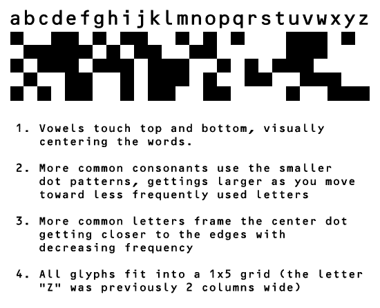
[0] https://news.ycombinator.com/item?id=3601687

Re:Iosevka – A Typeface for Code, from Code by andai on Saturday April 01, 2017 @05:01AM (#14011273)
Wow, thanks for sharing!
Re:Iosevka – A Typeface for Code, from Code by tajen on Sunday April 02, 2017 @06:20AM (#14016651)
Didn't expect such enthusiasm. Out of curiosity: Are you trying to learn it?
Re:Iosevka – A Typeface for Code, from Code by andai on Tuesday April 04, 2017 @11:41AM (#14033841)
I will most likely create my own at some point. In the previous discussion there were some interesting suggestions for improvements.

eg. http://esploded.s3.amazonaws.com/anon_data/2012/e5YO-dotsie3...

In terms of creating a space-saving reading system, I think a better place to start would be with the writing system itself. Dotsies squishes letters but does not remove them.

I propose a system where each word is reduced to its minimal representation, eg. where letters are removed until the smallest unique form is found (giving more common words shorter forms).

Once I have such a mapping developed (for both reading and accelerated writing) I will see if something like dotsies still makes sense.

In any case I will not use squares: they make my eyes sad. Maybe circles :)

Re:Iosevka – A Typeface for Code, from Code by mtkd on Saturday April 01, 2017 @02:42AM (#14010879)
if you've not tried it already take a look at "M+ 1M light" - I run it at quite a high font size - it's similar but less ornate to Iosevka

on the whitespace - Sublime and Atom have a setting to put an unobtrusive dot or line which I find useful

Re:Iosevka – A Typeface for Code, from Code by IshKebab on Saturday April 01, 2017 @05:19AM (#14011316)
Another reason to use tabs...
Re:Iosevka – A Typeface for Code, from Code by Kequc on Saturday April 01, 2017 @10:23AM (#14012237)
Every time you press tab and your code editor actually inserts a tab, we are 1 step closer to the outcome from Terminator.
Re:Iosevka – A Typeface for Code, from Code by IshKebab on Sunday April 02, 2017 @04:39PM (#14018927)
What where the terminator is killed and everything turns out ok?
Re:Iosevka – A Typeface for Code, from Code by Kequc on Saturday April 15, 2017 @02:10PM (#14121935)
Unless the machines figure out how to subvert time itself which is what happens, all because of carelessness on the part of developers and their insistence on tabs.