Re:Iosevka – A Typeface for Code, from Code
by tajen on Saturday April 01, 2017 @04:50AM
(#14011249)
If anyone uses narrower fonts so they can see more on a single screen, here's exactly what you need: http://dotsies.org — It's a mysterious dot font that is not braille. Have fun (spoiler: I didn't succeed to use it).
[ Parent
| on HN ]
Re:Iosevka – A Typeface for Code, from Code
by boardwaalk on Saturday April 01, 2017 @09:50AM
(#14012104)
That is cool. I wish it wasn't dependent on the vertical alignment so much (e.g. if you have a single character, you can't tell an 'a' from a 'b' from a 'c' -- heck if you have a 'ab' that could also be a 'bc' or a 'cd'). Maybe it matters less in practice than I think.
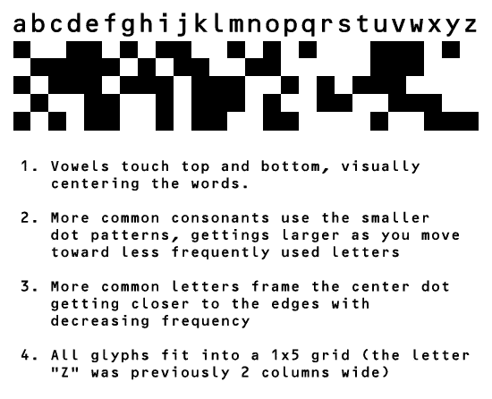
In the previous discussion[0] on Dotsies, someone posted a modified version which tries to address this issue, as well as a few others:
"dotsies 3" http://esploded.s3.amazonaws.com/anon_data/2012/e5YO-dotsie3...
Re:Iosevka – A Typeface for Code, from Code
by andai on Saturday April 01, 2017 @05:01AM
(#14011273)
Wow, thanks for sharing!
Didn't expect such enthusiasm. Out of curiosity: Are you trying to learn it?
I will most likely create my own at some point. In the previous discussion there were some interesting suggestions for improvements.
eg. http://esploded.s3.amazonaws.com/anon_data/2012/e5YO-dotsie3...
In terms of creating a space-saving reading system, I think a better place to start would be with the writing system itself. Dotsies squishes letters but does not remove them.
I propose a system where each word is reduced to its minimal representation, eg. where letters are removed until the smallest unique form is found (giving more common words shorter forms).
Once I have such a mapping developed (for both reading and accelerated writing) I will see if something like dotsies still makes sense.
In any case I will not use squares: they make my eyes sad. Maybe circles :)