Re:Go fonts
by crsmithdev on Wednesday November 16, 2016 @09:41PM
(#12973788)
Yuck, the monospace font feels too dense, and dislike the serifs.
[ Parent
| on HN ]
Re:Go fonts
by userbinator on Wednesday November 16, 2016 @09:51PM
(#12973839)
I think the rendering is horrible too, with plenty of colour fringing and unevenness.
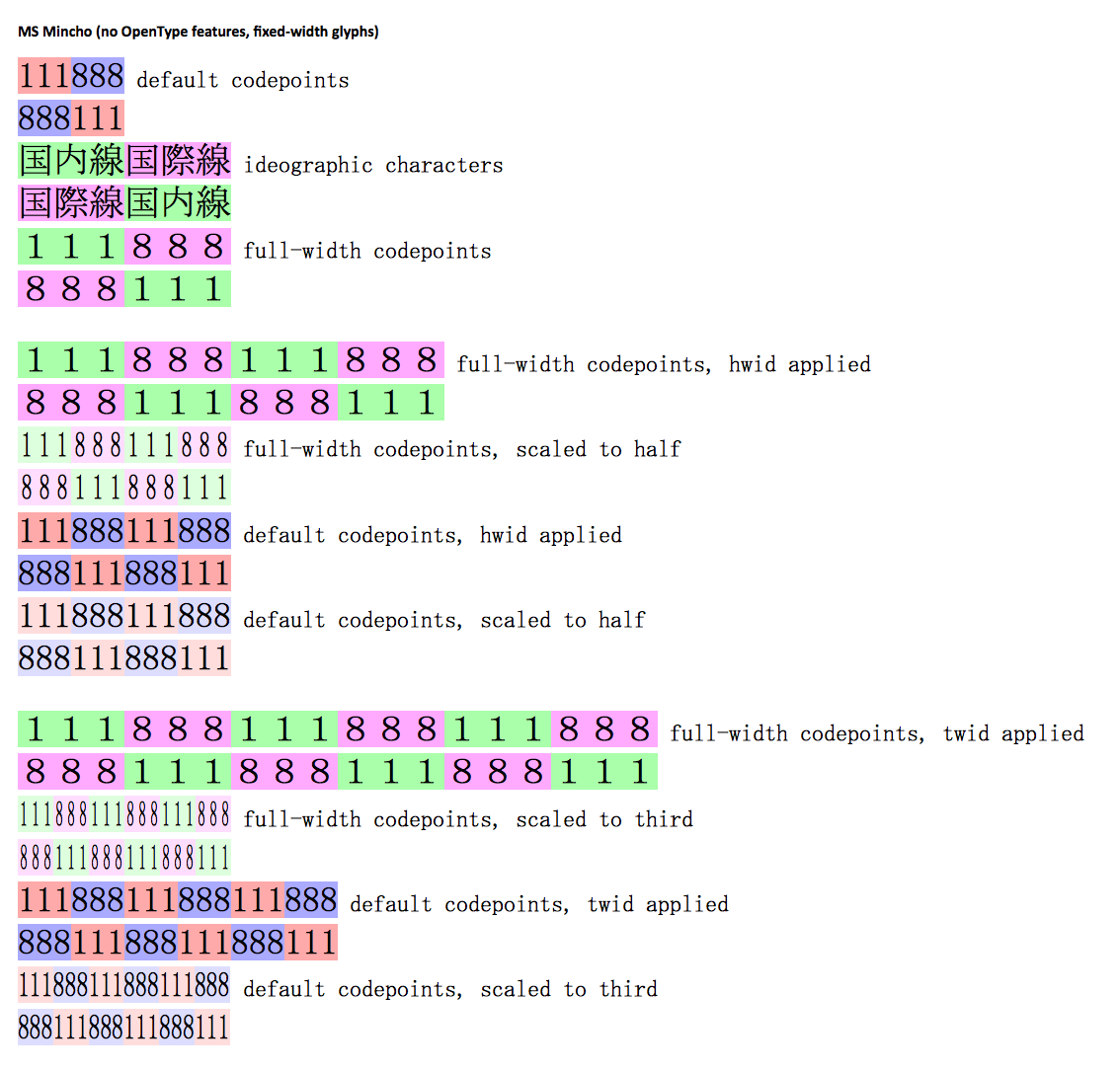
The monospace font reminds me of the generic "Asian product manual font" - although the individual shapes are slightly different, it has a similar feeling to MS Mincho:
http://lists.w3.org/Archives/Public/www-archive/2013Jul/att-...
Re:Go fonts
by honkhonkpants on Wednesday November 16, 2016 @10:08PM
(#12973899)
Images of the way a font was rendered on some output device are always going to look weird and wrong on another one.
Re:Go fonts
by TheOtherHobbes on Wednesday November 16, 2016 @10:18PM
(#12973948)
The monospace is kind of okay, I guess, but considering the competition there's nothing special about it. Many users will be coding with colour keyword support anyway, so the idea that it's going to be super-great for Go code is strange.
I found the proportional font really hard to read.
It's not as if Google can't do good typography:
https://fonts.google.com/about
So this seems like a rather self-indulgent and not wholly successful side project.
You do realise that B&H designed the original OS X system font, Lucida Grande, right?
And also the original MacOS font, Chicago!
It's a pity when newer typefaces don't have lighter weights — they look far better on high resolution displays than normal/regular weights, which look almost bold.
My favourite example and what I use daily, Office Code Pro Light: https://raw.githubusercontent.com/sjrmanning/darkokai/screen...
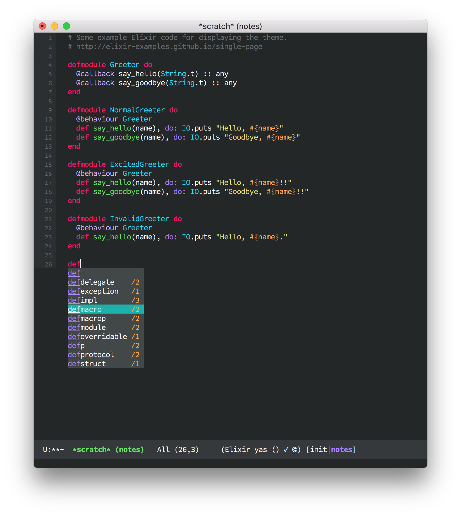
Thanks for the recommendation! going to swap it in as a replacement for Fira Mono for a while, see how it feels.
Re:Go fonts
by vertebrate on Thursday November 17, 2016 @03:47AM
(#12975614)
This is MacOS font rendering for you, in Linux normal weight looks normal
Or rather, in macOS it looks normal and in Linux it looks too thin.
Wow. Gorgeous.
It's a matter of personal opinion of cause, but I find it extremely easy on the eyes. Some one else posted a screenshot with some code displayed using the Go font, and it's extremely readable, to me at least.
I love serifs and haven't found a good monospaced serif font yet. This one looks good but has some minor bugs like spacing and * not being centered vertically for the times you write OCaml or C comments. I'm trying it out anyway because I've been missing serifs in my terminal and editor for too long.
Agree - I find these fonts deeply unpleasant, and would never choose to work with the monospaced option.
Re:Go fonts
by romanovcode on Thursday November 17, 2016 @07:43AM
(#12976914)
Yup. Horrible fonts IMO. I would never, ever work with these.