http://oestrem.com/thingstwice/wp-content/uploads/2007/05/sm...
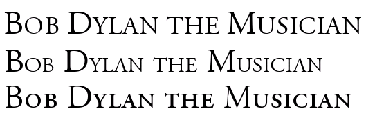
The left hand side of the capital D on the LaTeX output (bottom) looks thinner compared to every other vertical in the sentence. Word (top) clearly doesn't have this problem.
Image editor says the vertical on the B, D, and right hand of M are all 3 px wide for LaTeX.
Writer is 4, 3+2 anti-aliased, and 3+1 anti-aliased (both equating to approximately 4, but the M winds up rendered with a very slight slope.
Word is 4, 4, 3+1 with the same slope issue.
Interestingly, the smallcaps B in LaTex has a wider vertical (4px) where Writer and Word are smaller - 2px and 3px, respectively, after accounting for anti-aliasing.
Yes, but the smaller caps should have thinner lines. Instead the larger font is thinner.
That’s not true. Small caps should be drawn so that their line widths about match those of capitals. They should not just be smaller versions of capitals. Both Word and Writer fake small caps by making capitals slightly smaller. That’s just wrong.
“Instead the larger font is thinner.”
As it can be. The thinnest lines of the capitals should in most cases be thinner than the widest lines of the small caps. That’s just normal.
That's not what's happening here - open up an image editor and measure it: the thickest line of the small caps is thicker than the thickest line of the caps. Only LaTeX has this problem.
Whether you label those techniques as 'fake' or not does not change that LaTeX and/or Metafont's displayed results are poorer than Word and OpenOffice in this aspect.
I also love using LaTeX because I can grab a set of template and style files from whatever publication I might be writing for, and I can be sure that the outcome will be in line with what they were expecting. True, I could also get a Word template, but I've always found that with Word templates I hit backspace at some inopportune location and ruin the layout. "A set of finely tuned defaults" indeed!