Re:UI Design Dos and Don'ts
by Mandatum on Sunday June 14, 2015 @08:32PM
(#9716864)
Do you have a better example? I don't find the select diag's like in Desktop Chrome easier to use especially on a mobile. I think what they've done is better than anything else I've seen. With enough following it'd become the norm like anything else.
[ Parent
| on HN ]
Re:UI Design Dos and Don'ts
by juriansluiman on Monday June 15, 2015 @03:02AM
(#9717918)
Android has a simple calendar which you can swipe to change the month. Click on the year and a year selection is shown.
The time is a clock where you're able to select the hour first and minutes thereafter. This is the most intuitive mobile touch interface I have seen so far, any other is really small, awkward or not mentally easy to comprehend.
Image: https://raw.githubusercontent.com/CiTuX/datetimepicker/maste...
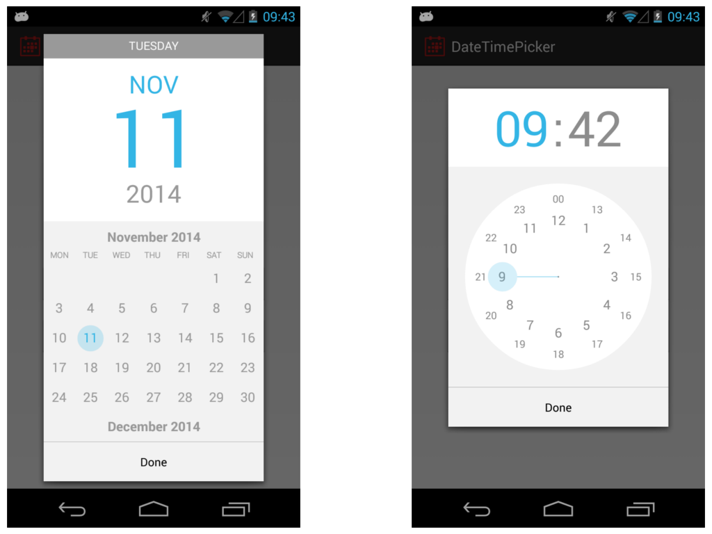
>> "The time is a clock where you're able to select the hour first and minutes thereafter. This is the most intuitive mobile touch interface I have seen so far, any other is really small, awkward or not mentally easy to comprehend."
Really? This is incredibly unintuitive in my opinion. That clock was my biggest annoyance with Android and I always selected the wrong time first go round.
Re:UI Design Dos and Don'ts
by juriansluiman on Monday June 15, 2015 @10:12AM
(#9719339)
I just see it as pointing where I'd like the hands of a clock. The only learning curve I had is the difference between 10:00 and 22:00 (or likewise, between AM and PM).
Re:UI Design Dos and Don'ts
by ilovecomputers on Monday June 15, 2015 @12:29AM
(#9717519)
Cultured Code's date picker for Things has been my favorite: http://culturedcode.cachefly.net/things/videos/things-iphone...
I used gldate picker. http://glad.github.io/glDatePicker/
I find it's familiarity calendar display coupled with iphone friendly format strikes a good balance.
How do I choose a date that's 30 odd years ago - a birthdate for example.
You wouldn't want to do that in Things (it's a todo app) - you're most likely not going past next month, at the most. You're right though - this wouldn't be a good replacement calendar picker for every app.
Re:UI Design Dos and Don'ts
by themartorana on Sunday June 14, 2015 @09:15PM
(#9716973)
I actually wanted to state the same thing the GP did - the date selector is terribad. It was much better before "The Flattening" in iOS 7. IMHO.
I find sometimes I have difficulty understanding where the bounds of the control actually are. That's not good design, and it seems far from obvious.