News for hackers. Stuff that matters.
Re:UI Design Dos and Don'ts by johnnyo on Sunday June 14, 2015 @08:30PM (#9716856)
Agree with these, but in my opinion, the date selector wheels in iOS are a terrible design. Three rolling wheels just doesn't map to most people's concept of a calendar
Re:UI Design Dos and Don'ts by jonahx on Sunday June 14, 2015 @09:19PM (#9716983)
Agree. I would rather try my luck tapping a too-small calendar date as pictured on the right. I'll often get it right the first time, but even accounting for the extra time of an error and a retry (2 extra taps) it will still be faster and less frustrating than setting 4 separate scroll wheels.
Re:UI Design Dos and Don'ts by vbezhenar on Monday June 15, 2015 @06:04AM (#9718428)
What I absolutely hate is minute picker. 60 items is just too much to scroll. For most usages 5 minutes step is enough and 12 items much better.

As for calendar, I never had any problems with it. Of course it's not standard way that most people get used to, but I think any person will understand what to do.

Re:UI Design Dos and Don'ts by b15h0p on Monday June 15, 2015 @06:27AM (#9718499)
A double tap on the minute picker switches between 1- and 5-minute increments, afaik.
Re:UI Design Dos and Don'ts by kagamine on Monday June 15, 2015 @07:01AM (#9718586)
That's a perfect example of "Apple thought of everything" except how well that feature is hidden from the user. I mean, who was the first person to discover that? And I'll bet money it was by accident.
Re:UI Design Dos and Don'ts by tacone on Monday June 15, 2015 @10:13AM (#9719355)
To get simplicity sometimes you have to remove features, sometimes there's no way around it.

When you face the choice, to hide a feature instead of removing it altogether can be a good compromise. So it can be still discovered casually, it can spread by the word of mouth, blog posts, and of course the user manual.

When selecting text, would you, for example, put select-word/select-line buttons everywhere a text can be selected or just let people discover what triple click does?

The topic is debatable, I just wanted to say that this kind of choice does make sense to me, and probably many others.

Re:UI Design Dos and Don'ts by vbezhenar on Monday June 15, 2015 @02:15PM (#9720997)
Works in Calendar but does not work in Alarm clock, so it's not a default behaviour and probably hard-coded into Calendar app.
Re:UI Design Dos and Don'ts by Y-bar on Monday June 15, 2015 @06:21AM (#9718476)
100% in agreement with you. I can't remember the last time I needed to add a time with more granularity than 5 minutes. And the iOS date picker actually [does allow for custom granularity](https://developer.apple.com/library/ios/documentation/UIKit/...) up to 30 minutes.

But I guess there is no easy way to accommodate for both those that do need 1-minute intervals and those who would rather have 5-minute intervals (without adding yet another UI element or yet another setting to toggle).

Re:UI Design Dos and Don'ts by beloch on Monday June 15, 2015 @12:05AM (#9717467)
This is a great example of when it's more important to stick with a familiar interface (i.e. the calendar) than to go with something that is "designed for touch".
Re:UI Design Dos and Don'ts by BillinghamJ on Monday June 15, 2015 @11:46AM (#9720085)
I would wholeheartedly disagree - I think this is a great example of where you should break from common desktop norms and provide something which is easier for a big stubby thumb to use.
Re:UI Design Dos and Don'ts by Mandatum on Sunday June 14, 2015 @08:32PM (#9716864)
Do you have a better example? I don't find the select diag's like in Desktop Chrome easier to use especially on a mobile. I think what they've done is better than anything else I've seen. With enough following it'd become the norm like anything else.
Re:UI Design Dos and Don'ts by juriansluiman on Monday June 15, 2015 @03:02AM (#9717918)
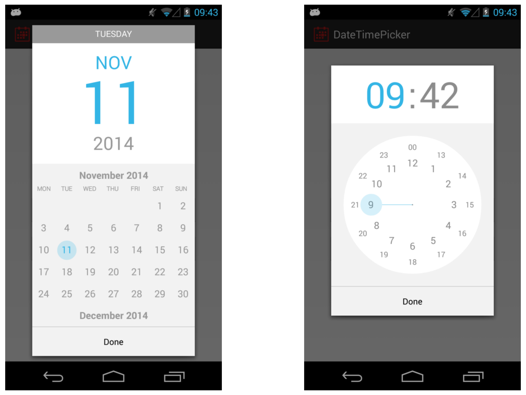
Android has a simple calendar which you can swipe to change the month. Click on the year and a year selection is shown.

The time is a clock where you're able to select the hour first and minutes thereafter. This is the most intuitive mobile touch interface I have seen so far, any other is really small, awkward or not mentally easy to comprehend.

Image: https://raw.githubusercontent.com/CiTuX/datetimepicker/maste...
Re:UI Design Dos and Don'ts by k-mcgrady on Monday June 15, 2015 @09:40AM (#9719178)
>> "The time is a clock where you're able to select the hour first and minutes thereafter. This is the most intuitive mobile touch interface I have seen so far, any other is really small, awkward or not mentally easy to comprehend."

Really? This is incredibly unintuitive in my opinion. That clock was my biggest annoyance with Android and I always selected the wrong time first go round.

Re:UI Design Dos and Don'ts by juriansluiman on Monday June 15, 2015 @10:12AM (#9719339)
I just see it as pointing where I'd like the hands of a clock. The only learning curve I had is the difference between 10:00 and 22:00 (or likewise, between AM and PM).
Re:UI Design Dos and Don'ts by ilovecomputers on Monday June 15, 2015 @12:29AM (#9717519)
Cultured Code's date picker for Things has been my favorite: http://culturedcode.cachefly.net/things/videos/things-iphone...
Re:UI Design Dos and Don'ts by kayman on Monday June 15, 2015 @01:12AM (#9717620)
I used gldate picker. http://glad.github.io/glDatePicker/

I find it's familiarity calendar display coupled with iphone friendly format strikes a good balance.

Re:UI Design Dos and Don'ts by afro88 on Monday June 15, 2015 @01:21AM (#9717646)
How do I choose a date that's 30 odd years ago - a birthdate for example.
Re:UI Design Dos and Don'ts by kaolinite on Monday June 15, 2015 @03:14AM (#9717946)
You wouldn't want to do that in Things (it's a todo app) - you're most likely not going past next month, at the most. You're right though - this wouldn't be a good replacement calendar picker for every app.
Re:UI Design Dos and Don'ts by themartorana on Sunday June 14, 2015 @09:15PM (#9716973)
I actually wanted to state the same thing the GP did - the date selector is terribad. It was much better before "The Flattening" in iOS 7. IMHO.

I find sometimes I have difficulty understanding where the bounds of the control actually are. That's not good design, and it seems far from obvious.

Re:UI Design Dos and Don'ts by bananaboy on Sunday June 14, 2015 @09:36PM (#9717041)
Yeah I agree, the date and time selector was MUCH better before the flattening!
Re:UI Design Dos and Don'ts by k-mcgrady on Monday June 15, 2015 @09:38AM (#9719171)
Personally I love them. I hate when apps put in their own calendar control. It's always more time consuming to get where I want whereas with the wheel I can quickly spin it to move to where I want quickly.