News for hackers. Stuff that matters.
Re:Ubuntu 9.10 Karmic Koala released by ivenkys on Thursday October 29, 2009 @03:17PM (#910645)
Its all well and good for Ubuntu to push further ahead but they would do a real big favor to the push of Linux on the Desktop if they could solve 1 major issue , remove the ugliness in the default rendering of the Fonts. Yes, i know it can be done via a bazillion font config options and yes its very powerful and flexible, but lets get it right by default.
Re:Ubuntu 9.10 Karmic Koala released by spamizbad on Thursday October 29, 2009 @04:11PM (#910780)
Basically, here's what's going on:

1) There aren't many free typefaces for daily use that are beautiful, so you have to buy (or commission) several and "open source" them.

2) Techniques for AA font rendering that maximize aesthetics and readability are protected by numerous software patents. Years ago there was a short-lived patch in Xorg that had a modern font-AA algorithm that held its own against the competition, but it turned out to step on several patents so it was axed out of fear of litigation. That fear is very real, as typography-related tech patents are one of the most aggressively guarded elements of tech-IP.

As a result, the Linux developers have been forced to re-invent the wheel from the ground up when it comes to typography in Linux distributions.

Re:Ubuntu 9.10 Karmic Koala released by ZeroGravitas on Friday October 30, 2009 @04:01AM (#911694)
I'm fairly certain that this is a common misconception, which was true at one point in time but no longer applies but I'm not really expert enough (in fonts or Linux) to sound confident in that.

Basically, my take is that you need the fancy expensive typefaces and the patented hinting if you want type to look really good at small sizes and without anti-aliasing i.e. Windows before cleartype or Macs before OS X.

The vast majority of people don't want that, they want OS X style rendering, particularly if their monitor is 95dpi or up. Admittedly there are a vocal minority of geeks that grew up with the former type of font rendering, but even they seem to limit this preference to coding fonts and even they seem to be leaving this behind as dpis go up.

If you want OS X rendering on Linux you can have it today, without patented code, or the need for meticusously hinted fonts (which makes them much easier to produce as open source).

It basically involves going into the advanced Gnome font controls turning off all hinting. Voila! "Blurry" Mac OS X style font rendering. You can add sub-pixel rendering to taste.

You can also make it look like XP, which I personally think is a bit retrograde and ironically this does require well-hinted fonts (like Microsoft's) and patented code.

There's a how-to here: http://www.sharpfonts.com/

Re:Ubuntu 9.10 Karmic Koala released by rms on Thursday October 29, 2009 @04:32PM (#910839)
Is there source code out there for a patent infringing Ubuntu font fix?
Re:Ubuntu 9.10 Karmic Koala released by blasdel on Friday October 30, 2009 @12:40PM (#912288)
Yes, it's a part of Freetype, Ubuntu just doesn't enable it at compile-time.

  In include/freetype/config/ftoption.h:
    enable  FT_CONFIG_OPTION_SUBPIXEL_RENDERING
    enable  TT_CONFIG_OPTION_BYTECODE_INTERPRETER
    disable TT_CONFIG_OPTION_UNPATENTED_HINTING
Even under the most anal-retentive freetard fealty to Intellectual Property Law, distribution of C source code cannot infringe upon patents, only distribution of compiled binaries. It's the difference between promulgating plans for the machine (the original point of patents) and capitalizing on said plans.

Gentoo is the only distro I know of that has it turned on by default.

Re:Ubuntu 9.10 Karmic Koala released by ivenkys on Thursday October 29, 2009 @04:49PM (#910877)
All true.

Ubuntu's avowed mission is to bring Linux to the Masses. For the masses, a computer still "looks" like Windows. Ubuntu being a Funded initiative unlike Arch(my choice), Gentoo, Crunchbang et all needs to fund the development of typography on Linux.

Yes, its possible to download msttcorefonts (with some creativity you could also get the Consolas set of fonts) and get Cleartype or Os X type smoothing - but as long as its not the default , i am afraid there is no pushing Linux onto the masses.

Re:Ubuntu 9.10 Karmic Koala released by chancho on Thursday October 29, 2009 @10:31PM (#911410)
I think you overestimate how closely "the masses" pay attention to fonts. (Unless you're talking about "the masses" of programmers and designers, which actually is still a healthy chunk of Ubuntu's potential market at this point.) Yeah ok the hinting isn't so great and Bitstream Vera Sans is a little too wide but it's not THAT bad.
Re:Ubuntu 9.10 Karmic Koala released by ivenkys on Friday October 30, 2009 @04:26AM (#911705)
I should have been clearer - most programmers i know are happy to try out the various font customization techniques and some of them accept it even - by "masses" i meant the large number of people who have used a computer(primarily Windows) before and are willing to give Ubuntu a try, but they do not want or know how-to fiddle with font customizations. This group of people is the natural customer for Ubuntu and i believe the vast majority of them go back to their previous O.S simply because the default fonts for them are not Windows-like. My point is Ubuntu would better serve its "natural customer" by focussing on making the O.S look good for this group of people i.e. look Windows-like by default, rather than other newer features.
Re:Ubuntu 9.10 Karmic Koala released by viraptor on Friday October 30, 2009 @06:03AM (#911792)
The masses still use Comic Sans for presentations. They don't really know or care what that serif/sans business is all about and they definitely don't care about the default font. As bad as it is, that's what I see all around.

But I'm not sure what is the problem with font customisation you're referring to. There's a dialog with 4 basic choices (from "blurry" to "crisp, subpixel) and another dialog for fine tuning where you see examples for every single option. How can it be simpler?

Re:Ubuntu 9.10 Karmic Koala released by billybob on Friday October 30, 2009 @11:31AM (#912163)
Just because people don't know anything about fonts doesn't mean they don't recognize when something looks nice.
Re:Ubuntu 9.10 Karmic Koala released by martey on Friday October 30, 2009 @06:29AM (#911815)
A lot of information surrounding #2 is discussed at http://david.freetype.org/cleartype-patents.html
Re:Ubuntu 9.10 Karmic Koala released by ZeroGravitas on Friday October 30, 2009 @08:58AM (#911931)
I thought the patent issues were mostly about these older Apple patents:

http://www.freetype.org/patents.html

I'd not heard about these subpixel patents, but I'd be happy to have them removed from Linux as I honestly don't think they add that much in Mac OS X style font presentation, as opposed to Windows Cleartype style.

Re:Ubuntu 9.10 Karmic Koala released by daleharvey on Thursday October 29, 2009 @03:25PM (#910659)
I replied to someone else with the same issue, font rendering has always been by far the best with ubuntu for me than anything else

http://junk.arandomurl.com/type.jpg

all default installs, ill reply in 10 minutes or something confirming which is which

Re:Ubuntu 9.10 Karmic Koala released by rms on Thursday October 29, 2009 @04:28PM (#910825)
I personally greatly prefer Windows style font rendering (presumably #2). Fortunately Ubuntu is flexible enough that I can configure it for Windows style font smoothing.
Re:Ubuntu 9.10 Karmic Koala released by bd on Thursday October 29, 2009 @05:19PM (#910944)
For better comparison, here is Windows with ClearType switched on (#2):

http://alteredqualia.com/visualization/hn/font-cleartype.png

Re:Ubuntu 9.10 Karmic Koala released by aarongough on Thursday October 29, 2009 @03:33PM (#910674)
1) OS X

2) Windows (XP I think...)

3) Ubuntu

I may have transposed OS X and Ubuntu though...

Re:Ubuntu 9.10 Karmic Koala released by f00 on Thursday October 29, 2009 @04:41PM (#910856)
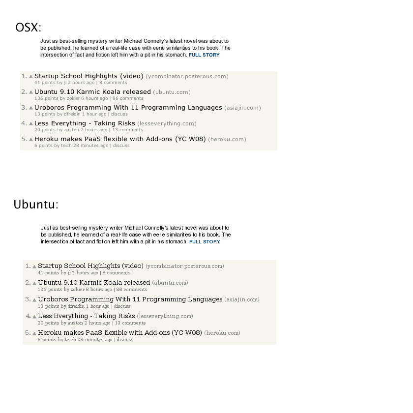
1) OS X. A tad fuzzy, but everything is rendered _accurately_. Consistent thickness and character tracking (spacing).

2) Windows. Everything is slammed into pixel boundaries, making it look clean. Verdana is optimized for this style of rendering, so it doesn't look terrible.. but it's definitely not accurate.

3) Ubuntu. Worst of both worlds. Fuzzy and inaccurate.

Re:Ubuntu 9.10 Karmic Koala released by daleharvey on Thursday October 29, 2009 @05:10PM (#910932)
I am honestly having a hard time believing someone with decent eyesite can say ubuntu(3) is fuzzy while osx(1) is not,

ubuntu obviously chooses sharpness over balance (H and E), however osx has virtually every lowercase character heavily aliased, its blurry to the point where its almost 2 shades lighter than its supposed to be and there are individual characters A, u, B, a where it is almost a joke

Re:Ubuntu 9.10 Karmic Koala released by f00 on Thursday October 29, 2009 @06:04PM (#911031)
I absolutely admit that OS X has a somewhat fuzzy appearance, particularly at small point sizes. This gets exaggerated with the MS Core/Web fonts, which were designed for the screen (stems that line up with pixel boundaries, etc), and have hinting that is specifically designed to be compatible with MS ClearType.

Ubuntu has similar (but not exactly the same) levels of fuzziness, but the rendering is inaccurate. Character tracking/spacing is the biggest issue, but there are others.

If you look at traditional fonts that are designed for print or general purpose use (e.g. Helvetica, Frutiger, Univers, Myriad, etc.), the accuracy and quality of OS X rendering stands out considerably. There is simply no comparison.. and once you get used to it, the small amount of "fuzziness" that you observe in small point sizes just doesn't bother you anymore.

Re:Ubuntu 9.10 Karmic Koala released by daleharvey on Friday October 30, 2009 @04:56AM (#911733)
its kerning not tracking, and its only off in a few minor places (for the same reason the midline is off in H E), in those paragraphs I can find around the same mistakes from both the renders around the kerning (both make pretty identical errors)

I use osx every day, I am very used to it, I just prefer ubuntus rendering by quite a long way

Re:Ubuntu 9.10 Karmic Koala released by cma on Thursday October 29, 2009 @06:06PM (#911034)
OS X has the glyphs clipped to an imaginary sub-screen-resolution grid. The same letter may in some instances take up one black pixel and in others take up two (and be greyish in both). That's what he meant by accuracy. On linux every identical glyph is rendered identically, no matter where it is positioned.
Re:Ubuntu 9.10 Karmic Koala released by rms on Friday October 30, 2009 @01:37AM (#911581)
That's funny, I didn't know Verdana was optimized for that type of rendering.

I use Ubuntu configured to use Windows style hinting without sub-pixel smoothing, and I have absolutely every font forced to Verdana. I'm glad that there is accidentally a little bit of logic behind my choice.

Re:Ubuntu 9.10 Karmic Koala released by rufugee on Thursday October 29, 2009 @03:34PM (#910676)
How long has it been since you looked at Ubuntu's fonts? I use both OS X and Ubuntu, and Ubuntu is at least equal to OS X these days IMO.
Re:Ubuntu 9.10 Karmic Koala released by f00 on Thursday October 29, 2009 @04:31PM (#910837)
Run, don't walk, to your nearest optometrist and get your eyes checked.

Ubuntu and OS X are not even remotely comparable from a typography standpoint. Using Freetype (the Linux/X11 lib for font rendering), tracking and stem thickness is inconsistent, ascenders and descenders get cut off, etc.

The Freetype team puts forth a valiant effort, but until they're allowed to use Adobe/Apple/etc.'s patented hinting algorithms, there's no comparison.
Re:Ubuntu 9.10 Karmic Koala released by rbanffy on Friday October 30, 2009 @08:44AM (#911916)
Interestingly enough, they probably are allowed to use those in my country ;-)
Re:Ubuntu 9.10 Karmic Koala released by jsz0 on Thursday October 29, 2009 @04:23PM (#910814)
Re:Ubuntu 9.10 Karmic Koala released by grandalf on Thursday October 29, 2009 @04:36PM (#910845)
I'm using Ubuntu and my screen looks like the OSX screen in the picture. The default ubuntu install comes with only free fonts, and clearly HN has been designed to look best with non free. All that is required to make both look the same is to type:

sudo aptitude install ttf-mscorefonts-installer

Re:Ubuntu 9.10 Karmic Koala released by ZeroGravitas on Friday October 30, 2009 @08:56AM (#911928)
I don't install the microsoft fonts and still HN looks like much more like the Mac OS X example for me on Ubuntu 9.10 with Chromium and Firefox.
Re:Ubuntu 9.10 Karmic Koala released by nuclear_eclipse on Thursday October 29, 2009 @04:34PM (#910843)
Just tell Ubuntu/Gnome to use the DejaVu fonts by default. They are much nicer looking than the "standard" fonts. Also, `aptitude install ttf-mscorefonts-installer` goes a long way towards making the web look nicer, as does changing Firefox's default font selections.

And yes, I wish Ubuntu would at least make DejaVu the defaults for everything out of the box.

Re:Ubuntu 9.10 Karmic Koala released by avdi on Friday October 30, 2009 @06:41AM (#911821)
I'm using Ubuntu and my fonts look nothing like that. And no, I don't use the Microsoft fonts. Something's messed up on that machine.
Re:Ubuntu 9.10 Karmic Koala released by f00 on Thursday October 29, 2009 @04:37PM (#910846)
Being fair to the parent, you don't seem to have the MS web fonts installed on Ubuntu, so the two OSes are rendering different fonts.

Still.. even if you do install the right fonts, the results will be the same.

Re:Ubuntu 9.10 Karmic Koala released by pbhjpbhj on Thursday October 29, 2009 @08:45PM (#911273)
They look like different fonts and different weights (heavier fonts, emboldened, are more readable at smaller sizes). Both look ugly OSX ones are too ragged, Ubuntu are too sharp. Is it the exact same font being rendered by the different engines??
Re:Ubuntu 9.10 Karmic Koala released by chanux on Thursday October 29, 2009 @09:46PM (#911352)
Well.. Ubuntu Font rendering was way better than XP (for me). I never used any windows version after that.

But now I'm pretty sure that no operating system can beat my Ubuntu system in font rendering. maybe after this little hack. http://rewind.themasterplan.in/2007/07/15/sexy-smooth-fonts-...