Usually when there's no screenshot or video for GUI apps I assume it's because the creator is not proud of it, so a sign that the UI will be shit.
I'm into rockets, and clicked the link earlier today. I shared the suggestor's view, but didn't bother to post. I came back now, saw the comment thread had updated significantly, noticed that OP had addressed the suggestion, clicked again -- and noticed, hey wow, there are cool screenshots now, these are a lot more interesting, this is better than I thought!
A short looping video of the software in action might also be good. But a lot more effort.
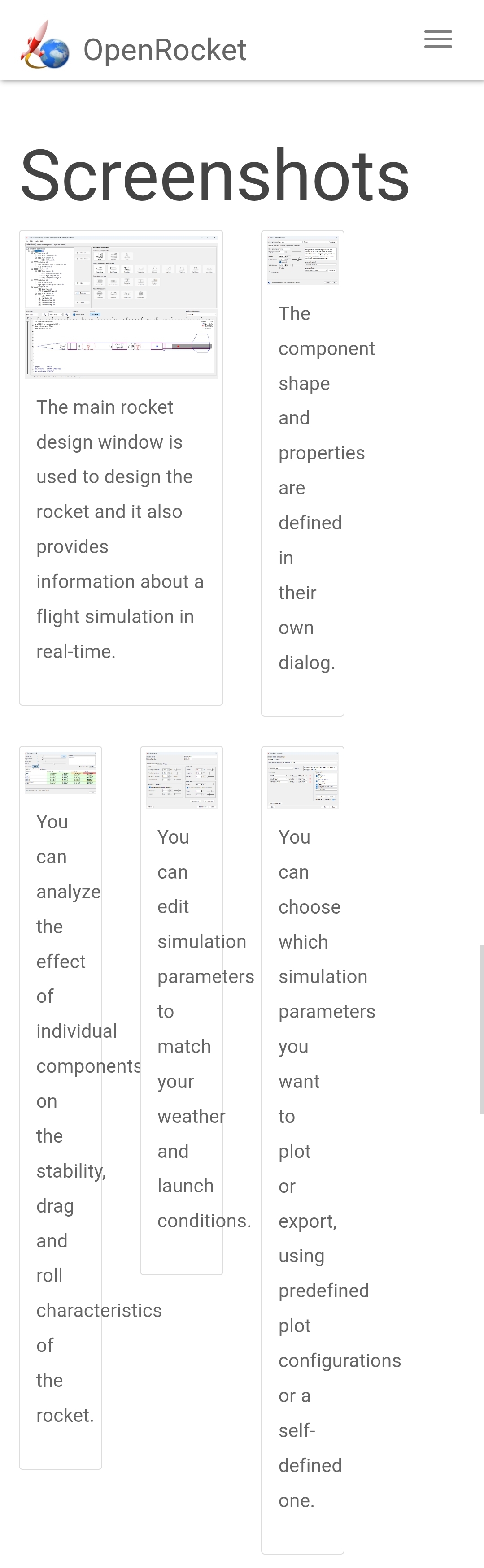
> on the home page
and I meant it
If anyone is curious of what I expect (in page order top to bottom)
Screenshot of complete product ui with description (showing complete UI)
Button to the download/buy product.
Header/tagline description of feature below:
Screenshot of individual parts of the UI (These are more often then not videos these days/gifs). Description of these screenshots
Buttons to expand to another page to learn more.
Bluntly, Just copy what other companies are doing. They are doing it because it works.
Example
I know you want to tell us all about the amazing (sincerely!) stuff under the hood, but to users, the interface is the product.