Re:Adobe's Source Code Pro Font
by ggchappell on Sunday October 07, 2012 @03:26PM
(#4624133)
It's good, but I'd say it's short of perfect due to the similarity of the "1" [one] and "l" [lower-case ell]. Inconsolata-g fixed this, but in a strange way (taking the lower serif off the "1" [one]).
[ Parent
| on HN ]
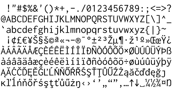
The 1 in Inconsolata does not have the serif either, and it hasn't for a while I think: http://levien.com/type/myfonts/incoshow.png
Re:Adobe's Source Code Pro Font
by ggchappell on Sunday October 07, 2012 @05:30PM
(#4624520)
Yes, you're right. I was looking at an old version. That change definitely improves the font, but it's still an odd solution, IMHO.
the top serif is also angled downward on the 'one'.
here's a preview of Inconsolata-g at high res (~100kB)