Re:Adobe's Source Code Pro Font
by joshkaufman on Sunday October 07, 2012 @12:45PM
(#4623666)
I'm a huge fan of Inconsolata. There's a variant called Inconsolata-g that's even better: http://leonardo-m.livejournal.com/77079.html
Thanks for that! This font looks gorgeous in Terminal. I was just struggling 2 days ago to find a better font because I was fed up with the system defaults.
me 2.
Been using it in the recent years.
I love Inconsolata as well -- it's the only font on OS X that comes close to Consolas on Windows. For some reason though IntelliJ cannot render it well at all, so I've resorted to using Droid Sans Mono [1], which is awesome as well.
[1]: http://www.google.com/webfonts/specimen/Droid+Sans+Mono
Re:Adobe's Source Code Pro Font
by ggchappell on Sunday October 07, 2012 @03:26PM
(#4624133)
It's good, but I'd say it's short of perfect due to the similarity of the "1" [one] and "l" [lower-case ell]. Inconsolata-g fixed this, but in a strange way (taking the lower serif off the "1" [one]).
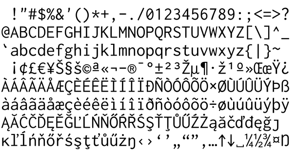
The 1 in Inconsolata does not have the serif either, and it hasn't for a while I think: http://levien.com/type/myfonts/incoshow.png
Re:Adobe's Source Code Pro Font
by ggchappell on Sunday October 07, 2012 @05:30PM
(#4624520)
Yes, you're right. I was looking at an old version. That change definitely improves the font, but it's still an odd solution, IMHO.
the top serif is also angled downward on the 'one'.
here's a preview of Inconsolata-g at high res (~100kB)
Where?
For those who miss Greek characters, here's an Inconsolata variant that has them as well: http://www.cosmix.org/software/
Re:Adobe's Source Code Pro Font
by jamesaguilar on Monday October 08, 2012 @02:36AM
(#4625752)
The big trouble with Inconsolata for me is the lack of a bold weight. This means it doesn't work in emacs if you use bold with your font lock mode.
http://levien.com/type/myfonts/inconsolata.html