It wouldn't be fair to use "MENU", as not everyone speaks English, and regardless, many UIs aesthetically need an icon, so why not have standardized on one?
It's healthy to have decided on an icon, but I agree an ellipsis would've been (and still would be) intuitive too. Maybe designers trying to make their mark will start using ellipses in new designs... who knows.
In terms of using MENU, if your audience is not English speaking then you can, and should, consider adding internationalisation and localisation as an alternative. If you have considered it for your content, it makes sense to consider it for your UI as well.
Heck, even when I have splayed out all the most-important options across the screen... where do I put the /rest/ of the menu options? in an "other" menu, likely drawn with 3 horizontal lines.
> it's the disorganization
A restaurant menu contains hamburgers, hotdogs, meatballs. A UI menu is represented by abstract icons of the items contained within a restaurant menu.
Now I am starting to like the hamburger menu after all… perhaps more as satire though. :)
For what it’s worth, ellipsis is the best of the bunch, because it means the same thing as in the written language, and is concise enough to use as a button that suggests what the action does.
Screens, somewhat counterintuitively, used to be wider. Because they were not on handheld mobile devices. Then we had the menubar and nested dropdowns, suckerfish, etc. It was an exciting time to see a menu, you were never quite sure what you were going to get - I believe there are positives to learning curves for power users.
But I digress. 三 means 3 in Chinese. It doesn't take cognitive load. Why does a hamburger? I really am curious.
Menu Settings Notepad
If these are actionable buttons, the message is encoded and decoded by viewers.
Three bars means what, exactly? There’s the cognitive load.
This was true early on when it was not a common convention, or only used in mobile apps. Now, it is nearly universal, though still not nearly standard enough in placement or presentation.
If we were to redo history, it would've been great to see an expanding menu closely positioned by a top-left logo. Sort of like a Windows Start Menu for each website.
However, it stands that language is more specific and unambiguous—thus better suited to communicate an action.
There’s also the problem of the plethora of OTHER icons which use horizontal bars to cause even more cognitive load.
And then, there are many people who have not learned hamburger menu since childhood, and thus the burden is even greater!
People have no inate understanding of 'menu'. We don't even read short words like that letter by letter, it's read as a block and is far more complex than three bars.
And if we want to focus on just three bars let's not leave out the skeuomorphism trend where three bars meant the "grip" area, something to use to rearrange items or windows.
This is true. It means "exactly the same" where it was used millions of times before it landed on a computer: https://en.wikipedia.org/wiki/Triple_bar
"Menu" has a consistent meaning (a list of items to choose from) which most people can be assumed to know. Icons aren't as easily parsed and take more of a mental load to reason about them. Or just trial and error to figure them out.
In contrast, some people can't not-read something and it being a button is automatically parsed out. Symbols and icons have to be learned which is a more gradual process. The other day I didn't recognize the flower icon for settings.
The what now? When did they stop using gears for settings?
Pretty much this...
https://www.dreamstime.com/daisy-flower-outline-icon-white-f...
I'm still considering stealing the idea. If you put a daisy in the top corner others will get to experience the same.
Ah yes, this...
https://www.dreamstime.com/white-daisy-chamomile-smiling-fac...
I'm onto something here...
https://www.vecteezy.com/png/11017932-cute-burger-cartoon-il...
It's barely tolerable in situations where screen space is at a premium, but it's still pretty awful.
> Its growing ubiquity helped standardize its meaning: Through repeated exposure, users learned to recognize and interpret the icon with increasing confidence.
Sure: it's the symbol of the "junk drawer" of the UI. Who knows what random assortment lurks in there? It's a place you go only as a last resort.
Mobile users?
Mobile UI design isn't about making things more understandable, it's about getting the user into a helpless and suggestible state so your ad impressions are worth more.
Common User Access (CUA) is a standard for user interfaces developed by IBM to provide consistency across operating systems and computer programs.
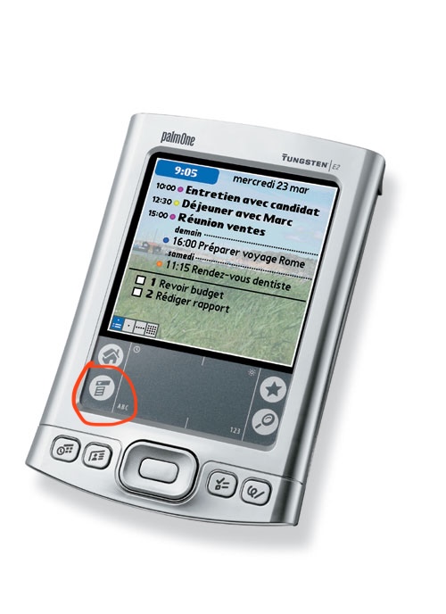
The menu itself also tends to be a "grab bag" of multiple otherwise unconnected things, increasing the effort required to figure out how to do something.
Apps with hamburger menus also tend to have navigation that’s otherwise not well though out, think burying options in chains of modals where the paths to those options change whenever the app’s dev decides it wants to push a different feature/metric.
It’s plenty doable, but like I said it takes some sitting down and planning and perhaps more importantly, design centered around the user and their needs and less around looking pretty in a slideshow or trying herd the user around.
The hamburger is basically all of that rolled into one button. It's pretty abstract, you never know what's behind it and when they get fancy with animations and swipe gestures, it's almost always a failure.
I know it's a convenient way to clean up a screen, but the content in that menu needs to be absolutely optional for it to work.
I regularly use a piece of software from IBM that has (this won't surprise you) an awful UI. There are not one but TWO hamburger menus, hidden amongst a bunch of text menu headings, and figuring out where the one you want is can be noticeably taxing. Explaining to another user where to click is even worse - "No, not that one, the one under the... to the right..."
Also as an example, three horizontal lines also sometimes get used as grips to indicate an element can be click-dragged around. It is less common than it used to be, though.
In addition the three bars are as mundane of a composition as you can get, so it doesn’t capture the eye well to begin with. Typically the eye gets pulled to more visually complexity.
But ultimately it boils down to the decoding idea—language is the ultimate “codec” of human communication.
Written words have a "voice" - that part of your mind that recognizes something spoken. Hamburger menu icons don't have that, nor do they have the higher contrast or complexity that emoji have.
Nothing about the food suggests its function. And the function varies, it might be a whole rabbit-warren of menus and options. It might be a bunch of actions. It might just be one last item that wouldn't fit on the screen. It's an awful graphic for an awful concept. "We ran out of UI ideas so we just shoveled what was left into this junk drawer" is no way to go through life.
Also, it used to be important when screens were nowhere near as wide but now there’s no longer any reason to use it the way it is.
Perhaps it is permissible on a busy UI with many buttons, but that job was taken by the ellipses, which also takes less cognitive burden!