News for hackers. Stuff that matters.
Re:Apple introduces a universal design across platforms by gherkinnn on Monday June 09, 2025 @02:18PM (#44227450)
https://www.lux.camera/physicality-the-new-age-of-ui/

This blog's prediction got remarkably close. I've been a sucker for glass UI since the first Longhorn (later Vista) screenshots.

Re:Apple introduces a universal design across platforms by dmix on Monday June 09, 2025 @02:45PM (#44227797)
I figured out why I don't like the icons

https://www.lux.camera/content/images/size/w2400/2025/05/Mai...
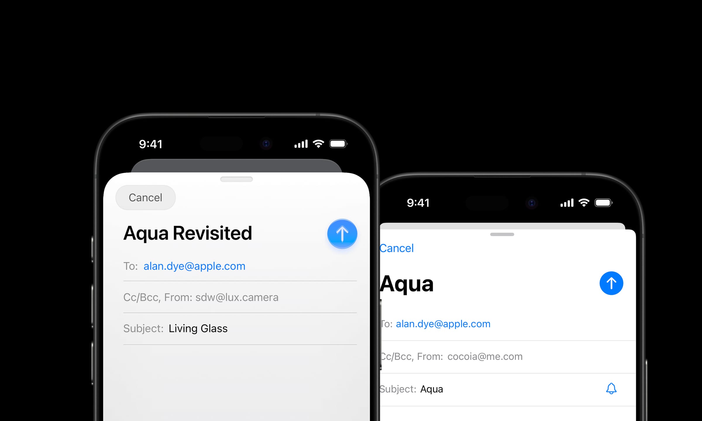
zoomed out they look blurry and unrefined, but when viewed zoomed in and large (like how a designer probably created them) they look kinda nice. Too bad they will all be small on iphone.

Re:Apple introduces a universal design across platforms by wmeredith on Monday June 09, 2025 @02:49PM (#44227879)
I find the assumption that these icons were designed huge and never tested at smaller sizes kind of baffling. There may be a difference in taste, but to think that Apple wouldn't look at their icons at different sizes is really, uh, something.
Re:Apple introduces a universal design across platforms by JadeNB on Monday June 09, 2025 @03:34PM (#44228457)
I think your parent said that they look good at some sizes and bad at others, and pointed out that this could be explained by their only being tested at the larger sizes, but didn't say that they necessarily believed that's what happened. The alternative, "tested but don't care," may be worse. (Or maybe you're disagreeing with the aesthetic judgment?)
Re:Apple introduces a universal design across platforms by dmix on Monday June 09, 2025 @05:20PM (#44229637)
Fair enough. I should wait to test it on iphone. Although sometimes concept ideas get mandated from above and the designers are left to figure it out the best they can.
Re:Apple introduces a universal design across platforms by marcelroed on Tuesday June 10, 2025 @11:53AM (#44238330)
After trying this out on my iphone, I can say your conclusion is exactly correct. The icons look subtly out of focus in a way that's quite unsettling.
Re:Apple introduces a universal design across platforms by dmix on Tuesday June 10, 2025 @07:55PM (#44242812)
Same, I do enjoy the glass stuff in the beta for most cases but the icons are a major regression.
Re:Apple introduces a universal design across platforms by 2d8a875f-39a2-4 on Tuesday June 10, 2025 @02:49AM (#44233467)
I mean, that just blog sums up the whole attitude issue here.

"It’s an exciting time to be a designer on iOS. My professional universe is trembling and rumbling with a deep sense of mystery."

This person is excited that their job designing iOS apps will be more interesting (and the prospect of plenty of work in the pipeline doesn't hurt either).

Fuck the end users who need to adapt to this needless change, suffer newly slow devices or invest in new ones, and put up with a hodge-podge of different UIs. Fuck the orgs who need to fund all this rework if they want their app on new devices. Fuck the waste of energy spent in the extra client-side cycles rendering all the needless new bling.

Re:Apple introduces a universal design across platforms by gherkinnn on Tuesday June 10, 2025 @03:52AM (#44233884)
Indeed. This attitude is found throughout the tech industry. It stinks from a product manager's spreadsheets down to the infrastructure that runs it all. The design is just what is immediately obvious.

In this case I am lucky, as I find glassy UIs visually appealing.