Re:Atkinson Hyperlegible Font
by zamalek on Wednesday September 18, 2024 @04:04PM
(#41584802)
I really like the aesthetics of Iosevka, but the glyphs are really narrow - resulting in severe readability problems for me (I'm diagnosed dyslexic).
[ Parent
| on HN ]
Re:Atkinson Hyperlegible Font
by AndyKluger on Wednesday September 18, 2024 @10:30PM
(#41587892)
You can configure your build to be wider than default. In order of increasing width:
- semi-extended
- extended
- extra-extended
- ultra-extended
I think by default the extended variant is included in most builds anyway, if you want to try it.
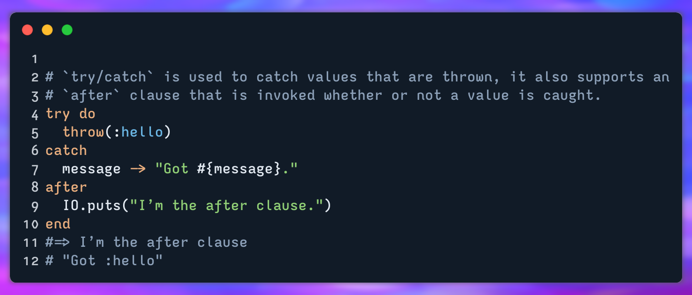
FWIW here's a sample of my usual build's extended variant: https://cdn.imgchest.com/files/b49zcjd53oy.png
Re:Atkinson Hyperlegible Font
by AndyKluger on Thursday September 19, 2024 @12:14PM
(#41593396)
I'll add that https://github.com/0xType/0xProto is worth checking out, if you haven't. What mono (and proportional) fonts do you find work best for you?
* MonoLisa was pretty good, minus the cursive. As a late/16yo diagnosis under a British curriculum, I cannot express in words just how hostile cursive is. Its continued use in society is an embarrassment /rant
* Intel Commit.
* I am currently using Maple Mono.