it's not "grey box", it's "uses the native theme of the user's desktop". e.g. I use strawberry music player, if I am on a computer with a dark theme it's dark.
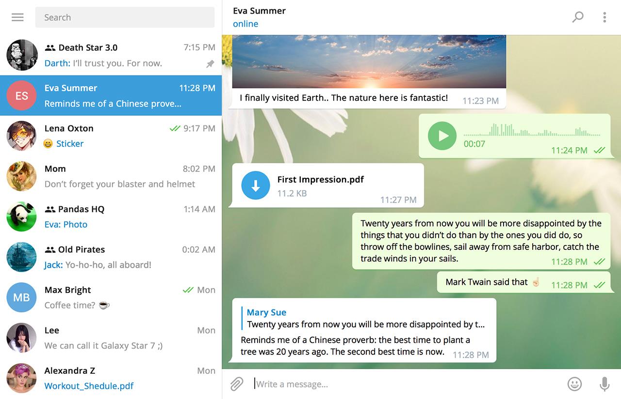
Qt definitely allows slack-like look though if the developer opts-in to it - e.g. Telegram Desktop (https://cdn2.nextinpact.com/images/bd/news/163843.jpeg) is made with Qt Widgets.
Ripcord is another Qt app which is a discord / slack client made by a single guy, which goes more for the native look'n'feel : https://cancel.fm/ripcord/
(contrast this with slack needing dozens of developers and being at their third rewrite of the app because of performance issue :-))
In the end I don't care how it's done as long as it works fine (which it does).
Telegram uses this non-native visual language which is very common in electron apps.
As a backend dev, I find that the most annoying part. I don't want free-form; I want something I can put together in a few minutes without having to think about design and it still having it look acceptable on the platform I deploy it on. On the web I can do that with bootstrap (and it's 100.000s of themes), native I can do this with the native libraries but in the html5-for-desktop-apps space it seems I have to spend time on doing stuff I don't want to do or even care about to make it look anything different than vomit; that is simply not worth the time. I know that is very different from your use-case, so not saying you are wrong or anything, just that this is what annoys me about html/css. I think there would be a market for 'electron desktop themes' like (1) (basically unsupported now) but seems there is not (or no-one finds it necessary anyway; maybe i'm the only one with this 'issue', well, me and all my colleagues that is).
That aside, if the rest of my OS has a "grey boxes" look, I would like my software to have a "grey boxes" look.
Sure, your design may be pretty, but if it looks and works completely differently to my other applications and the OS itself, I consider that a pretty huge point against it.
One can preach about "brand identity" the whole day, but as a user, I couldn't care less about your brand. Integrate or die!
While i otherwise agree with you, the "die" part requires users to value such integration and they do not seem to be doing that enough.
Your examples of boring native UI is the result of developers that don’t bother to exploit these features for whatever reasons- probably because it can be extremely time consuming to build native custom UI and adds mental overhead unless one has/is a dedicated designer/artist.
I’m not sure which part of the Slack UI you believe can’t be done natively? Flat colors or the revealing menu?
Take for example that "Jump to" text box - if your native UI toolkit doesn't let you add icons into the placeholder text like that (does it even have placeholder text natively?), you'll have to deal with drawing offsets, caret position, or possibly nested components, overriding focus outline, in the worst case resizing the stuff when focused, and other stuff that makes the whole endeavor not worth it due to the added complexity (assuming that text box works how I think it works, I haven't used Slack in a while).
And I don’t think it’s quite as hard as you describe natively, at least on AppKit/UIKit, windows, and android.
It would still look mostly native (even though it's clearly not a native control), be very performant and use a tiny amount of memory.
In 90s this was solved by using "skins" which were actually drawn in graphics programs and then spliced and edited in some proprietary editor and/or positioned by hand crafted config file.
See https://winampheritage.com/skin for example. You can't go more original than these. :-D
I don't see a point why you would need web library for this.
Doesn’t mean you need electron to fix it, it can be done with a native UI. But bitmapped skins are generally not used anymore for a reason.
Yes, but with what price?
We (people outside of Microsoft, Apple and Google) cannot afford UIs nailed down to pixel grids and particular trends.
Years ago it was Skeumorphism, then it was flat UI as Metro, today people started speaking about Skeumorphism again. CSS is just a convenient tool to follow the trends.
And "yes" it "doesn’t mean you need electron" as there are other options :)
Take Sciter and forget about UI problems and "resource hogs" for years to come. HTML/CSS will be with us together with the Internet. And so are UI developers that can take care about it. And C++ developers in case you will need to fix something critical inside the Sciter.
The slack UI is a counter-example of a good UI. It's confusing, it's unpredictable, it's inaccessible. They made the application look like a fancy website instead of an application. That's a bad thing, not a good thing. There should be no attempt to replicate it. Using it as a benchmark to evaluate how flexible a UI framework is a non-starter.
Also, it's more like 200 MB on my computer, most of which is predictably CEF. In comparison bundling Qt dlls would also add like 50MB if I remember correctly.
Unfortunately iirc the neat dynamically generated playlist stuff isn't supported because it's not exposed properly through their APIs. Certainly when I tried to use Spotify's own libspotify its functionality was crippled to static playlist management, searching for stuff, and playback. despotify was in a similar state at the time.
Also - Spotify sucks HARD at doing all the stuff it does, and I blame this entirely on the UI implementation. The service, I love. The apps, I have become to loathe. They used to be nice and quick and responsive. Now? It can't even get shuffle right!! My mid tier smartphone takes 10 minutes to load search results or my own playlists sometimes; something i've encountered across multiple devices. The desktop app crawls on my 24gb 8-core workstation.
Conversely, I can have a 200gb library of music loaded into mpd or foobar2000 or vlc in all sorts of exotic (and higher bitrate) formats and from weird and wonderful local and remote storage and play it all on shuffle and have all the albumart showing and it organised neatly into a searchable library via the id3 tags and have volume normalized with replaygain and it'll do it in under 20mb and has been doing so for a decade.........
https://i.imgur.com/K44tJ2Y.png
Lots of native UIs (especially from the past) tend to all have the same "grey boxes" look. I don't see how that's universally better.
Another example was this part of Slack UI https://i.imgur.com/O71fdP5.png - how would you even do something like that with a typical native library? It would certainly take a lot more effort if you had to build that from a limited set of pre-existing components, instead of relying on the more free-form "rectangles and text" building blocks of the web.