http://www.amazon.com/Non-Designers-Design-Book-Typographic-...
It's a quick, easy read and the concepts can really apply to any kind of visual design. Any of her other titles are also excellent.
  > 7. Bad designers. Oh yea, there's -a few- of us out there
  > that just picked up GIMP yesterday and think a
  > 600 x 600px favicon should be fine. Even designers
  > capable of really good work may not understand why
  > a 2400x1600 image cannot be used thumbnail-size on
  > the page. This is sad, but I've seen it.
re: 4) As a developer, I recognize that I am not the best at everything and don't pretend that I could design an awesome Wordpress theme if my life depended on it but as you point out, design is not just the "eye candy". At the same time, I am not just an codemonkey. I want to participate in making something awesome, I want to learn and I want to work with people who know more than I do (I learn more that way and will probably come up with a better result).
In my mind, there is a difference between working together and saying "developers can't design, just go over there and write some code to make my vision come true" (I realize that I'm exaggerating a bit here). Any hint of a "just shut up and color" mentality makes my hair stand up in ways that I just don't have words for.
I don't think that either extreme (designers are the only people who can design or 'I can do it myself') is the right answer in any projects where volunteers are involved. As you pointed out, the trick is finding a happy medium and some way for people who stereotypically think in different ways to find common ground.
Now I have some thinking to do about how I can help reach that common ground in the projects that I work on and will work on.
* Edited formatting because it was hard to read. I'm new here and learning.
I'm also not a big believer in the "big design effort up front" methodologies. I tend to think of design (of code, at least) as more of an iterative process. I can't think of a single project I've worked on where a big design effort up front hasn't gone through a huge change before project completion.
Why spend all that time on a huge, detailed design that will end up being partially thrown out in the end when you can make iterative changes and design some things as you go?
Granted, this doesn't work in all situations and you do need good developers who are willing and able to write good, testable code and throw it away at a moment's notice.
If I code something in the "first make it work" phase that isn't throwaway code or can't be completely ripped out and rewritten without too much risk/effort, then I have failed as a developer.
Another mantra I try to code by is: never let perfect be the enemy of good. Perfection is never done and the best design in the world means nothing if it never gets finished.
As a designer, I feel that the design process is meant to highlight better routes to take with any artefact. It develops it further whilst keeping the goals more focused as they are nearer.
http://www.000fff.org/uploads/code_alignment.png
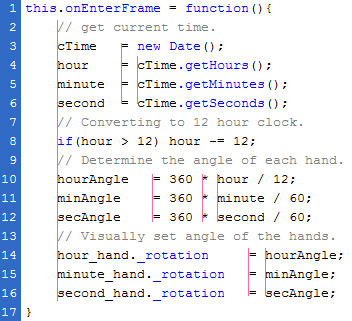
Alignment is everywhere. When you start analyzing interfaces you will often find that great interface design attempts to have as few alignment lines as possible.
Obviously text on a line is alignment too (horisontal).
And then there is optical alignment which is especially important in typography.
http://brandonwalkin.com/blog/images/LightroomVsExpressionBl...
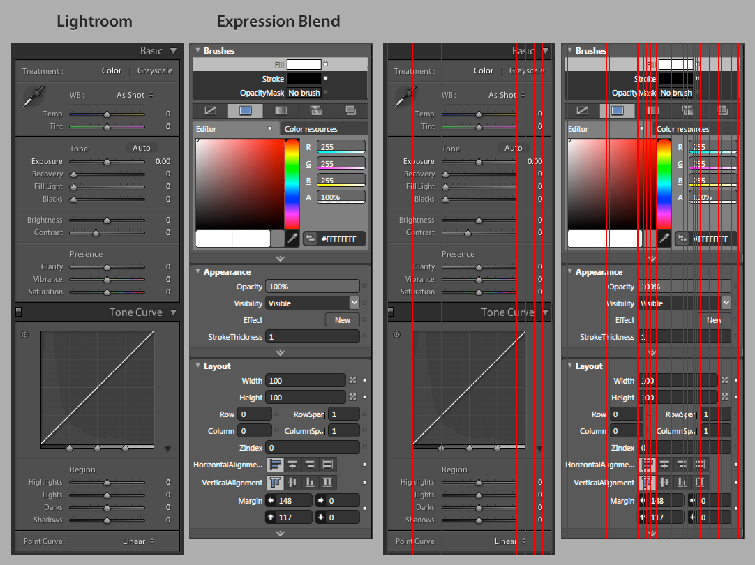
This time not from my own blog but from Brandon Walkins
And yes, alignment is a big deal, especially in any kind of information design. Look at magazines, newspapers, good newsletters, business cards, etc. Alignment is all over the place, and most are designed on a fairly strict grid, i.e. many newspapers use a 6 or 12 column grid.
The big concepts I want developers understand are: Alignment, repetition, contrast and proximity. If you understand those, you will be a better visual designer.
P.S. "natural inviting" in my original post should be "natural and inviting".
The most important function of aAlignment is to communicate what belongs together.
Having objects align also makes for a “calmer” design. Imagine that each new place any object has a beginning or an end adds an invisible line to your design. These makes the design more chaotic. Aligning objects is a way to “re-use” the lines so that you don't end up with too many of them.
(Designer here, although I will not claim to be an expert on it.)
Here's an article for the interested. Often times, designers will use a grid, like http://960.gs/ offers, to help make layouts with good alignment.
Left, right centre alignment refers to the relationship of text and text frame. You can still have alignment relationships betweens photo and text frame, photo and animation, text frame & text frame, etc.
When I had the chance to work in the cakePHP website they were 100% hands off and just let me run wild and do my thing. That has not happened again in my career and I think that continues to be the major highlight in my portfolio (apart from the exciting stuff I'm doing nowadays :P)
Many sites are heralded as an example of 'no design necessary' because they lack the eye candy. However, the minimalism of these sites, the layout of results by date (as opposed to alphabetically or something else) the categories they are arranged by, all are part of the design of these sites. Was a designer involved in this? Hard to say, probably not, but were these decisions made intentionally by someone considering alternative choices? absolutely.
I'm not saying designers are the only people who can design. Just that designers are trained and have experience making decisions like the ones I mentioned above. We can - and do - provide value to software.
In this way, Reddit's 'poor design' serves a function of repelling undesirable people. If you want to repel people then go for a non-design. If you want to attract as many people as possible, or attract people who are turned on by something other than a wall of text, then hire a designer.
Design isn't necessarily about embellishment, but aesthetic choices. Good typography and color scheme choices don't have to be paired with elaborate graphics for a design to be good.
But more to the point of what you're saying, design is NOT optional. It is the essence of how people interact with your website/product. There are certainly some exceptions to the rule, but generally people flock to a more attractive product because it is attractive. Look at any Apple product for a perfect example of this. iOS is far less usable and powerful than Android, but people like it more because it's visually pleasing. OSS is never going to win unless it has that similar level of sex appeal in its products.
I'd argue that iOS is far more usable than Android in addition to being visually pleasing.
The problem here is your very definition of design. If you were a designer, you'd be the bad kind that equates good design with over the top graphics. The best design is subtle. It doesn't call attention to itself or say "look at me." It just is. To paraphrase from the movie Helvetica, good design shouldn't make you say oh look how nice this design is—it should make you say well of course it's this way, why would it be any other way?
Take this very comment page, it's not flashy but I wouldn't say it's bad design at all. It knows it's audience isn't looking for bells and whistles. Everything lines up in a pleasing—and more importantly, logical—way. The typography is decent and there's enough differentiation between the comment and it's meta data. I could go on.
Basically, just open your mind. Bashing someone's profession without hearing their side is never smart.
The way there are upvotes and downvotes on reddit is an important part of the design. It has deep repercussions on the user's dynamics, the way posts get popular or are ignored, etc.
Now, purely font-choosing 'design' is not that important, but if you think that's design, you are misguided.
And this comes from a guy who just codes and does SQL queries all day.
1. Communication. Developers use a completely different language than designers. If I come in talking about alignment, developers are thinking 'right left or center justified?' When developers start talking about recursion, I go to sleep.
2. Attitude. Often developers seem to think of designers as 'artsy' types, and design as 'nice-to-have,' which is to imply not necessary.
3. Attitude. Designers often get emotionally attached to their work and get discouraged or give up when someone disagrees, has a different idea or wants to go another direction.
4. I can do it myself. A LOT of developers - particularly less experienced ones - think design is something they can, and are, successfully doing themselves. After all, it's just pixels on a screen, who needs photoshop, right?
5. Small changes. Developers often make small changes to designs. 5px extra padding here, no margin there. Blue is blue, right? We'll just use that 10x10 icon the designer did for that page for this 25x25 icon we need on this page. This drives designers insane.
6. Eyecandy. This goes to a lack of understanding of the design profession; many think design is just slick icons and pretty colors. Developers who have worked with talented designers know that designers can improve entire systems, helping streamline work flows and adapt the system to actual users.
7. Bad designers. Oh yea, there's -a few- of us out there that just picked up GIMP yesterday and think a 600 x 600px favicon should be fine. Even designers capable of really good work may not understand why a 2400x1600 image cannot be used thumbnail-size on the page. This is sad, but I've seen it.
8. Lack of trust. Developers may have worked with bad designers in the past. Most likely they have, actually. They'll likely limit the designers interaction to making icons and css rather than involving them in the system design and planning. Designers may not give as much as they could because they don't trust the developers to value their input or even understand and execute their contributions well.
Of course, that's not to say all projects are this way, and in fact, when I've been involved in projects from early-on, this is very much not the case.
However, I've run into the above issues in my professional career more than once, working face-to-face with people. Trying to make the relationship work online, in projects as distributed as OSS projects are, that's very difficult.
But I think it can be done. For distributed design to work, designers need to be brought on board from the beginning, in the planning phases. The initial designer or designers would have to be responsible for creating a clear vision, clear guidelines, and a well-documented style for future contributors to follow. All contributions would have to adhere to those guidelines, and developers would have to be as adept at spotting violations as designers.
Part of the problem here is also making designers aware of projects to work on. Designers generally join different message boards (if they join message boards at all), read different blogs and generally don't run in the same circles as developers, possibly with HN being one of the exceptions. I'm not sure how to change that...