News for hackers. Stuff that matters.
Re:Slashdot Launches Re-Design by jessriedel on Wednesday January 26, 2011 @01:47AM (#2142415)
I was hoping Slashdot was going to reduce the huge amount of padding around each comment, but no luck. For instance, on my screen right now I can fit 13 comments on HN or reddit but no more than 5 on slashdot. This makes it much harder to navigate comment threads, connect replies with comments, etc.

I'm I the only one who thinks this is easily the worst part of Slashdot? It's reminiscent of a bad forum where each 3-word quip comes with an avatar, a custom border, and a 5-line signature.

Re:Slashdot Launches Re-Design by moe on Wednesday January 26, 2011 @03:52AM (#2142650)
The original slashdot was actually very readable. Here's a screenshot: http://images.slashdot.org/faq/screen_nested.gif
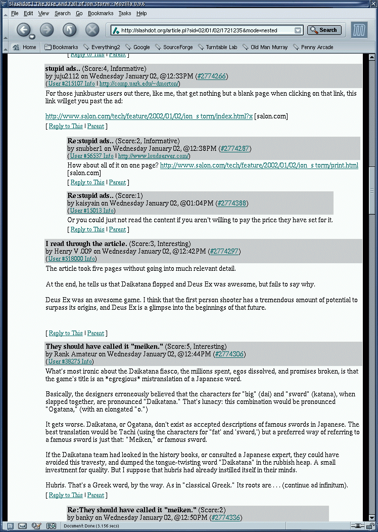
Not pretty, but readable and very usable.

The padding and useless decoration that you (rightfully) complain about was introduced with the first ajax-redesign a few years ago.

Re:Slashdot Launches Re-Design by cabalamat on Wednesday January 26, 2011 @08:12AM (#2143144)
> a 5-line signature

Surely you mean a 200 pixel signature containing an animated image? :-)