What people are calling “spectral violet”, as in, a particular range of wavelengths of light, is not a “color”. Color is a perceptual phenomenon which happens in people’s brains, and is several steps removed from light spectra, involving several types of adaptation and varying from person to person and context to context.
“Violet” is a type of purple or purple–blue flower. People use the color term “violet” to mean a hue between blue and purple, without specific reference to the spectrum. People get confused about this because Newton stuck the label violet on a diagram of a color wheel one time.
> The “red” signal path has an interesting additional property. As you can see above, it has a small bump of activation around the short-wavelength (violet) end of the visible spectrum
No this is bunk. That bump is an artifact of the process used for defining the XYZ color matching functions in the 1930s before anyone could measure cone cells directly, and the author is grossly misinterpreting what it means. On a linear scale the cone responses look like this https://upload.wikimedia.org/wikipedia/commons/thumb/1/1e/Co...
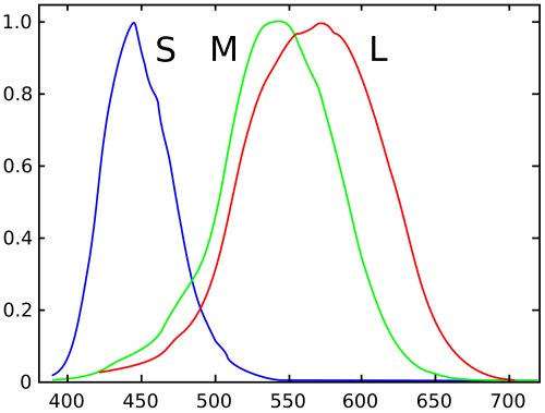
* * *
While we’re at it, “cyan” is a terrible generic name for a blue–green hue. Stick to “teal”.
“Cyan” is just the Greek word for “blue”, and is a technical term for the type of greenish blue ink used in 4-color printing.
You can see what “cyan” is as the little x, square, and + in this picture, https://upload.wikimedia.org/wikipedia/en/e/ed/Color-map-2.p...

Also it’s a crying shame that the RGB display color made of mixing yellowish green and purplish blue is called “cyan”, since it bears almost no resemblance to the printing color.
Regardless of whether or not the article's description of the specific mechanism is correct, it's true that humans perceive violet (~400nm) light in a way that can be simulated on a monitor using a mixture of red and blue light.
Using "violet" and "purple" interchangeably in a lot of contexts is probably fine, but it's extremely frustrating when someone uses "violet" to mean "purple" (or vice-versa) in a technical context. E.g. if I buy a "violet" photo filter, I will be extremely disappointed if it turns out to be dark magenta/purple.
> “Cyan” is just the Greek word for “blue”, and is a technical term for the type of greenish blue ink used in 4-color printing.
My understanding is that hundreds of years ago, "blue" was used to refer to what we would now think of as "cyan", and "indigo" was used to refer to what we would now think of as "blue" (0x0000FF on a computer monitor).
> Also it’s a crying shame that the RGB display color made of mixing yellowish green and purplish blue is called “cyan”, since it bears almost no resemblance to the printing color.
The colour people typically refer to as "cyan" in RGB colourspace (0x00FFFF) is the same colour referred to as "cyan" in the CMYK colourspace used for printing. I have several cyan glass photo filters (intended to cut out all longer wavelengths like red, but let shorter wavelengths pass), and they also look the same.
If you perceive 0x00FF00 on a computer monitor as "yellowish green" and 0x0000FF as "purplish blue", and especially if 0x00FFFF doesn't look like cyan printing ink to you, have you considered having the spectral sensitivity of your eyes tested? It sounds like either that's different than usual, or you grew up with a different set of perceptual colour definitions than most people.
If you are buying a photo filter you should look for a chart showing what specific wavelengths of light it absorbs.
Neither “purple” nor “violet” is a technical term.
> hundreds of years ago, "blue" was used to refer to what we would now think of as "cyan", and "indigo" was used to refer to what we would now think of as "blue" (0x0000FF on a computer monitor).
0x0000FF on your computer display is not anything like “unique blue” (some blue color a typical observer would say is neutral between green and red). Arguably calling computer-display primaries “blue” is a huge mistake.
Reasonable unambiguous human-comprehensible names for the RGB primaries would be something like “orangish red” (or even “reddish orange” if you take the ISCC–NBS color category name), “yellowish green”, and “purplish blue”.
> The colour people typically refer to as "cyan" in RGB colourspace (0x00FFFF) is the same colour referred to as "cyan" in the CMYK colourspace used for printing.
These are not close at all. Look at the chart I made in 2010, https://upload.wikimedia.org/wikipedia/en/e/ed/Color-map-2.p...
The +, ◻, and × are printer’s “cyan”, (the ISCC–NBS named category for this is “greenish blue”) and the triangle shows the mixture of sRGB B and G (right at the edge of the ISCC–NBS category “bluish green”).
In a similar way, printer’s magenta is a purplish red color, whereas the 0xFF00FF on a computer display is very slightly reddish purple. The two are not remotely similar.
Notice that diagram also shows dotted lines for the NCS “unique hues” of red, yellow, green, blue, and also shows round dots for the world color survey’s color category foci.
> have you considered having the spectral sensitivity of your eyes tested?
Yes, I have normal color vision, can perfectly pass a Farnsworth-Munsell 100 hue test, etc.
OK, I acknowledge that I was in error here about RGB full-saturation green + blue being equivalent to printer's cyan, and apologize for the error. However, they are still both (in my mind) firmly in the category of "colours in the sky on a cloudless day".
I think we're going to have to agree to disagree on the rest, but thank you for teaching me some new things today.
If violet is between blue and purple, and indigo is between blue and violet, what are we doing here?
But yeah, color is a weirdly cultural-specific thing. For instance, "orange" used to just be considered a shade of red. (Not sure whether it's an urban legend or not, but supposedly the term "orange" to refer to a color originates from the Dutch royal house of Orange.)
>> The word ultimately derives from a Dravidian language — possibly Tamil நாரம் nāram or Telugu నారింజ nāriṃja or Malayalam നാരങ്ങ nāraŋŋa — via Sanskrit नारङ्ग nāraṅgaḥ "orange tree". From there the word entered Persian نارنگ nārang and then Arabic نارنج nāranj.[2] The initial n was lost through rebracketing in Italian and French, though some varieties of Arabic lost the n earlier.[2]
Teal is in the vicinity of #0AA, while cyan is around #5FF; there's almost as much difference between cyan and teal as between cyan and (light) blue or green.
Using the name “cyan” for the latter is very confusing. I would strongly advise against it.
If you want you can use names like “bluish green”, “greenish blue”, or “blue–green” to stay out of trouble.
If you have a blue–green color, maybe slightly on the greenish side, “teal” is a pretty safe name: people won’t misinterpret what you mean. The name “teal” can represent a quite large generic range of colors.
That's one way it's commonly used. But in some contexts color is also used to mean spectral distribution.
That's the whole issue.
It's the same as "If a tree falls in a forest and no one is around to hear it, does it make a sound?". The whole conundrum only arises due to overloaded meanings in many languages.
That's why cameras also have a bump at 400mn, as shown on this manufacturer's page (under the relative sensitivity tab) [3]. Cameras must have it so that they can capture light at 400nm the same way our eyes do. Otherwise those colors would look wrong in pictures.
That is also how computer monitors can display a color that we see as violet. They output a bit of red and lots of blue, which excites our red and blue cones and give the same stimulus as violet at 400nm wavelength. So, monitors can't output violet, but they can trick our eyes to think that there is violet.
The same happens for yellow. Monitors can't output yellow wavelength (590nm), but they output red and green, which excites our red and green cones and we think we see yellow. So, you could also say that when you see yellow on web pages, it isn't really yellow. It is just a mix of red and green.
[1] http://www.handprint.com/HP/WCL/color1.html
[2] https://en.wikipedia.org/wiki/Photoreceptor_cell#/media/File...

[3] https://www.thorlabs.com/newgrouppage9.cfm?objectgroup_id=40...
This explanation is incorrect.
Your graph is on a log scale.
You can make a camera out of any invertible linear combination of human cone cell responses and you will end up recording basically the same information as far as an idealized human observer is concerned (that’s the basic idea of the CIE system of colorimetry).
The specific choice of computer display primaries has to do with maximizing the possible gamut (as well as other technical and economic criteria), not precisely targeting specific cone cells.
> when you see yellow on web pages, it isn't really yellow
You are using a non-standard definition of “yellow” not accepted by color scientists or color measurement experts.
Have you considered the possibility that human vision might have a more-or-less logarithmic response, and that this is why so many graphs related to it use a log scale?[1][2][3]
[1] "Brightness as perceived by the [human visual system] is a logarithmic function of the light intensity incident on the eye.", https://people.cs.umass.edu/~elm/Teaching/ppt/691a/CV%20UNIT... [2] https://spectrum.ieee.org/podcast/biomedical/bionics/does-th... [3] https://learn.sparkfun.com/tutorials/light/visible-light
But what we are talking about here is the wavelength-responses of a particular type of cone cell. Individual cone cells are activated when some photon excites a little protein and causes a chemical reaction. You can read about the details here https://en.wikipedia.org/wiki/Opsin
The spectral sensitivity charts we are talking about here show more or less a summary of how likely that signaling process is to happen for a particular type of cone cell for light coming in at a particular wavelength. To figure out the eye’s overall cone response to some particular light source, you can more or less take the spectrum of the light source, multiply by the spectral sensitivity of the type of cone cell, and then integrate. Notice that that part of our process is linear in terms of the charts we are talking about.
The non-linear part has to do with various types of adaptation which attenuate or discount those cone sensitivities more or less uniformly across wavelengths (for each cone). This doesn’t suddenly make the left part of the long-wavelength cone response more relevant.
In normal circumstances (say, daylight surroundings), a moderate amount of light at very short wavelengths won’t look like much of anything at all, bluish–black, because the cone cells (especially L and M cones which determine red–green response) will be getting much more stimulus from other wavelengths.
If you go to a completely dark room, let your eyes adapt, and look at a blacklight, then you are right that you are at that point going to see it looking purplish because the L cones are stimulated a bit more than the M cones for those wavelengths, and other wavelengths are entirely absent. But this is a really weird edge case for vision.
Why does it say "long-wave" when UV is short-wavelength ?

Now what does this one from [2] mean https://en.wikipedia.org/wiki/File:1416_Color_Sensitivity.jp... (logarithmic scale or not)? The "Red cones" Long line says "absorbance" is higher at 425 than at 450.

The CIE color space isn't intended to represent the cone responses, though. The goal was to have a set of reasonably orthogonal, positive-definite functions with which to represent all visible colors as linear combinations of primitives. The "green" Y coordinate was chosen not for its color at all but because it matched the experimentally derived "brightness" function. X and Z are only kinda associated with red and blue.
But because CIE can represent all colors, you can use it to define other color spaces like sRGB which do correspond closely to retinal cell responses. There are also refined versions like LUV and LAB which are (sometimes nonlinear) transformations from XYZ and are intended to better represent perceptual "distance" linearly.
XYZ is just the basic language all these things are defined in, which was its purpose.
What does this even mean? sRGB primaries are chosen to maximize the gamut of a 3-primary additive computer display. They do not “correspond closely to retinal cell responses”.
I get that you're trying to be pedantic on this, and that's fine. But the fact that you're complaining about XYZ the way you are shows that... you've sorta missed a few steps. The pedantry goes much deeper, and XYZ is the way it is for some very good reasons.
RGB display primaries are only related to the CIE system insofar as people use the CIE system for characterizing and describing them. But it doesn’t constrain the choice of primaries. The primaries are chosen (more or less) to maximize the display gamut under the constraint that there will be 3 of them. They don’t match human cone cells per se (obviously there is some relationship between cone cell responses and maximizing the gamut, but it is not a simple one).
Which I took to be a complaint that XYZ doesn't represent cone response well.
And I responded that that's silly, because (1) XYZ wasn't designed to represent cone responses and (2) the bump is there deliberately to produce a more mathemetically orthogonal basis.
If you go back to all those books you've read over that decade you spent building your expertise, I'm sure you'll find the same info.
So I don't get your criticism. Poster above wanted a set of primaries that corresponds to how the cones react. The closest you can get to that is an RGB space like... sRGB.
Arguing about which design point (phosphor correspondence or cone correspondence) is "real" or "derived" is IMHO meaningless pedantry at this level.
> Similarly many people don't really make a distinction for cyan and just call it blue or green when they see it.
Isn’t there a difference here between poverty of naming and physiologic limitation? Most people call cyan something else because they don’t have a name for it, but they can be trained to distinguish blue or green and cyan. OTOH, the point here is that certain violets and purples are metamers and although they have different spectra they cannot be physiologically distinguished.
Also, do you by any chance have a handy link to an actual graph on how cones react to various spectra of light?
Many thanks!
The point is that you need a source which contains the wavelength of interest. Monitor leds are red/green/blue and don't emit violet photons. 405nm is usually somewhat visible, if a bit blurry. Blue leds are usually Gallium Nitride based which produces more like 450nm.
Look up the photopic and spectroscopic response:
https://en.m.wikipedia.org/wiki/Luminosity_function
Do spectral violet and ultraviolet differ? In what way? If something isn't visible, why does it matter?
Spectral violet and ultraviolet are just two ranges on the continuous frequency spectrum, so they differ in frequency.
There are several different classes of UV light, just like there's many shades of blue or classes of infrared (near, long-wave, mid-wave, etc).
The reason that you can see light from "UV" lamps is because they're usually emitting over a range of wavelengths and some of that falls in the visible spectrum. And on the other end, some infrared LEDs emit a little bit of red light which is visible.
If something isn't visible it matters for safety. Most of your eyes' defense mechanisms rely on limiting the amount of light entering your pupils, so they need to be able to perceive how bright a light is. Strong UV is particularly dangerous because it's high energy (think sunburn) and you can't see it so you won't reflexively blink and your pupils won't close. Infrared can also be dangerous, but it's a lower wavelength so you need more of it to do damage.
It's ultra because it isn't within the visible spectrum. Violet is a spectral color, which means it's evoked by a single wavelength of light. So the term spectral violet refers to all the shades of violet.
>>why does it matter?
You have a word for it.
Some fluorescent materials can be lit with UV light, because they will fluoresce at wavelengths we can see. Otherwise, UV lamps also emit visible wavelengths.
People who have had cornea-replacement surgery and opted for the UV-transparent corneas can see further into the UV.[1] A child (with young corneas that haven't yellowed at all) almost certainly can too.
[1] e.g. http://www.komar.org/faq/colorado-cataract-surgery-crystalen...
The CIE charts don’t really consider how to interpret or recolor data outside the color space, for example the UV reflection from flowers or astronomy photos in the UV/X-ray spectrum.
Anyway, when I do that, my moderate red-green color blindness is obvious. Because there's a gap in the spectrum. But on a good computer display, there's far less of a gap, because colors aren't spectral, just mixed. For example: https://www.deviantart.com/0bsidianfire/art/Sanguine-4676007...
I think you'll find everything you need here:
http://www.handprint.com/HP/WCL/color1.html
and elsewhere on the same fantastically web 1.0 style site[1]. Bruce Macevoy is an artist with penchant for color theory.
Refreshing! I want to read that site even if I don't care too much about colours.
(The only thing I kind of miss is if it could be even easier to read on mobile.)
You could also use a diffraction grating, prism, or spectroscope, but you'll need to make sure the light source going into it actually contains violet light. i.e. if you use one of those with a CFL or LED bulb, you'll most likely not get much (if any) actual violet.
Monitors can display a colour with the same hue as spectral violet, just less saturated (i.e. spectal violet + grey). I think it makes sense to call this colour a kind of violet.
The article deceptively passes off purple for violet, and shows magenta for contrast. It is wrong.
Can we at least agree that computers can produce a colour that looks the same as a spectral violet light reflected off grey paper?
Some child just learning the colors gets a free pass, but if you put up a website to explain something and its wrong, I think its reasonable to "aggressively" say so.
It is, though.
Claiming that it is no color in general is actually a pet peeve of mine: You're right, of course black is a color, in the right context. Colors are not singularly defined as some point across the spectral scale, where there is indeed no black and white, but can be interpreted through many other common, reasonable, and useful definitions as well.
For example, it is perfectly reasonable to define "color" as a point in a 3-dimensional space, for example as RGB or HSV triples, which are very popular and useful definitions in many contexts. Black, then, is (0,0,0).
You can also define color as an element of a particular set of available colors. If you had a "black" car, and someone asks you what color your car is, would they seriously answer with "my car does not have a color, it is black"? (Even ignoring the fact that that would most likely be a lie according to the physical definition, since the car is most certainly not perfectly black in the physical sense, but then what would you call it?)
Painters have a range of black colours.
Both are right in the right context.
I don't disagree with it but the colors shown in the article aren't violet, they are all shades of purple. Spectral violet is outside the gamut of most RGB color spaces, including sRGB, Adobe RGB, Pantone, CIELAB, etc. Monitors also wouldn't be able to reproduce it anyway.
The CIE 1931 curve showing a bump in red inside the blue is misleading I think. It does not represent how the cones react (the article says so in small print). The L cones aren't excited at all when pure blue or indigo or violet light hits them. The graph was built to find the best RGB primaries to use in order to best "emulate" how we interpret colors, so I think it actually already encodes our bias and general lack of skill at distinguishing violet from purple.
Similarly many people don't really make a distinction for cyan and just call it blue or green when they see it.