Here's a screenshot from OS X from a while back:
https://i2.wp.com/512pixels.net/wp-content/uploads/2018/08/1...

Looks amateur and dated right? The thing is, 15 years ago people like you shat all over linux because it didn't look shiny and pretty like OS X. 15 years ago that OS X screenshot was the pinnacle of elegance and polish. If your UI didn't look like that, you were amateur and dated and janky. What Linux desktops needed was shiny buttons and genie effects to be taken seriously.
Now that there are a bunch of perfectly usable linux desktops you need to move the goalposts again because it doesn't meet "common user standards". Meanwhile, you could put a "common user" in front of OS X 10.1 or windows XP and they would get along just fine, just like they did 15 years ago.
The top menu bar is clearly too short to hold its contents but hey even Apple makes mistakes.
10.1 and even the late and great 10.6 were products of their time. The world has moved on, and Linux does not handle itself well in an era of 4K high DPI monitors.
Sure, and clearly you are part of the other vocal, minority, that complains bitterly about this. The majority is silent. The majority doesn't care about Linux or Windows but keeps their Windows install because that is the ultimate easy (maybe MacOs people care). Someone in majority could probably be trained/persuaded to agree with either perspective if someone took the time to point it out one or another of these to them and if they had any incentive to look.
Linux is usable. Linux isn't pretty by graphic designer's view of pretty. That lack of prettiness probably doesn't have that much to do with desktop Linux not being adopted widely. At least in the sense that the only way that kind adoption is going to happen is if a wider percentage of people have some actual material incentive to adopt.
Most Linux desktops are not visually consistent. Their UI isn't designed intuitively. You put that in front of the average person, and they will have trouble using it.
There is a high level of subjectivity in all these, especially user-friendliness. Polish, you can quantify with stuff like alignment, consistency etc., but for user-friendliness, I find most modern UIs, including elementary or gnome, to be quite hostile. You can stare at pretty icons and parallel and perpendicular lines all day, but how do you get shit done ? That's what most modern designs miss. And it's not just these poor OSS projects. Look at all the random apple inspired navigation changes that google added to their basic navigation in pixel 3, which you can't even change although the old code exists in aosp. TLDR: user friendliness is very hard to get right.
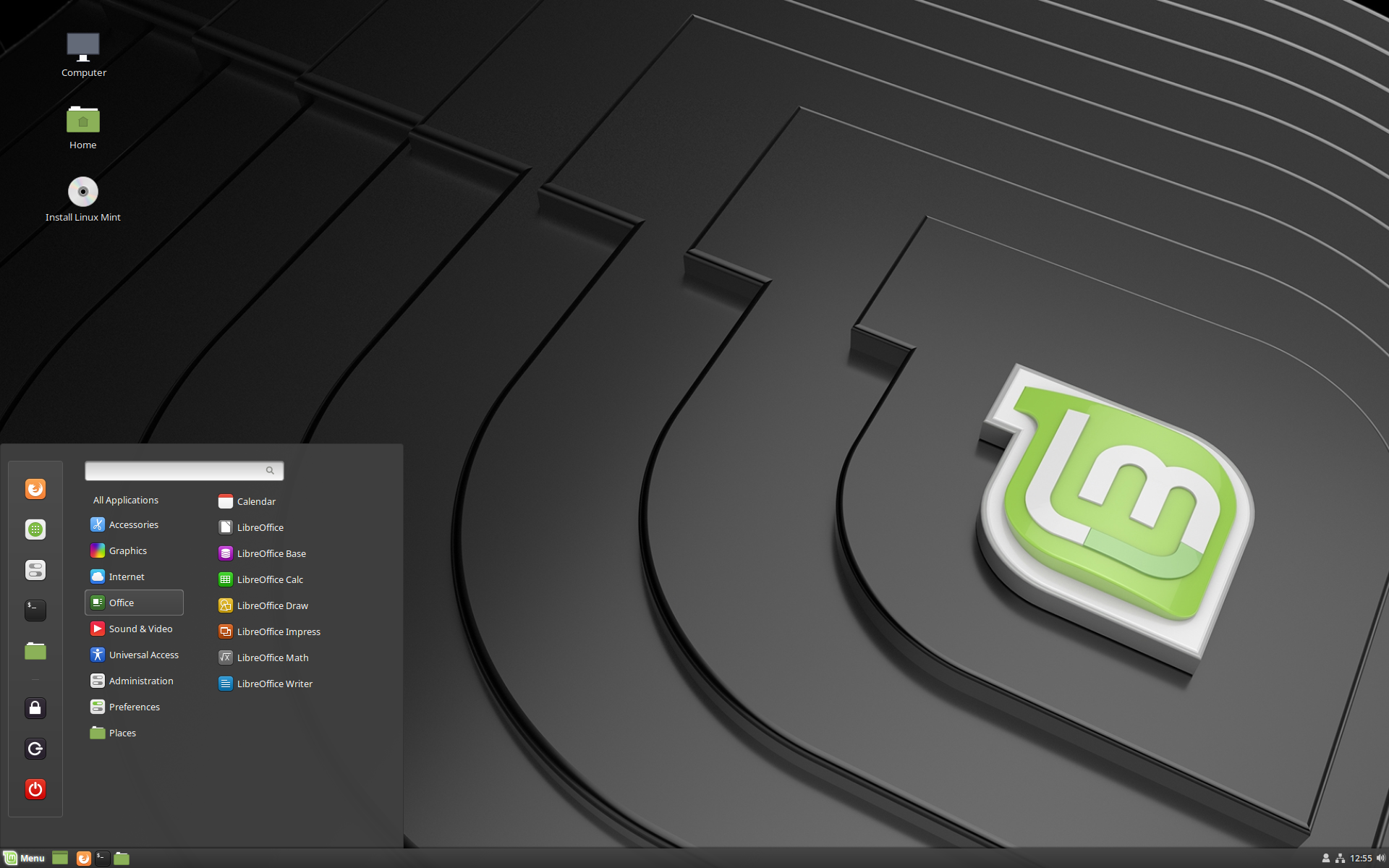
https://www.linuxmint.com/pictures/screenshots/tara/cinnamon...
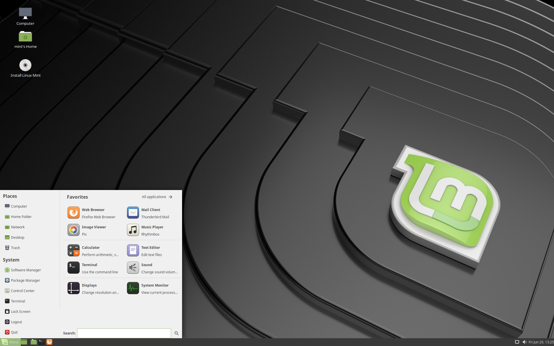
https://www.linuxmint.com/pictures/screenshots/tara/mate.png
Or is it just some perpetual need to evolve for the sake of evolving?
I've tried moving away from the traditional desktop (yes, for the sake of it), but I just can't. And cinnamon seems to suck the least.
(and no amount of polish will move me to mac/win)
I have used macOS for 10 years[1] and I always had the same feeling about Windows 7. The icons looked ugly, apps were all over the place UI-wise. The directory structure is impenetrable for a non-expert. Etc. With Windows 8 and 10 things are even worse, discoverability is hard in the super-flat new interface, Win32 applications or universal apps look out of place (depending which one you like), and even for Windows' own settings, things are scattered between Win32 and universal applications.
The Windows UI mess doesn't drive Windows users away, so I do not see why some misaligned icons or text would drive users away from e.g. Mint. There are other reasons why people do not use Linux, but I don't think this is it (outside some niche groups, such as designers). Death by a thousand paper cuts is why most people will stop using Linux after trying.
[1] Though I am now using Linux again the majority of my time.
Most people intuitively have a sense of whether the software they're using is elegant, polished, and user-friendly without necessarily being able to articulate that the "font heights", etc. are the problem.
By a common user's standards, Mint looks amateur and janky compared to Windows 10 and Mac OS.