Re:New Map Scale Is More Readable by People Who Are Color Blind
by mark-r on Friday August 10, 2018 @11:13AM
(#17733996)
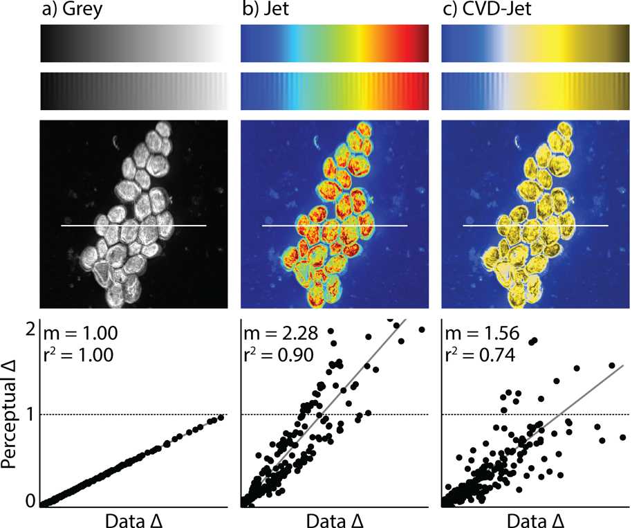
They claim that the new scale gives a continuum from dark to light, but if you look at the example it goes dark at both ends with the brightest colors in the exact middle. Why the discrepancy?
[ Parent
| on HN ]
Re:New Map Scale Is More Readable by People Who Are Color Blind
by zck on Friday August 10, 2018 @11:23AM
(#17734124)
I don't think it does. The picture here: https://static.scientificamerican.com/sciam/assets/Image/UPj... is CVD-Jet, not their new scale. The blue-and-yellow rightmost picture is described as "as a person with red-green color blindness sees the rainbow image [in the center]". This scale does put the brightest colors in the center.
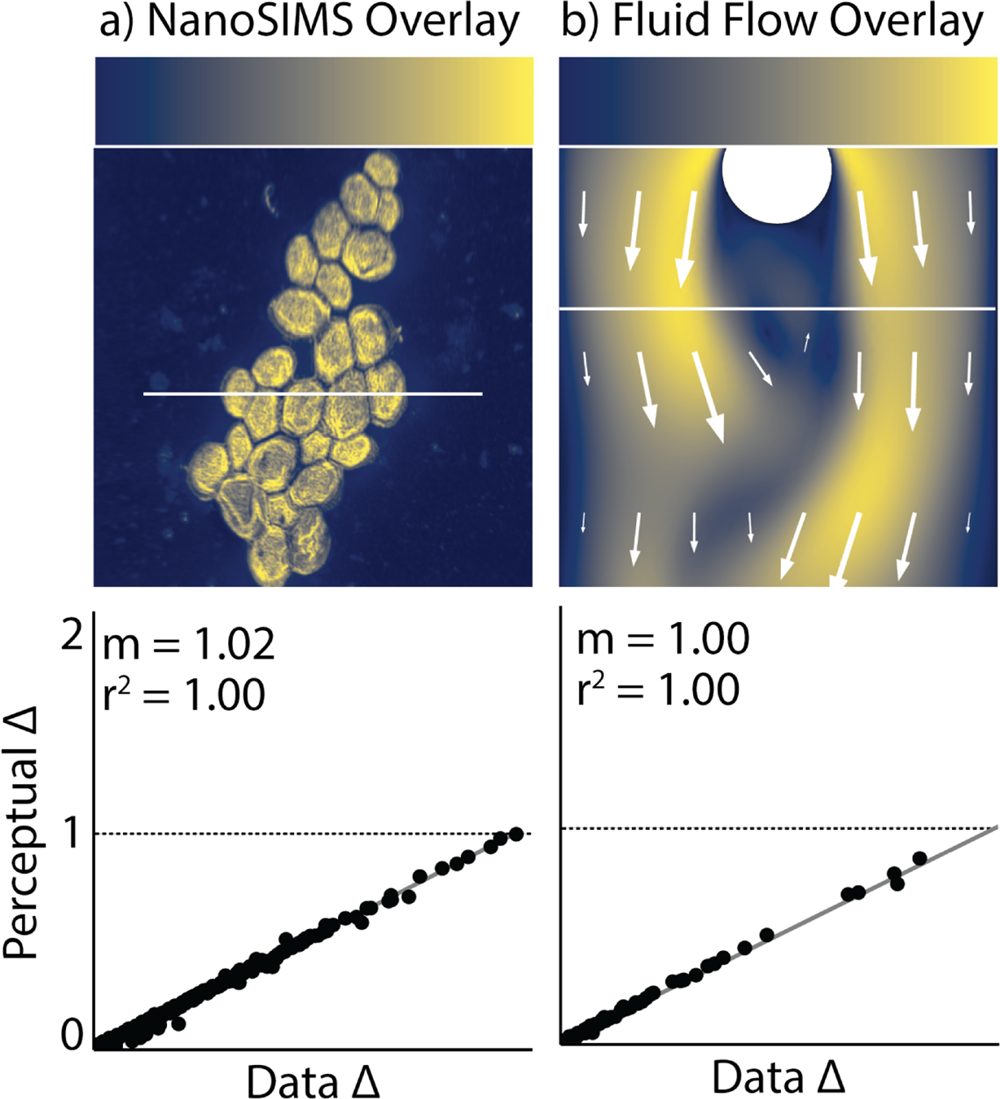
Their proposed scale, cividis, does not have a brightness in the middle of the scale. It's the second image in the article: https://static.scientificamerican.com/sciam/assets/Image/jou...
Re:New Map Scale Is More Readable by People Who Are Color Blind
by nbutyllithium on Friday August 10, 2018 @11:31AM
(#17734220)
Correct, one of the links in the article shows a pretty clear comparison between rainbow scale, how that looks to someone with color deficiency (with the dark portions on the ends), and their proposed scale.
https://www.comsol.com/blogs/a-simulation-color-table-for-en... - midway down the page.