Don't get me wrong, I love native applications—but saying that they're easier to develop than something in HTML/CSS is, generally speaking, not true.
Granted, I'm far worse of a programmer than a designer, so I might be missing out on what's good about Delphi because of it.
For a designer, yes, I can see your point -- it's easy to use markup to make something that looks good (or at least this month's fashion for web pages good) quickly. It's when you want to add any kind of sophisticated behavior and non-standard UI (i.e. exactly why you would want to have a desktop app instead of just using a browser in the first place) where even old Delphi would be far superior. And the result would actually look like a native app, too.
Discord's a highly admirable, semi-complicated web application, that extremely benefits by not looking native, in my opinion. The interface of it is miles ahead of any native desktop VOIP/Text client I know of, and I don't think it'd have been done without Electron.
Of course, I'll agree that generally nothing more complicated than that should be anything but native.
Discord seems to be a nice app (never used it, though) but it has the exact same generic look of, say, Microsoft Teams (another Electron app). Nice, but I would not say that it has any better interface than even classic Skype. Much better than the new monstrosity that is Skype 8, but then Skype 87 also drops proper native interface.
Of course you can get native application to look like nothing else quite easily, but by default they at least agree with the host OS conventions, which is a good thing IMHO.
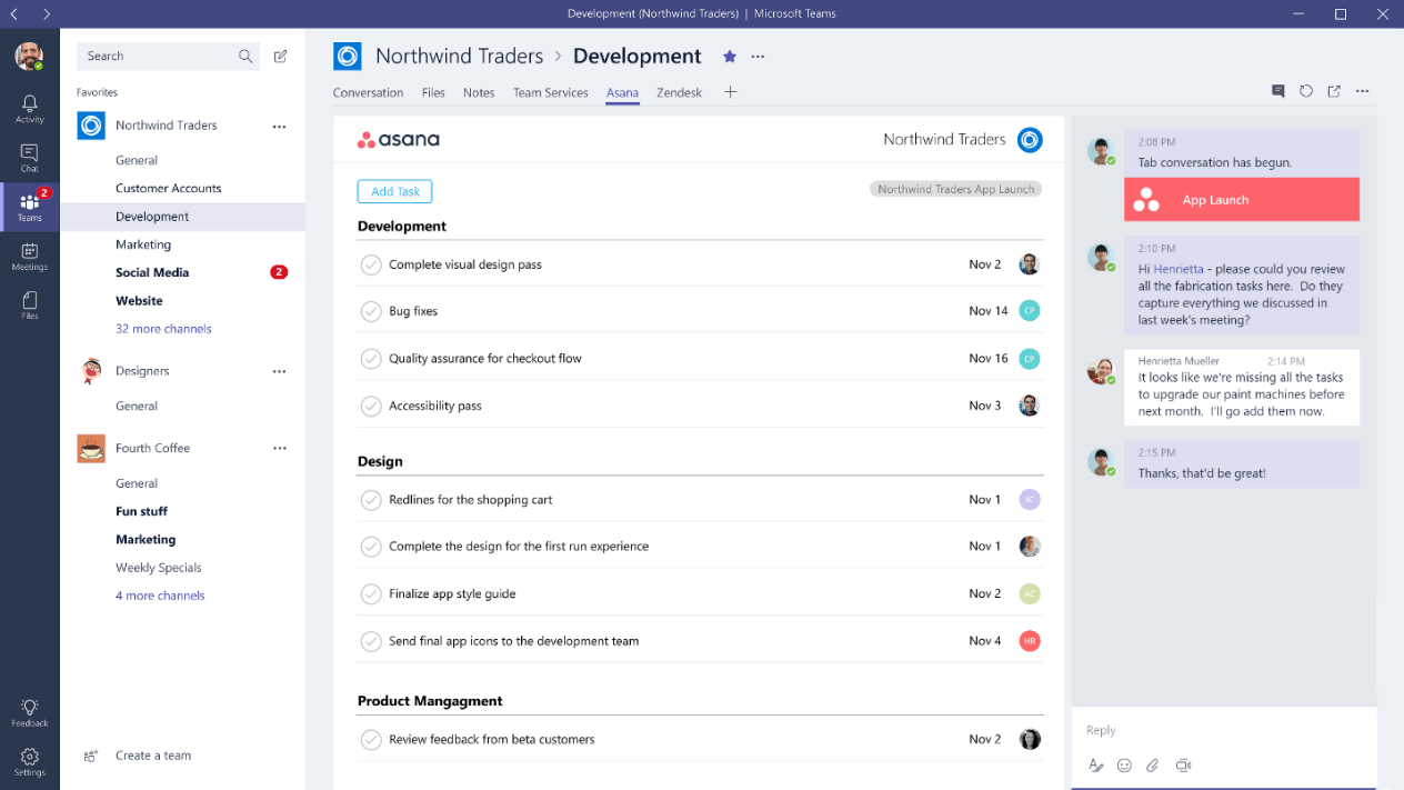
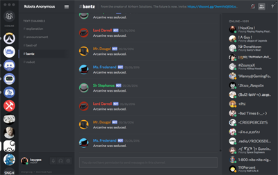
Also, the Discord interface looks entirely different than Microsoft Teams.
Microsoft Teams: https://www.windowscentral.com/sites/wpcentral.com/files/sty...
Discord: https://support.discordapp.com/hc/en-us/article_attachments/...
Discord also allows advanced users to theme it with ease, which is another good thing about it.
Now, just double-checked a few apps (Firefox, mIRC, Visual Studio) between Windows 7 and latest insider buld of Windows 10. They look exactly the same. Office? Looks the same, too. Can you reference some app that does look different between them?
Still not seeing any sinificanmt difference between Teams and Discord either. From left to right: - Narrow column with icons - Wider column with list of somethings - Even wider colunm with another list - Less wide column with more icons and text.
Seriously, if you swap icons between the two, would you be even able to tell the difference? Sure, some content in some of those colunms is different -- these are different apps, after all, but saying that one interface looks entrirely different seems to me to be an exaggeration. From a designers' POV maybe, colors re different, and icons are in slightly different locations. From a users view, they are basically identical. For that matter, Slack seems to look exactly the same, too. At least based on what they show on their site. Except, of course, that being an Electron app and not following even what little Windows has for UI standards, they have to start the description form saying that to find settings you need to go a Workspace menu. Which, of course, doesn't look like a menu to begin with.
Honestly, I do not see how this is an improvement. Cheaper for the manufacturer, sure.
I can understand the cross-platform angle, but not ease of development (unless you are limiting yourself to the very, well, limiting subset of interactions and controls that are easy to do in HTML). Nor, for that matter, the quality of the end-product.