News for hackers. Stuff that matters.
Re:HTML5 Version of the Tron:Legacy Boardroom Scene by thatcherc on Saturday August 05, 2017 @10:58PM (#14939444)
Are there any efforts to make movie-type window styles for real use? The Tron:Legacy style would be a fun one to have, as well as the one used in the computers in Westworld (similar light-blue-on-black)[1] and Interstellar [2]. I'm sure it's a more difficult process than I'm imagining, but it would be really cool to be able to use the window and interface themes of the computers in your favorite show or movie, especially since some have such great designs.

[1] - https://www.youtube.com/watch?v=Ikup60uEg0c [2] - https://youtu.be/bmz9lMP6aQU?t=2m4s, visible for a brief second just after 2m4s

Re:HTML5 Version of the Tron:Legacy Boardroom Scene by Rjevski on Sunday August 06, 2017 @12:43AM (#14939707)
The main problem with this kind of UI is information overload (which is the desired effect in movies, since the viewer isn't actually supposed to "use" nor understand all of the info displayed). There's no way to make this usable unless you lower the amount of info displayed, but then it will loose its "cool" factor.
Re:HTML5 Version of the Tron:Legacy Boardroom Scene by kwekly on Sunday August 06, 2017 @08:56AM (#14941103)
I work in the control room for an electrical generation system an this isn't the case at all for us.

Each desk has 12 ~30 inch monitors, and each monitor has a similar degree of information density, from monitors of system frequency, voltages, power flows etc. around the network, also financial / market information. There's a mix of diagrams, tabular data, maps, plots.

Two of the monitors are devoted to a geographic view with weather data, locations of field staff etc. Check out the similar setup from this California control room: https://www.bizjournals.com/sacramento/news/2016/06/17/calif...

Most displays show live data, but are not setup to be interacted with normally.

I think the truth is probably due to: 1) the same with all enterprise software, the folks who end up using the displays have token-to-no input into the purchasing or design decisions. Actually now I think of it, check out the interfaces marketed to electronic music composers (generally individuals or small studios): https://www.youtube.com/watch?v=GOq8R55xMyo

2) While I bet operators would select Tronish UI given the choice, they don't _need_ it because ultimately (with enough experience) the model of the system sits in your head, and the interface simply gives cues.

Re:HTML5 Version of the Tron:Legacy Boardroom Scene by yjftsjthsd-h on Sunday August 06, 2017 @11:30AM (#14941681)
> the model of the system sits in your head, and the interface simply gives cues.

This is a huge part of any interface that's heavily used. Once you're used to it, the interface is invisible; information is automatically parsed into a mental model, and commands are issued with minimal conscious awareness of actual keys pressed and clicks made. This is also why Emacs and vim users regard their editor as intuitive or good UI:)

Re:HTML5 Version of the Tron:Legacy Boardroom Scene by legolassexyman on Sunday August 06, 2017 @09:10AM (#14941148)
I work in this industry and there are a lot of bad UI choices all around. The picture of the California board looks like a good example and uncluttered. They have the budget out there to do that.

It doesn't have to be this way. There are standards for high performance HMI design where nothing is colored in unless it is an alarm condition.

I usually have to end up designing things the "bad way" because of customer expectation/demand. Some guy designed a screen back in 1989 and that became what they expect.

Re:HTML5 Version of the Tron:Legacy Boardroom Scene by Animats on Sunday August 06, 2017 @04:50PM (#14943447)
CAISO's big board is reasonably uncluttered. PJM's has too much small stuff. [1] But everybody probably uses mostly the screens at their own position.

One can get carried away. Here's the control room for Moscow United's power control room. This is just for the Moscow area, not a regional grid control room like the others.[2] This is the as-built version. The original plan [3] looked like a set for a Bond movie, including a suspended oval glass conference room overlooking the big board. That was from Russia's oligarch era.

[1] https://www.elliottlewis.com/app/css/images/pjm-control-room... [2] https://www.dezeen.com/2009/08/03/electricity-distribution-c... [3] http://www.experience-it-all.com/2009/08/moscow%E2%80%99s-el...

Re:HTML5 Version of the Tron:Legacy Boardroom Scene by joehan on Sunday August 06, 2017 @09:54AM (#14941328)
I don't know anything about control room but I'm generally interested in building information-dense dashboards. Was your electronic music example supposed to show a good example of a display that is developed-based-on-user-feedback?
Re:HTML5 Version of the Tron:Legacy Boardroom Scene by udkl on Sunday August 06, 2017 @02:23PM (#14942612)
You'd be interested in "Information-Dashboard-Design-At-Glance" https://www.amazon.com/Information-Dashboard-Design-At-Glanc...
Re:HTML5 Version of the Tron:Legacy Boardroom Scene by martin_ky on Sunday August 06, 2017 @02:21AM (#14940025)
Exactly. These fictional UIs are designed for a single end - to look good on camera. I think there is an inverse correlation between "cool" and "useful" - the "cool" often distracts from the "useful". While this kind of UI could work for something trivial like a simple calculator or alarm clock, in my experience it does not work for serious applications. As works of art however, these things are a beauty to look at - http://sciencefictioninterfaces.tumblr.com/

I had this idea first back when I saw Star Trek The Next Generation and its slick flat computer panels, called "okudagrams" after their designer, Michael Okuda - https://en.wikipedia.org/wiki/LCARS. I tried to reproduce the look in a note-taking application. It didn't work. The UI was dominated by these large colored buttons and arches, with too much contrast against the black background, leaving too little room for the actual content.

Re:HTML5 Version of the Tron:Legacy Boardroom Scene by mmjaa on Sunday August 06, 2017 @09:22AM (#14941184)
A corollary to this, though, is that UI's that cater to a well-written script and deliver the user into a story, which they enjoy manifesting over and over again, is a successful one.

There is a lot of room for creative metaphor in computer UI, in my opinion - however, I do also agree with your contention that its up to the user. I'm quite sure these complicated interfaces are good for, at the very least, one single user.

Re:HTML5 Version of the Tron:Legacy Boardroom Scene by djsumdog on Sunday August 06, 2017 @03:14AM (#14940168)
If you watch Cinemasins, he often makes fun of how useless 3D holographic displays really are for displaying and understanding data.
Re:HTML5 Version of the Tron:Legacy Boardroom Scene by naikrovek on Sunday August 06, 2017 @01:48AM (#14939952)
A good designer, paid to do so, could create very cool and useful UIs, I am sure.

Ultimately, it will depend on your own definition of "cool" and "useful" as to how well any one UI suits those labels.

Re:HTML5 Version of the Tron:Legacy Boardroom Scene by laumars on Monday August 07, 2017 @09:12AM (#14947218)
To be honest that looks like your typical sysadmins interface. A tiling window manager and/or few tmux sessions and you quickly end up with the same level of information density.
Re:HTML5 Version of the Tron:Legacy Boardroom Scene by vcjohnson on Sunday August 06, 2017 @12:50AM (#14939733)
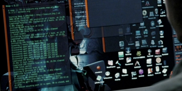
I used the gnome theme for the movie Live Free or Die Hard on linux back in 2008 or so

https://www.gnome-look.org/content/show.php/Die+Hard+4.0+-+M...

for reference this is what it looked like in the movie:

https://nmap.org/movies/diehard4/nmap-diehard4-crop-600x300....