This already exists in Europe. In the UK lots of companies us sqround bottles, like Innocent Smoothies:
http://www.wowfreestuff.co.uk/wp-content/uploads/2014/12/Inn...

I didn't mean the shape but the label. But still, I didn't even realize "sqround" is a word. Thanks!
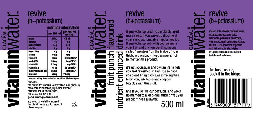
I think Vitamin Water is pretty good in terms of clean marketing, except they fail when you actually read the rubbish copy on the label.
https://www.thewrendesign.com/wp-content/uploads/2012/08/vit...
Tesco's old Value range was also pretty good for telling you immediately what's in it: http://www.s4rb.com/wp-content/uploads/2017/01/Old_Tesco_Val...

The juice bottles from "The Martian" movie are the epitome of consumer product design for me:
https://media1.giphy.com/media/11bglU5OG7SJAk/giphy-facebook...
(I apologize for the crappy image; I'm nowhere near a copy of the movie to make a decent screenshot)
No bullshit. Just the product name and necessary information about its content. No useless colors, no pictures of animals, smiling faces or other crap. There are days I dream of starting a food company just to make food in such packaging.