The juice bottles from "The Martian" movie are the epitome of consumer product design for me:
https://media1.giphy.com/media/11bglU5OG7SJAk/giphy-facebook...

(I apologize for the crappy image; I'm nowhere near a copy of the movie to make a decent screenshot)
No bullshit. Just the product name and necessary information about its content. No useless colors, no pictures of animals, smiling faces or other crap. There are days I dream of starting a food company just to make food in such packaging.
http://www.wowfreestuff.co.uk/wp-content/uploads/2014/12/Inn...

https://www.thewrendesign.com/wp-content/uploads/2012/08/vit...
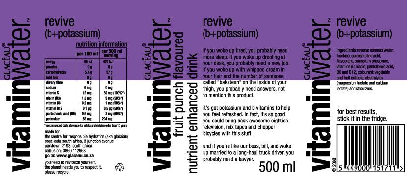
Tesco's old Value range was also pretty good for telling you immediately what's in it: http://www.s4rb.com/wp-content/uploads/2017/01/Old_Tesco_Val...

Soylent is an enterprise and they want to make themselves to look as good as possible in order to generate more revenue. No reason not to criticize awkward marketing blog posts like this.