Given that, it'd be redundant for the carbs icon to also be about weight. It's a meter of some sort, though. To me, it's either temperature—or pressure in a storage tank. Temperature would somewhat make sense, in the idea that carbs are the simplest thing that the body burns, and eating more carbs literally makes you hotter. But there are more common icons for temperatue (e.g. an old mercury thermometer with the teardrop base), so it's probably not temperature. Pressure it is.
Given that the referent is carbs, what would the storage tank be filled with? Probably a liquid. Liquid sugar? Sugar isn't green. What's a green liquid? Most hydrocarbons. Hydrocarbons are like carbohydrates, and serve many of the same functions for machines that carbs do for humans.
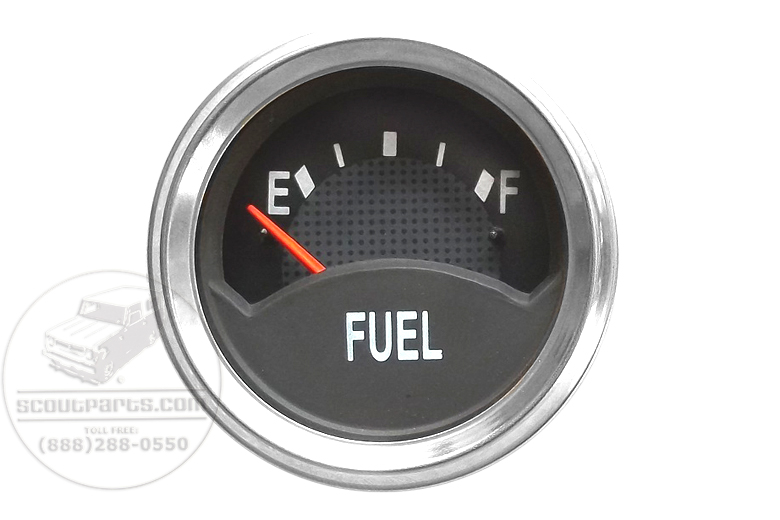
What's a common hydrocarbon pressure gauge? A car's gas gauge.
Fat, on the other hand, made no sense to me. And I had to go back and read the text to see if they really did intend it as "measuring tape to measure how fat you are", and yeesh, they did. That's... bad.
> Some colors were changed because nutritionist feedback identified red with protein, yellow with fat and green with energy.
Red, I understand. Muscle fibre (what protein builds, in most people's minds) is red. Yellow is fat because fat is, itself—in large enough amounts—a light yellow color. Butter, margarine, liposuction ejecta... etc.
Energy, though, is a bit hard to deduce. Notice that the symbol beside carbs is a gas gauge. Petrol is, in fact, a somewhat-greenish liquid. And I'm guessing petrol was the subliminal metaphor here. You "fill up on" energy like a car fills up on gas; and carbs make you go like gas makes a car go.