The vertical height of characters was dictated by the number of scan lines in the display. It was impractical to use displays that weren't compatible with TV standards, so that meant 240 non-interlaced scan lines. 10 pixels is about the smallest height you can make a font including line spacing, so that's how you get 24 rows.
Once you have the number of rows, you want the number of columns to have a good balance. 80 columns gives you well proportioned characters, where other alternatives e.g. 132 do not. Add that to the historic precedence and you have the makings of a standard.
Teletypes were in common use on the first time-sharing systems, and those were only 72 columns wide. Consider yourself lucky to have those extra 8 characters.
Re:The tyranny of the Hollerith punched card
by int_19h on Tuesday June 07, 2016 @03:49PM
(#11857235)
It's 9 vertical pixels, actually. Standard CGA font was 8x8, using the last column for character spacing, and the last row for descenders:
http://www.seasip.info/VintagePC/Images/cga.png
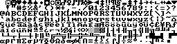
So then you need one more row to separate lines (or live with the occasional joined characters, as CGA did with its 640x200 resolution).
I don't think that's true at all. While 80 columns becoming initially common for displays was no doubt a product of the H-card, the fact is that there was reasonably widespread support even fairly early in the pre-GUI PC era for alternatives -- both more and less, but probably most notably in use 132 columns -- for display, printing, etc., and they were used where they offered superior utility. But, outside of a few niches, 80 columns stuck even in the face of alternatives, and the reason it did so was ergonomics.