Edit: and the color called "blue" in the image on top of the Munsell system wiki page is not blue, it's some shade of teal.
So yeah, it's "red". But it's not the color of anything that has ever been viewed by humans in real life (except itself). There are few pure colors in nature anyway, but you can talk about "red" being wavelength of the center of the "reddish" range of the visible light spectrum.
Of course, names for colors are always subjective. Crayola might be the best universal reference. Crayola red bears little resemblance to #ff0000, even discounting the pigment vs. light mixing and perception differences.
But you have to call it something, right? So #ff0000 is "pure red, RGB, luminous". :)
As for RGB #FF0000, the “R” primary on a computer display is very orange-ish compared to what a human would call the unique hue “red”.
Whereas I don't think most people would have any idea what "#9966B6" would look like without looking it up.
Is there even a standard for what people would say represents a given color? Color perception may very well have a cultural component to it. I know the perception of sound does have a cultural component because there are certain distinct sounds that, if not exposed to while really young, are effectively simplified into a single sound by the brain. The common example is the r and l sound among Japanese, but there is far more.
Plenty of good info there, but especially scrolling down to the color chart: http://imgs.xkcd.com/blag/satfaces_map_1024.png
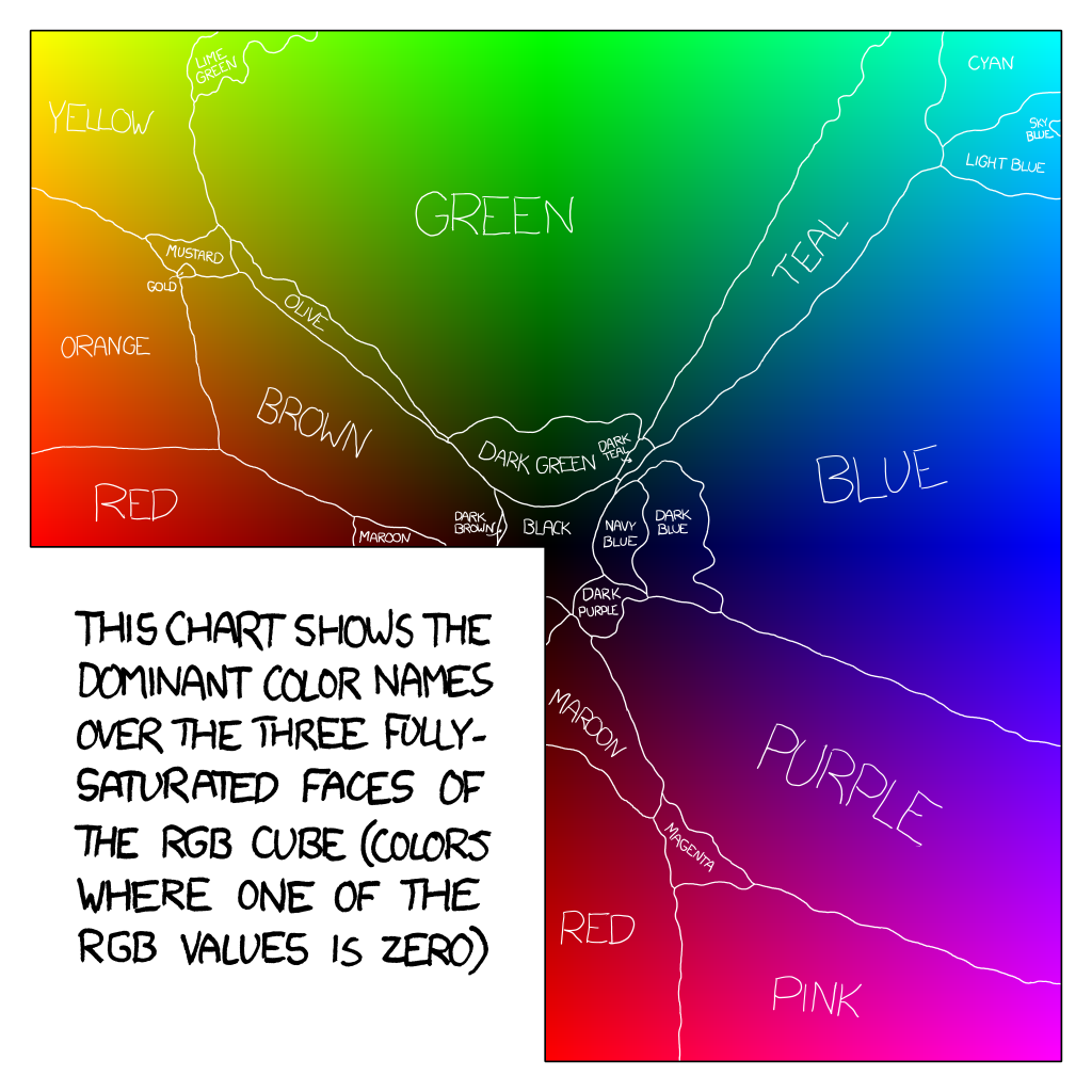
While it is true that our perception differs, we mostly share the same attributes close enough that we can fix standards (except for different cases of color blindness). For instance, we physically perceive blue, yellow, green and red as distinct colors and the rest is a mix of those (magenta being kind of a special case).
What we see as pure blue is actually a precise color point defined by how the eye physically perceive light. Reds, yellow and green are a little bit more fuzzy because they depend a lot on the ratio of red and green cones in our eyes so the brain is taking a little more liberty there.
The major difference between individuals is how precisely they can differentiate two similar colors.
I think the problem with CSS is they tried to qualify way too many colors with subjective terms instead of sticking to a clear and predictable system (either mathematic or designed), even if imperfect.
More generally, color collections without any order or structure are terrible – that goes for Pantone, Crayola crayon colors, paint names at the hardware store, etc. These are great for vendor lock in, but useless for human understanding.
Instead colors should be specified in e.g. Munsell coordinates https://en.wikipedia.org/wiki/Munsell_color_system where the numbers are meaningful and intuitive.
And in the context of computers, the specification of color as RGB coordinates is fine for CPU-to-display communication, but ordinary people should never be forced to interact with it, as the dimensions of gamma-corrected RGB have very little relation to the structure of human color perception. Trivial shims over RGB such as HSL or HSV are not an acceptable alternative.