black7375
Re:Vine: A programming language based on Interaction Nets
on Sunday February 23, 2025 @07:35AM (#43148833)
Awesome. It looks like Easy mode rust.
1. Since it is based on Interaction Net, is it parallelized well?
2. Will there be a borrow checker like Rust does?
Re:
on Thursday September 12, 2024 @03:59AM (#41518554)
I've written an in-depth article proposing a new approach to CSS in JS, aiming to address scalability issues and improve integration with design systems.
Key points:
1. Introduction of 'SCALE CSS' methodology, synthesizing existing approaches like ITCSS, BEM, and OOCSS. 2. Proposal of 'StyleStack', a new strategy combining design tokens, Atomic CSS, and variants. 3. Detailed explanation of the 'mincho' project implementing these concepts. 4. Analysis of CSS-friendly syntax in JavaScript and scalable CSS in JS approaches. 5. Exploration of integration with design tools like Figma and documentation systems.
The article covers the historical context of CSS and design, analyzes current style management methods, and proposes new implementation strategies for CSS in JS. It also discusses how these approaches can be integrated with modern design systems.
While it's a long read (about 40 minutes), I believe it offers valuable insights for developers dealing with CSS management in complex web applications, as well as those interested in the intersection of development and design.
I'm particularly interested in hearing thoughts from the HN community on the viability of this approach, potential pitfalls, and how it might be improved or extended.
Project: https://github.com/mincho-js/mincho
Re:How to make a better default Firefox UI
on Monday February 19, 2024 @02:57PM (#39433992)
> And not only tabs for apps like browser and IDEs, but also the desktop window manager should support tabs on top level windows in a consistent manner
I miss the tabbed window feature in KDE 4. This is the feature I'm most disappointed to see missing from version 5.
- https://bugs.kde.org/show_bug.cgi?id=343690 - https://community.kde.org/Plasma/5.4_Errata
I think this is a really essential feature when displaying tiled windows.
Re:How to make a better default Firefox UI
on Monday February 19, 2024 @08:46AM (#39429651)
In the middle of the article, there is a brief discussion about icons and colors.
I also think that well-coordinated color icons are good for readability and usability.
https://github.com/black7375/Firefox-UI-Fix/wiki/%5BArticle%...
However, it is difficult to apply it universally to support a variety of colors. If it is similar to the background color, it is difficult to distinguish and there may be contrast issues depending on the light/dark theme. I think it's just the ease of development of a solid color icon that matches the color of the text.
Re:How to make a better default Firefox UI
on Monday February 19, 2024 @08:17AM (#39429417)
The UI is definitely a matter of taste, which is why I created the distribution in three different shapes.
However, it was confusing that when muting, there was no indication that it was loading or there was no tab separator.
Re:How to make a better default Firefox UI
on Monday February 19, 2024 @07:02AM (#39428857)
Oh, it looks pretty neat.
Re:How to make a better default Firefox UI
on Monday February 19, 2024 @07:00AM (#39428847)
Since Mozilla does not allow it as an add-on, you must download and install it yourself.
Yes. I know it's really uncomfortable. Nevertheless, the fact that it was this popular is also proof that the existing UI was inconvenient.
https://github.com/black7375/Firefox-UI-Fix/wiki/Installatio...
Re:How to make a better default Firefox UI
on Monday February 19, 2024 @06:02AM (#39428411)
I'm the author of Lepton, a popular theme for Firefox.
You can see how I made various decisions from my perspective and how I improved on some of Mozilla's less-than-stellar decisions.
I think that might explain how we improved it and made it popular.
This article is part of a series. - https://github.com/black7375/Firefox-UI-Fix/wiki/%5BArticle%...
Re:Firefox 118
on Tuesday September 26, 2023 @10:26AM (#37659862)
If you use my theme and set a few things, it looks pretty good.
- https://github.com/black7375/Firefox-UI-Fix/wiki/Show-Off-Yo...
Re:DragonFlyBSD's HAMMER2 File-System Being Ported to NetBSD
on Sunday January 15, 2023 @05:40AM (#34388421)
wow LWKT and HAMMER2 look good.
Re:South Korea’s online security dead end
on Tuesday January 03, 2023 @02:51PM (#34237022)
In 1999, the adoption of its own 128bit algorithm was reasonable.
- https://en.wikipedia.org/wiki/SEED - https://en.wikipedia.org/wiki/ARIA_(cipher)
Of course, it's close to technology debt now.
Re:South Korea’s online security dead end
on Tuesday January 03, 2023 @02:35PM (#34236793)
One of the reasons for maintaining is to transfer consumers to security responsibility.
Re:Min: A fast, minimal browser that protects your privacy
on Wednesday December 14, 2022 @01:26PM (#33987615)
Firefox's design is more custom than you think.
https://github.com/black7375/Firefox-UI-Fix/wiki/Show-Off-Yo... https://github.com/black7375/Firefox-UI-Fix/pull/511
Re:Japanese Manga are being eclipsed by Korean webtoons
on Monday December 12, 2022 @05:14AM (#33952991)
There were several regulations, such as designating webtoons as youth harmful media when Lee Myung-bak took office.
At that time, the artists held campaign NO CUT.
Re:Lepton – Settings Framework for Various Firefox UI Custom
on Sunday September 04, 2022 @08:56AM (#32712519)
Recently, compatibility issues have been solved and uploaded.
By default, you can get improved UI / UX, and you can easily make many UI customs.
- https://github.com/black7375/Firefox-UI-Fix/wiki/Installatio...
- https://github.com/black7375/Firefox-UI-Fix/wiki/Tutorial
- https://github.com/black7375/Firefox-UI-Fix/wiki/Compatibili...
- https://github.com/black7375/Firefox-UI-Fix/wiki/Options
- https://github.com/black7375/Firefox-UI-Fix/wiki/Tips
- https://github.com/black7375/Firefox-UI-Fix/wiki/Show-Off-Yo...
Lepton – Settings Framework for Various Firefox UI Custom
Re:Lepton v5.0 – Firefox's 100 options and unopinionated custom theme
on Wednesday April 27, 2022 @01:38PM (#31183196)
- Option
As a first anniversary update, an option system is introduced.
Everything can be configured with 100+ options and changes to a unopinionated theme.
- Customize
To enhance customization, we changed the folder structure and updated the installation script.
If there are any changes: Run `git stash` and `git stash pop` before and after `git pull`. If there are `user-overrides.js`, `userChrome-overrides.css`, and `userContent-overrides.css` files, proceed with override
- Developement
The Pure CSS file has been changed to SCSS. Therefore, it becomes more structured, and the compatibility response has become easier.
Developer documents have been added to facilitate development, and discussions have been activated.
Lepton v5.0 – Firefox's 100 options and unopinionated custom theme
Re:The Impervious Browser: Your Portal to the P2P Internet
on Saturday April 09, 2022 @12:30PM (#30969455)
Among the P2P browsers, beaker looked pretty good.
Although their journey has stopped.
Re:Show HN: Warp, a Rust-based terminal
on Tuesday April 05, 2022 @08:06PM (#30926764)
Some features remind me of upterm.
Re:WebAssembly in my browser desktop environment
on Tuesday March 29, 2022 @09:41AM (#30842401)
It's amazing that ffmpeg is working on browser
Re:Firefox UI/UX History
on Sunday March 27, 2022 @10:12PM (#30826332)
The default value is always necessary, so it is worth studying.
However, I agree that the different preferences should not undermine the possibility of customization.
Re:Firefox UI/UX History
on Sunday March 27, 2022 @08:15PM (#30825550)
Basic information is the same as the article. https://msuja.ws/svg.html
The actual implementation is exemplified to read the Firefox source code.
- https://searchfox.org/mozilla-central/search?q=reload-to-sto...

Re:Firefox UI/UX History
on Sunday March 27, 2022 @08:06PM (#30825490)
That's why I made a theme. https://github.com/black7375/Firefox-UI-Fix
Re:Firefox UI/UX History
on Sunday March 27, 2022 @08:00PM (#30825436)
Thank you very much!
Re:Firefox UI/UX History
on Sunday March 27, 2022 @01:11PM (#30821923)
Yes. Actually the tab indicator behavior is weird.
https://user-images.githubusercontent.com/25581533/160292608... https://user-images.githubusercontent.com/25581533/160292618...
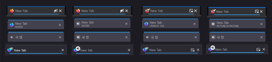
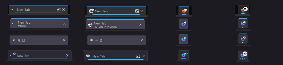
Each language has different behavior and does not display information properly.
Firefox UI/UX History
Re:Firefox UI/UX History
on Sunday March 27, 2022 @11:18AM (#30820895)
I'm making a firefox custom theme, and researching the UI/UX history of Firefox.
1. Early (v1 ~ v3)
v1~v3 are classic UI that we remember when we were in the early 2000s.
Features
- Clear as the icons do only one thing
- Unique color for each icon
Limits
- Not fused with OS UI
- UI height
- Contrary to the modern interface philosophy as there is no abstraction
- Inconsistent icon size and texture
2. Classic (v4, 2016.10)
Thus, v4.0 was released after a large-scale UI reconstruction project was launched!!
It is the longest-lived UI and loved by many people.
Commonly called a Classic theme.
Features
- Orange app button at the top left like the symbol
- Calmer tone
- Win7 Aero Glass support
- Stop / Reload / Go with one button
- Tab moved to the top
Limits
- Unfamiliar interface with large-scale changes
3. Australis (v29, 2014.04)
Australis, which had a lot of likes and dislikes compared to Proton UI.
It was a change that put a lot of effort into simplicity.
Features
- Curved Tab
- Drag & Drop customizing UI
- Change settings UI pop-up to contents(tab) format
- Animation
Limits
- Panel UI that looks like a tablet
- Remove status bar
4. Photon (v57, 2017)
Photon was a generally well-received update to the UI that was used until June of this year(2021), when Proton appeared.
Features
- Components: List based panel and page actions, library menu
- Animation: Add animation to actions of buttons, tabs, panels, etc.
- Visual redesign: tabs, icons, density, etc.
- Performance: improved initialization, synchronization reflow, etc.
Limits
- It looks a bit complicated
- Only light weight themes are allowed.
5. Proton (v89, 2021.06)
This is the moment I started working on themes.
Features
- Neatly organized menu
- Icon that are pretty enough to remind of the edge
- Some of animations that I like & skeleton screens
- Stylish color scheme
- Moderate rounding
- Meticulous implementation
Limits
- Excessively wide padding
- Remove icons from menu
- Feels like a button rather than a tab with a connected look
- Confusion of tab indicators
- Remove page action menu in address bar
- Delete bookmarks / library animations and illustrations
- The icon size of the new tab contents
- Changed the search bar of the new tab to be performed on the URL bar.
Re:Attempts to Support PWA in Firefox
on Saturday July 03, 2021 @06:00AM (#27720530)
Context: Firefox's desktop does not support PWAs.
https://9to5google.com/2021/01/27/firefox-discontinues-work-...
Disclaimer: It's not my project